CSS Transitions: A No-Sweat Guide to Smooth Web Animations
Tired of janky, instant state changes? Master CSS Transitions with our in-depth guide. Learn properties, timing functions, real-world examples, and best practices to make your website buttery smooth.
CSS Transitions: Your Secret Weapon for a Buttery-Smooth Website
Let's be real for a second. Remember the early 2000s web? When you hovered over a button, it would just... instantly change color. It was functional, sure, but it felt clunky. robotic, and honestly, a bit cheap.
Fast forward to today. You hover over a button, and it gracefully darkens. You click a menu icon, and it smoothly transforms into a close icon. You add an item to a cart, and it glides into place. That subtle magic? That's the difference between a good website and a great, polished one. And nine times out of ten, that magic is powered by CSS Transitions.
In this guide, we're not just going to skim the surface. We're going to dive deep into CSS Transitions, break down exactly how they work, and show you how to use them to level up your web development game. No fluff, just the good stuff.
So, What Exactly is a CSS Transition?
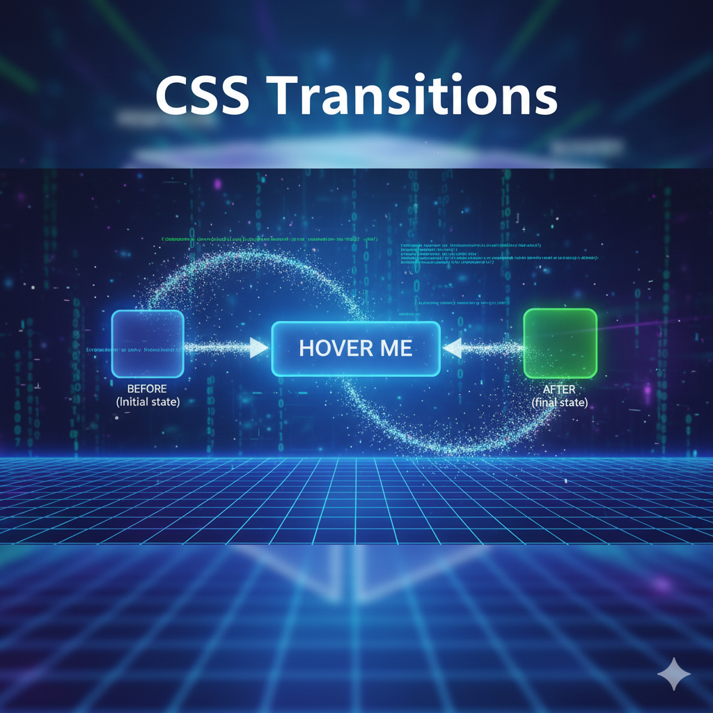
In the simplest terms, a CSS Transition is a way to control the animation between two states of an element.
Think of it like this: an element has a default state (State A) and a changed state (State B). State B could be triggered by a user hovering, focusing, clicking, or even by your JavaScript adding a new class.
Without a Transition: The element snaps instantly from State A to State B. Blink and you'll miss it.
With a Transition: The element animates smoothly from State A to State B over a period of time you specify. Ahhh, so satisfying.
It’s the difference between a light switch (instant on/off) and a dimmer switch (smooth fade). We all prefer the dimmer, right?
The Building Blocks: The Four Transition Properties
To wield the power of transitions, you need to understand the four key properties. Don't worry, they're straightforward.
1. transition-property
This is where you tell the browser what you want to animate. Not all CSS properties can be animated, but most of the visual ones can (color, background-color, opacity, transform, width, height, etc.).
css
.button {
  transition-property: background-color;
}
You can also use the keyword all to animate every animatable property that changes, but use this with caution—it can sometimes cause performance issues if you're not careful.
2. transition-duration
This is the star of the show. It defines how long the animation should take. Without this, nothing happens! The value is defined in seconds (s) or milliseconds (ms).
css
.button {
  transition-property: background-color;
  transition-duration: 0.3s; /* Or 300ms */
}
0.3s is a great starting point for most hover effects—fast enough to feel snappy, but slow enough to be noticeable.
3. transition-timing-function
Okay, this is where the real magic happens. This property controls the pace of the animation. It answers the question: "Does it start slow and end fast? Or does it have a bouncy feel?"
The most common values are:
ease(Default): Starts slow, speeds up, then ends slow. Good for most things.linear: Constant speed. Can feel a bit robotic.ease-in: Starts slow, ends fast.ease-out: Starts fast, ends slow. Great for fade-ins.ease-in-out: Similar toease, but with a more symmetrical start and end.cubic-bezier(): The ultimate power move. Allows you to define your own custom timing curve. (Check out https://cubic-bezier.com to play with this!).
css
.button {
  transition-property: background-color;
  transition-duration: 0.3s;
  transition-timing-function: ease-out;
}
4. transition-delay
Want the animation to wait a beat before starting? That's what transition-delay is for.
css
.button {
  transition-property: background-color;
  transition-duration: 0.3s;
  transition-timing-function: ease-out;
  transition-delay: 0.1s; /* Waits for 100ms before starting */
}
The Shorthand: Your Best Friend
Writing out all four properties every time is a pain. That's why we use the shorthand: transition.
The order is: property | duration | timing-function | delay
So, our previous example becomes this clean one-liner:
css
.button {
  transition: background-color 0.3s ease-out 0.1s;
}
You can even define transitions for multiple properties by separating them with commas:
css
.button {
  transition: background-color 0.3s ease, color 0.2s linear, transform 0.3s cubic-bezier(0.175, 0.885, 0.32, 1.275);
}
Let's Build Something Real: A Classic Button Hover
Enough theory, let's get our hands dirty. We'll create a button that changes background color, text color, and lifts up slightly when hovered.
HTML:
html
<button class="cta-button">Click Me, You Know You Want To</button>CSS:
css
.cta-button {
  padding: 15px 30px;
  background-color: #4CAF50; /* A nice green */
  color: white;
  border: none;
  border-radius: 8px;
  font-size: 1.1em;
  cursor: pointer;

  /* The Transition Magic */
  transition: all 0.4s cubic-bezier(0.175, 0.885, 0.32, 1.275);
}

.cta-button:hover {
  background-color: #367B36; /* A darker green */
  color: #f0f0f0;
  transform: translateY(-5px); /* Lifts the button up 5 pixels */
  box-shadow: 0 10px 20px rgba(0, 0, 0, 0.2); /* Adds a shadow for a "floating" effect */
}
What's happening here? On hover, the button's background darkens, the text gets slightly lighter, it moves up, and a shadow appears. But thanks to the transition property, it doesn't just snap to that state—it glides into it over 0.4 seconds with a slightly bouncy, energetic feel. Copy this code into a file and try it yourself. Feel that difference? That's polish.
Leveling Up: Real-World Use Cases
Transitions aren't just for buttons. Here’s how they’re used in professional projects:
Smooth Scrolling:
html { scroll-behavior: smooth; }(This uses a built-in transition for the scroll!)Mobile Menu Sliding In: Toggling a class with JavaScript that changes
transform: translateX(100%)totransform: translateX(0), with a transition on thetransformproperty.Image Galleries & Hover Overlays: Fading in a caption or a dark overlay on an image using
opacity.Form Field Focus States: Gently changing the border color of an input field when the user clicks into it.
Loading Spinners: Creating infinite, smooth rotations using
transform: rotate().
Pro Tips & Best Practices
Animate
transformandopacityfor Performance: The browser is incredibly efficient at animating these two properties. If you can, avoid animatingwidth,height, ormarginas they can cause expensive "layout" calculations and lead to jank on slower devices.Don't Go Overboard: Subtlety is key. If every single element on your page is bouncing and sliding, it becomes distracting and annoying. Use transitions to guide the user, not to overwhelm them.
Provide "Off" Switches: Respect users who prefer reduced motion. You can use a media query to turn off animations:
css
@media (prefers-reduced-motion: reduce) {
  * {
    transition-duration: 0.01ms !important;
  }
}
Test the "In" and "Out": Remember that the transition also applies when the hover state ends. Make sure the reverse animation (the "out" state) also feels good. A slightly faster "out" animation can often feel more responsive.
FAQs: Stuff You Might Be Wondering
Q: Can I transition from display: none to display: block?
A: Sadly, no. display is not an animatable property. The workaround is to use opacity: 0 combined with visibility: hidden (which is transitionable for visibility), or to use height: 0.
Q: What's the difference between Transitions and Animations?
A: Great question! Transitions need a trigger (like hover) and animate between two states. CSS Animations (using @keyframes) are more powerful—they can loop infinitely, move through multiple states automatically, and don't necessarily need a trigger.
Q: How do I debug a transition that's not working?
A: Check your checklist:
Did you specify a
transition-duration?Is the
transition-propertyyou're listing actually changing?Are you applying the transition to the original state, not the hover state? (A common mistake!).
Q: Are CSS Transitions hard to learn?
A: Absolutely not! As you've seen, the basic concept is incredibly simple. Mastering the timing and feel takes practice, but getting started takes just five minutes. This is exactly the kind of practical, impactful skill we focus on at CoderCrafter. To learn professional software development courses such as Python Programming, Full Stack Development, and MERN Stack, visit and enroll today at codercrafter.in. We break down these concepts in a way that's easy to understand and immediately applicable to real-world projects.
Conclusion: Your Website, Now with Feeling
CSS Transitions are a cornerstone of modern web design. They are a tiny bit of code that delivers a massive payoff in user experience, making your creations feel dynamic, responsive, and professionally crafted. They bridge the gap between a static, functional page and an engaging, interactive application.
So, stop letting your elements just blink into existence. Give them a little life. Start by adding a simple transition: all 0.3s ease to your buttons and links, and feel the difference. Once you start, you'll never go back.
Ready to take the next step and not just style your websites, but build them from the ground up? CoderCrafter provides comprehensive, project-based training in Full Stack Development, equipping you with the skills to be a complete developer. Head over to codercrafter.in to check out our courses and start your journey today


