CSS Shadows 101: Master box-shadow & text-shadow Like a Pro
Stop with the flat designs! Learn how to use CSS box-shadow and text-shadow to create depth, realism, and wow-factor in your web projects. Full code examples & pro tips included.
Alright, let's be real. We've all been there. You've got your HTML structure looking clean, your colors are on point, but your website still looks... a bit flat. It's missing that je ne sais quoi, that little spark of life that makes a design pop.
Enter CSS Shadows.
Forget the old-school, blurry grey boxes you might be thinking of. Modern CSS shadows are your secret weapon for creating depth, hierarchy, and a touch of magic that makes your site feel tactile and modern. They guide your user's eye, make buttons look clickable, and can literally lift your elements off the screen.
In this deep dive, we're going to break down everything about CSS shadows. No fluff, just practical, actionable knowledge with code you can copy-paste and play with. Let's get this.
The Two Pillars: box-shadow and text-shadow
First things first, you have two main tools in your shadow arsenal:
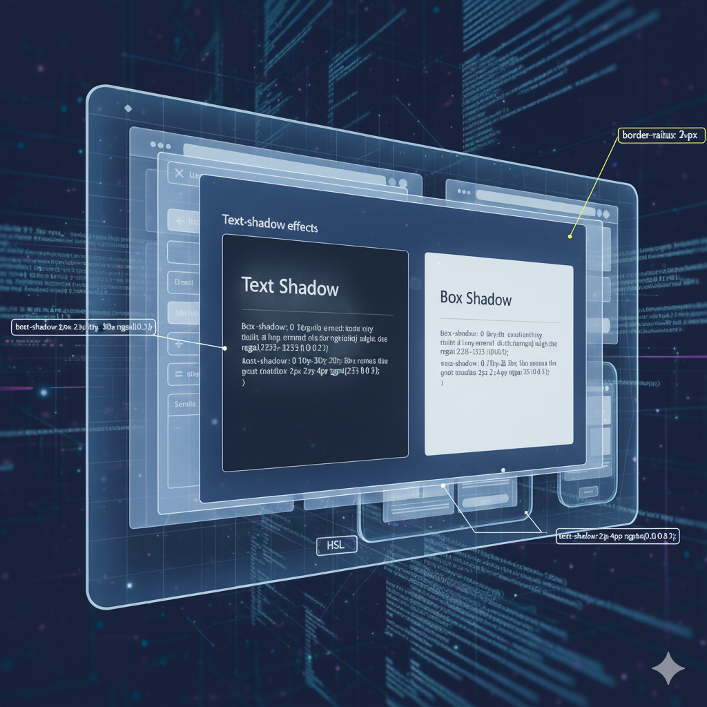
box-shadow: This is your go-to for adding shadows to the entire box of an element. Think divs, sections, buttons, cards, images—you name it.text-shadow: This one is, you guessed it, exclusively for adding shadows to text content.
We'll spend most of our time on box-shadow because it's a powerhouse, but we'll give text-shadow its well-deserved spotlight too.
Deconstructing the box-shadow Property
The box-shadow property looks a bit intimidating at first because it can take a bunch of values. But once you understand the syntax, it's like riding a bike.
Here's the full syntax breakdown:
css
box-shadow: [horizontal offset] [vertical offset] [blur radius] [spread radius] [color] [inset];Let's translate that from geek to human:
Horizontal Offset (
X): How far right the shadow is pushed. Use a negative value (-10px) to push it to the left.Vertical Offset (
Y): How far down the shadow is pushed. Use a negative value (-10px) to push it up.Blur Radius (
blur): This controls how... well, blurry the shadow is. A value of0means a sharp, hard shadow. The higher the value, the softer and more diffused the shadow becomes. This is key for realism.Spread Radius (
spread): This is the "size" of the shadow. A positive value makes the shadow larger than the element, and a negative value makes it smaller. It's optional and often left out (defaults to0).Color (
color): The color of the shadow! This can be any CSS color value—hex, RGB, RGBA, HSL, etc. Using RGBA with an alpha (transparency) channel is a pro move for creating subtle, realistic shadows.Inset (
inset): This keyword changes the shadow from being outside the element to inside the element, creating a pressed or engraved effect. Also optional.
Let's See It in Action: Code Examples
Example 1: The Classic Subtle Shadow
This is your bread and butter, the shadow you'll use on cards and containers.
css
.card {
  box-shadow: 0 4px 8px rgba(0, 0, 0, 0.1);
  /* X: 0 (centered), Y: 4px down, Blur: 8px, Color: black at 10% opacity */
}
Effect: A soft, subtle shadow that gently lifts the card off the background.
Example 2: The "Floating" Button
A sharper shadow with less blur for elements that feel closer to the user.
css
.button {
  box-shadow: 0 2px 4px rgba(0, 0, 0, 0.2);
}
Effect: A tighter shadow that makes the button feel instantly clickable.
Example 3: The "Inset" Pressed Effect
Perfect for toggle switches or input fields.
css
.input-field:focus {
  box-shadow: inset 0 1px 3px rgba(0, 0, 0, 0.2);
}
Effect: Makes the input field look like it's sunken into the page.
Example 4: Going Big with Spread
Want a more dramatic, "halo" effect? Use the spread value.
css
.highlight-box {
  box-shadow: 0 0 20px 10px rgba(100, 200, 255, 0.3);
  /* X:0, Y:0, Blur:20px, Spread:10px, Color: light blue */
}
Level Up: Multiple Shadows & Neumorphism
Here's where things get really fun. You can apply multiple shadows to a single element by separating them with commas. This is how you create incredibly sophisticated effects.
Example: Layering Shadows for Realism
css
.super-card {
  box-shadow:
    0 2px 4px rgba(0, 0, 0, 0.1),       /* Top, subtle layer */
    0 8px 16px rgba(0, 0, 0, 0.1);      /* Bottom, stronger layer */
}
Effect: This creates a much more natural, multi-layered depth than a single shadow ever could.
The Neumorphism Trend (Use with Caution!)
You've probably seen this soft, extruded plastic look. It's created by using a white and a dark shadow on a background that matches the element's color.
css
.neo-element {
  background: #e0e0e0; /* Same as the page background */
  box-shadow:
    5px 5px 10px #bebebe,                /* Dark shadow */
    -5px -5px 10px #ffffff;              /* Light shadow */
}
Word of caution: While it looks cool, Neumorphism can be a nightmare for accessibility as it often lacks contrast. Use it sparingly and never for critical interactive elements.
Don't Forget text-shadow
While box-shadow is the star, text-shadow is a fantastic supporting actor. Its syntax is simpler:
css
text-shadow: [horizontal offset] [vertical offset] [blur radius] [color];Example: Making Text Pop
css
.headline {
  text-shadow: 2px 2px 4px rgba(0, 0, 0, 0.3);
  /* X:2px, Y:2px, Blur:4px */
  color: white; /* Good contrast on a dark background */
}
Example: The "Clean Outline" Effect
You can create a simple outline by using multiple shadows with no blur.
css
.outline-text {
  color: white;
  text-shadow: 1px 1px 0 #000, -1px -1px 0 #000, 1px -1px 0 #000, -1px 1px 0 #000;
}
Real-World Use Cases: Where to Actually Use These
Cards & Containers: The #1 use case. A subtle
box-shadowinstantly defines a container and separates it from the background.Navigation Bars: A tiny bottom shadow (
box-shadow: 0 2px 4px rgba(0,0,0,0.1)) on a navbar creates a feeling that it's sitting on top of the page content.Buttons: Shadows on buttons provide visual feedback. You can even use the
:activepseudo-class to change the shadow to aninsetwhen clicked, mimicking a press.Images & Avatars: A light shadow can prevent images from blending into the background.
Modal/Popup Windows: A larger, more diffuse shadow makes it clear that the modal is in front of everything else.
Text for Readability: Use a
text-shadowon light-colored text over a busy background image to ensure it remains readable.
Pro Tips & Best Practices
Use RGBA for Colors: Instead of solid black (
#000), usergba(0, 0, 0, 0.1). This allows the background color to show through, creating a much more natural and blended effect.Less is More: Especially for UI elements, subtlety is key. A shadow that's too strong can look dirty and outdated.
Performance is (Mostly) a Non-Issue: Modern browsers are highly optimized for rendering shadows. Don't overthink performance unless you're animating dozens of heavily shadowed elements at once.
Test on Multiple Backgrounds: A shadow that looks perfect on a white background might disappear or look strange on a dark one. Always test in context.
Leverage DevTools: Your browser's developer tools are your best friend. You can play with all the values in real-time until you get the perfect look.
FAQs
Q: Can I animate a shadow?
A: Absolutely! You can use CSS transition to animate the box-shadow property. For example, making a button's shadow grow and darken on :hover is a classic and effective interaction.
Q: What's the difference between filter: drop-shadow() and box-shadow?
A: Great question! box-shadow applies to the rectangular box of the element. drop-shadow() is a filter that applies a shadow to the non-transparent parts of an image. So if you have a PNG of a star, drop-shadow() will create a shadow in the shape of the star, while box-shadow would just create a rectangular shadow around its box.
Q: Do shadows work with rounded corners (border-radius)?
A: Yes! The box-shadow perfectly follows the element's border-radius. If you have a circle, the shadow will be circular.
Conclusion: Stop Being Flat, Start Casting Shadows
Mastering CSS shadows is one of the fastest ways to elevate your front-end development skills from "it works" to "it looks professional." It's a small detail that makes a massive difference in user experience and perceived quality.
Remember, the goal is to use shadows to create a visual hierarchy and a sense of depth, guiding your user intuitively through your interface. So open up your code editor, start experimenting with the examples above, and watch your designs come to life.
Feeling inspired to build more than just shadows? This is just the tip of the iceberg in the world of modern web development. To learn professional software development courses such as Python Programming, Full Stack Development, and the MERN Stack, visit and enroll today at codercrafter.in. We'll help you build the skills to craft not just beautiful UIs, but entire, robust applications from the ground up.


