CSS Pseudo-classes Explained: A No-BS Guide to Interactive Web Design

Stop guessing how to make your website interactive. Our in-depth guide to CSS pseudo-classes covers :hover, :focus, :nth-child, and more with real-world examples. Level up your front-end skills today!
Unlocking the Magic of CSS Pseudo-classes: Your Guide to a Killer Interactive Website
Let's be real. You can build a website. It has a header, some content, a footer. It's... fine. But "fine" doesn't cut it anymore. Users expect smooth, intuitive, and reactive experiences. They want a button that feels clickable, a form that guides them, and a list that's easy to scan.
This is where the magic of CSS Pseudo-classes comes in.
Think of pseudo-classes as your secret weapon for adding that layer of polish and interactivity without reaching for a single line of JavaScript. They are the subtle, yet powerful, details that separate a basic website from a professionally crafted one.
So, grab your coffee, and let's dive deep into the world of CSS pseudo-classes.
What Even Are CSS Pseudo-classes?
In simple terms, a CSS pseudo-class is a keyword you add to a selector that specifies a special state of the selected element.
Read that again. A special state.
It’s like describing an element not just by what it is (a <button>), but by what it's currently doing or its context.
Is a user hovering their mouse over it? That's a state (
:hover).Is it the very first child of its parent? That's a state (
:first-child).Has the user already visited that link? That's a state (
:visited).
The syntax is straightforward. You attach it to your CSS selector with a colon (:).
css
selector:pseudo-class {
  property: value;
}
For example, a:hover { color: red; } means "make the text color of all <a> tags red when a user hovers over them."
Easy, right? Let's break down the most useful ones.
The A-Listers: Pseudo-classes You'll Use Every Day
1. The Interaction Rockstars
These are your go-to's for user interaction. They make your site feel alive.
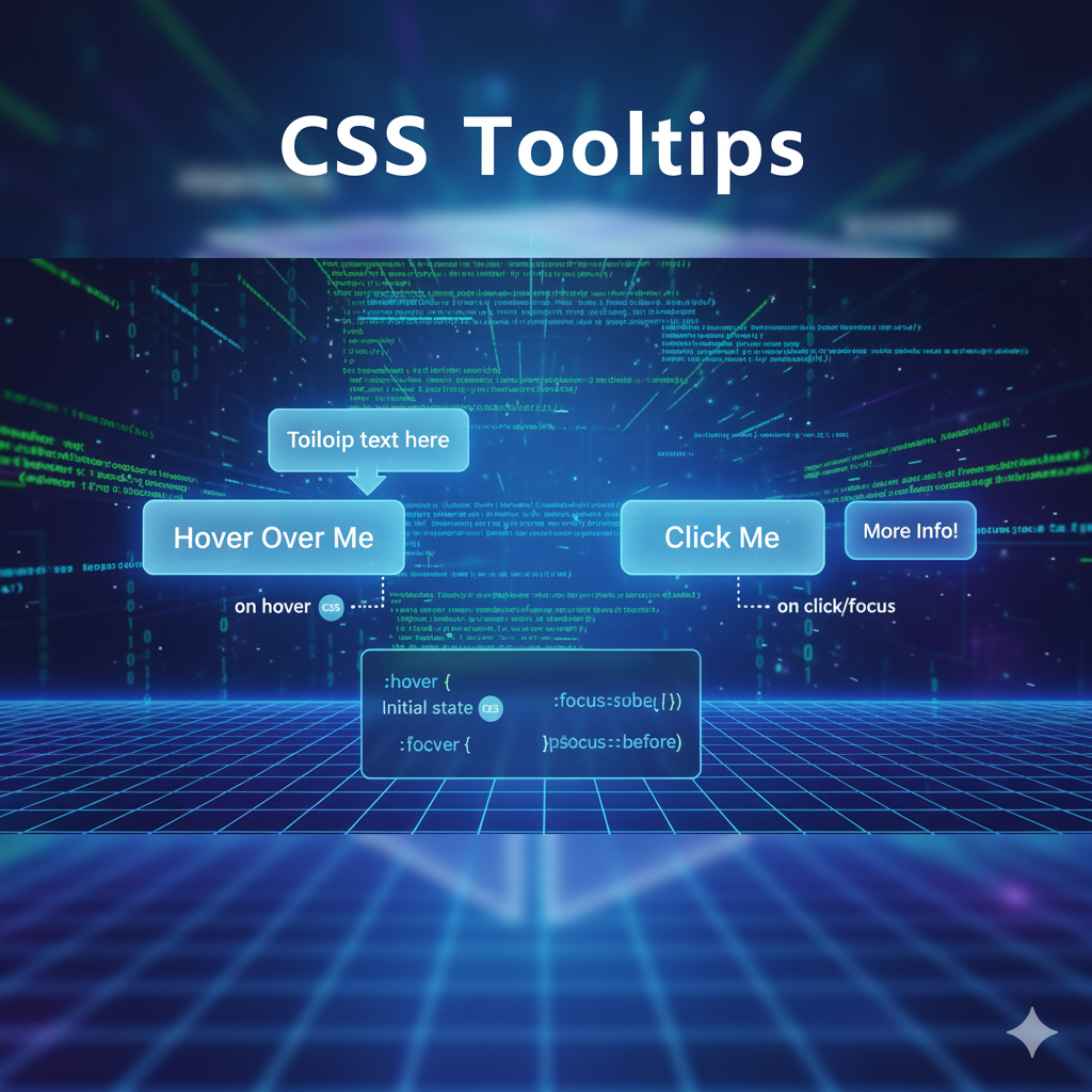
:hover: The OG of interactivity. It applies when a user places their cursor over an element. Don't just stop at links; use it on buttons, cards, and images.css
.cool-btn {
  background-color: blue;
  color: white;
  padding: 10px 20px;
  border: none;
  transition: all 0.3s ease; /* This makes the change smooth */
}

.cool-btn:hover {
  background-color: darkblue;
  transform: translateY(-2px); /* A slight lift effect */
  box-shadow: 0 4px 8px rgba(0,0,0,0.2);
}
Real-world use case: Making buttons feel tactile and clickable.
:active: This style applies in the split second the element is being activated (i.e., while the mouse button is held down on it). It's perfect for creating a "pressed" effect.css
.cool-btn:active { transform: translateY(0); /* Remove the lift */ box-shadow: none; }:focus: Crucial for accessibility. It styles an element when it has received focus, typically via keyboard navigation (using theTabkey). This is a lifesaver for users who can't use a mouse.css
input:focus {
  outline: none; /* But be careful! Always replace the default outline */
  border-color: #4CAF50;
  box-shadow: 0 0 0 3px rgba(76, 175, 80, 0.3);
}
Real-world use case: Guiding users through a form, showing exactly which field they are currently on.
2. The Link & Form MVPs
These pseudo-classes are hyper-specific to links and form elements.
:link: Styles links that have not been visited yet.:visited: Styles links that the user has already visited in their browser history. (For privacy reasons, modern browsers heavily restrict which styles you can apply here—mostly justcolor,background-color,border-color, etc.):checked: A game-changer for customizing checkboxes and radio buttons. You can hide the native input and style its adjacent label based on whether it's checked or not.css
/* Hide the default checkbox */
input[type="checkbox"] {
  display: none;
}

/* Style the label to look like a custom checkbox */
.custom-checkbox {
  display: inline-block;
  width: 20px;
  height: 20px;
  background: #eee;
  border-radius: 4px;
  margin-right: 8px;
  cursor: pointer;
}

/* When the hidden checkbox is checked, style its adjacent label */
input[type="checkbox"]:checked + .custom-checkbox {
  background-color: #2196F3;
  background-image: url('checkmark.svg');
}
The Structural Powerhouses: :nth-child and Friends
This is where things get powerful. These pseudo-classes select elements based on their position within a parent container.
:first-child&:last-child: Select the first and last child elements, respectively. Great for removing top/bottom margins or adding special borders.:nth-child(): The undisputed champion. It uses a simple formula(an + b)to select elements.:nth-child(odd)or:nth-child(even): Perfect for zebra-striping table rows.:nth-child(3): Selects the 3rd element.:nth-child(3n): Selects every 3rd element (3, 6, 9...).:nth-child(3n+1): Selects every 3rd element, starting from the 1st (1, 4, 7...).
css
/* Zebra striping for a list */
.task-list li:nth-child(odd) {
  background-color: #f9f9f9;
}

/* Highlight every 4th item in a grid, starting from the 2nd */
.product-grid .item:nth-child(4n+2) {
  border: 2px solid gold;
}
Real-world use case: Creating visually distinct data tables, highlighting featured products in a grid, or creating complex, rhythmic layouts.
Leveling Up: Advanced Use Cases & Best Practices
Once you're comfortable, you can combine pseudo-classes for even more precise control.
css
/* Style a button only when it's being hovered AND is disabled */
button:disabled:hover {
  cursor: not-allowed;
  background-color: #ccc;
}

/* Style every other list item, but only if it's not the first one */
li:not(:first-child):nth-child(even) {
  background-color: lightgray;
}
Best Practices to Keep You Sane:
Don't Overdo It: Subtle animations and color changes are your friend. Blinking, rainbow-colored text on hover is not.
Accessibility First: Never, ever remove
:focusstyles without providing a clear alternative. Your keyboard users will thank you. Using:focus-visibleis a modern way to provide focus rings only for keyboard users, which is often the desired behavior.Performance is Key: Stick to animating properties like
opacityandtransformfor buttery-smooth 60fps performance, as they are cheaper for the browser to handle.Specificity Matters: Remember, a selector like
a:hoveris more specific than justa. This can sometimes override your other styles, so keep your CSS structure clean.
FAQs: Your Pseudo-class Questions, Answered
Q: What's the difference between :nth-child and :nth-of-type?
A: :nth-child counts all siblings, regardless of type. :nth-of-type counts only siblings of the same type. If you have a <div> followed by a <p>, p:nth-child(2) would select the <p> (it's the second child), but p:nth-of-type(1) would also select it (it's the first <p>).
Q: Can I use multiple pseudo-classes on one element?
A: Absolutely! You can chain them, like a:hover:focus to style a link that is both being hovered and has keyboard focus.
Q: Are pseudo-classes a replacement for JavaScript?
A: For many visual state changes (hover, focus, checked), yes! But for complex logic, data fetching, or truly dynamic behavior, you'll still need JavaScript. They are complementary technologies.
Q: Where can I practice and see these in action?
A: The best way to learn is by doing. Fire up your code editor or use a tool like CodePen. Try recreating the button example from above or styling a navigation menu with hover effects.
Conclusion: From Functional to Fantastic
Mastering CSS pseudo-classes is a non-negotiable skill for any front-end developer. They are the bridge between a static, functional webpage and a dynamic, engaging user experience. They make your site not just usable, but enjoyable.
Start small. Add a smooth :hover effect to your buttons. Use :focus to improve your form accessibility. Then, get fancy with :nth-child to style your lists and grids. The cumulative effect of these small details is what makes a website feel professional and polished.
If you're excited to move beyond the basics and want to build complex, full-fledged applications, you need a structured path.
To learn professional software development courses such as Python Programming, Full Stack Development, and MERN Stack, visit and enroll today at codercrafter.in. Our project-based curriculum is designed to take you from curious beginner to job-ready developer, teaching you how to weave together HTML, CSS, JavaScript, and backend technologies into seamless, user-loving web applications.
