CSS Position Explained: A No-BS Guide to Static, Relative, Absolute, Fixed & Sticky
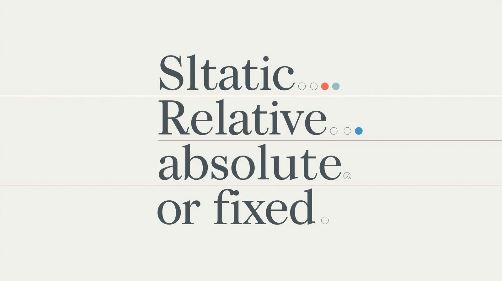
Tired of fighting with CSS layout? Master the CSS position property once and for all. We break down static, relative, absolute, fixed, and sticky with simple examples and real-world use cases. Stop guessing, start building!
CSS Position: Finally, A Guide That Doesn't Suck
Let's be real. When you first started learning web development, CSS felt like magic. Then you got to the position property, and suddenly it felt like a messy breakup—confusing, emotional, and nothing was where you wanted it to be.
You've probably been there: you set position: absolute; and your element vanishes into the shadow realm. Or you try to make a navbar stick, and it just... doesn't. You're not alone. We've all frantically Googled "css position absolute not working" at 2 AM.
But what if I told you that the position property isn't your enemy? It's actually one of the most powerful tools in your CSS arsenal. Once you truly get it, you can create complex, polished, and professional layouts without tearing your hair out.
This isn't just another tutorial. This is your definitive, no-fluff guide to mastering CSS Position. We’re going to break down static, relative, absolute, fixed, and sticky so clearly that it'll feel like a lightbulb moment. Let's dive in.
The Foundation: What Even Is CSS Position?
In simple terms, the position property tells your browser how an element should be placed on the page. It answers the question: "Where do you live, little div, and what are your rules?"
Every single element on a webpage has a position. By default, it's static. But when you change this value, you unlock the ability to use the "coordinate" properties: top, right, bottom, and left. These are your steering wheels.
Think of it like this: A static element is like a person standing in a line—they can't just move unless they push everyone else. A positioned element (like relative or absolute) is like a person with a jetpack—they can move freely, but they need to know where to launch from.
Breaking Down the Fab Five of Position
1. position: static; (The Default Normie)
This is the default for every single HTML element. A static element just follows the normal document flow. It doesn't care about top, right, bottom, or left. It's a law-abiding citizen.
When to use it: You don't, really. It's the default. You only explicitly set it if you need to override a different position value that was applied elsewhere.
Code Example:
html
<div class="box static-box">I'm static. I'm basic. I'm boring.</div>css
.static-box {
  position: static;
  top: 100px; /* This will do NOTHING. IGNORED. */
  left: 50px; /* This also does NOTHING. */
}
2. position: relative; (The "Nudgeable" Element)
This is where things get interesting. An element with position: relative still lives in the normal document flow. The space it originally took up is still reserved. But, you can now "nudge" it from its original position using top, right, bottom, and left.
It's like you're telling the element: "Stay in your lane, but you can scootch over a bit."
Real-World Use Case: Perfect for minor design tweaks, like offsetting an icon slightly from its text, or creating a layered effect where one element slightly overlaps another.
Code Example:
html
<div class="box relative-box">I've been nudged!</div>css
.relative-box {
  position: relative;
  top: 20px;  /* Moves down 20px FROM its original top */
  left: 30px; /* Moves right 30px FROM its original left */
}
Notice how the space where it was is still there? It's just the visual representation that moved.
3. position: absolute; (The "Jetpack" Element)
Alright, buckle up. This is the one that causes the most confusion.
An absolute element is removed from the normal document flow. Poof! The space it was occupying collapses, and other elements act like it never existed.
But here's the crucial part: It positions itself relative to its nearest positioned ancestor.
What does that mean? It looks up its chain of parent elements until it finds one that has a position value set to anything other than static (relative, absolute, fixed, sticky). If it can't find one, it will use the <html> document as its reference point.
Real-World Use Case:
Dropdown Menus: The menu is absolutely positioned inside a relatively positioned navigation button.
Custom Tooltips: The tooltip is absolutely positioned relative to the element you're hovering over.
Overlays and Badges: Think of a "Sale" badge on a product image. The image container is
position: relative, and the badge isposition: absolutewithtop: 10px; right: 10px;.
Code Example:
html
<div class="card">
  <img src="product.jpg" alt="Cool Product">
  <div class="badge">SALE!</div> <!-- This will be the absolute one -->
</div>
css
.card {
  position: relative; /* THE KEY! This becomes the anchor. */
  width: 300px;
}

.badge {
  position: absolute;
  top: 10px;
  right: 10px;
  background: red;
  color: white;
  padding: 5px;
}
Without position: relative on the .card, the "SALE!" badge would fly off and position itself relative to the entire page, which is almost never what you want.
4. position: fixed; (The "Stubborn" Element)
A fixed element is also removed from the document flow, just like absolute. The difference? It's always positioned relative to the viewport (the browser window). It doesn't care about scrolling.
Real-World Use Case:
Sticky Navigation Bars: The nav bar that stays at the top as you scroll.
Floating Chat Widgets: That little chat button in the bottom-right corner.
"Back to Top" Buttons: That appears after you've scrolled down a bit.
Full-screen Modals: That take over the entire viewport.
Code Example:
html
<nav class="fixed-nav">I'm stuck here, forever.</nav>
<div class="content">Lots of content to scroll...</div>
css
.fixed-nav {
  position: fixed;
  top: 0;
  left: 0;
  width: 100%;
  background: #333;
  color: white;
  padding: 1rem;
  z-index: 1000; /* Important to stay on top of other content */
}
5. position: sticky; (The "Best of Both" Element)
This is the cool kid on the block. sticky is a hybrid. It acts like a relative element until you scroll past a certain threshold (defined by top, right, bottom, or left), then it "sticks" in place and behaves like a fixed element.
Real-World Use Case:
Sticky Table Headers: As you scroll down a long table, the header sticks to the top.
Sticky Section Headings: In a long article, the heading for each section can stick as you read through it.
Code Example:
html
<div class="sticky-header">I'll stick when you scroll past me.</div>
<p>Lots of paragraph content...</p>
css
.sticky-header {
  position: sticky;
  top: 0; /* The moment it's 0px from the top, it STICKS */
  background: white;
  padding: 1rem;
  border-bottom: 1px solid #ccc;
}
Best Practices & Pro-Tips (So You Don't Get Burned)
Use
relativeon the Parent,absoluteon the Child: This is the golden rule. It keeps your absolutely positioned elements contained and predictable.Mind Your
z-index: When you start positioning elements, they can overlap. Thez-indexproperty controls the stacking order. Higher numbers appear on top. But a word of caution:z-indexonly works on positioned elements!Don't Overuse
absolute: It's tempting to useabsolutefor everything, but it creates fragile layouts. If the parent's size changes, your absolute child might break. Use Flexbox and Grid for overall page structure, and useabsolutefor small, specific UI components.stickyNeeds a Threshold: You must define at least one oftop,right,bottom, orleftforposition: stickyto work. Otherwise, it will just behave asrelative.
FAQs: Your Burning Questions, Answered
Q: Why did my element disappear when I used position: absolute?
A: It probably didn't have a "positioned" ancestor to anchor to, so it's likely hiding at the top or bottom of the page. Check if its parent has a position set to something other than static.
Q: What's the difference between fixed and sticky?
A: fixed is always fixed to the viewport, from the moment it's rendered. sticky starts off in the normal flow and only becomes fixed after you scroll past it.
Q: Can I use position: absolute inside a position: sticky container?
A: Yes! A sticky element is considered a "positioned" element, so it can act as a containing block for an absolute child.
Q: My z-index isn't working! Why?
A: First, make sure the element is positioned (relative, absolute, fixed, sticky). Second, be aware of stacking contexts. A parent with a low z-index can limit how high its children can appear.
Conclusion: You've Got the Power Now
Look at you. You've just leveled up from "fighting with CSS" to "understanding the rules of the game." The position property is no longer a mystery. It's a precise tool.
You now know that relative is for nudging, absolute is for precise placement within a container, fixed is for viewport-hugging elements, and sticky is the magical hybrid for scroll-based interfaces.
Mastering these fundamentals is what separates hobbyists from professional developers. It’s the attention to detail that makes a website feel polished and intentional.
Ready to transform from a coder who guesses to a developer who builds with confidence? This deep understanding of core concepts is exactly what we focus on at CoderCrafter. We don't just teach you syntax; we teach you how to think like a software engineer. To learn professional, in-demand software development courses such as Python Programming, Full Stack Development, and the MERN Stack, visit and enroll today at codercrafter.in. Let's build your future, together.
