CSS Multiple Columns: A No-Fuss Guide to Magazine-Style Layouts
Tired of boring text blocks? Learn how to use CSS Multiple Columns to create stunning, responsive, magazine-like layouts for your articles, blogs, and more. Level up your web dev skills!
Let's be real. The internet is drowning in a sea of... rectangles. Endless scrolling through single-column text blocks can be a snooze-fest for your readers. You've put your heart and soul into your content, so why present it in a way that makes people's eyes glaze over?
What if I told you there's a native CSS feature that lets you break free from this monotony? A feature that lets you create those sleek, professional, magazine-style layouts without needing a complex framework or a dozen nested divs?
Enter CSS Multiple Columns.
This isn't some fancy new framework; it's built right into CSS, and it's probably one of the most underrated tools in a front-end developer's arsenal. In this deep dive, we're going to unpack everything about it—from the "what" and "why" to the "how" and "when." Let's make your content look as good as it reads.
What Even Are CSS Multiple Columns?
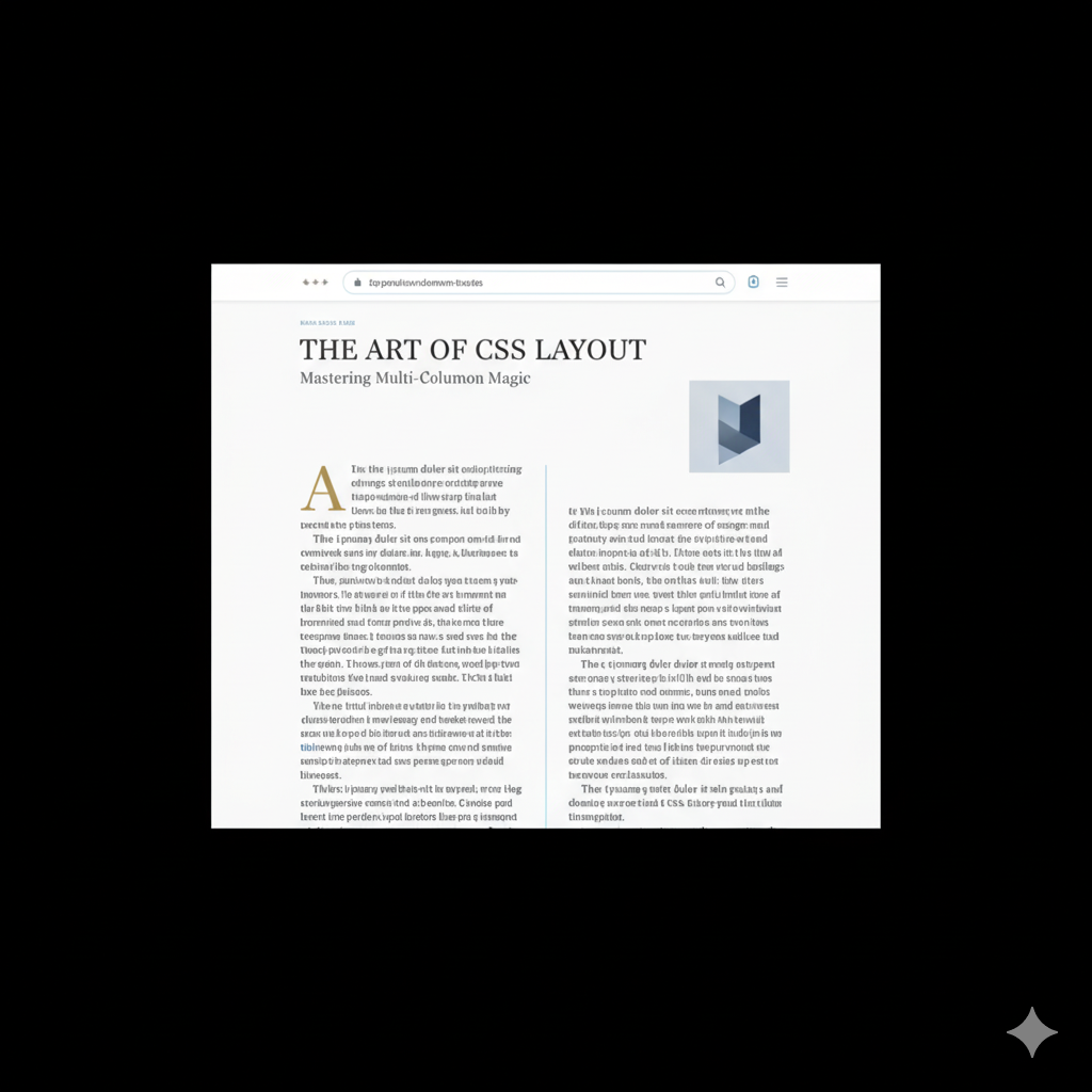
In the simplest terms, CSS Multiple Columns (or CSS Multi-column Layout) is a module that allows you to flow your content—like text, lists, etc.—into multiple columns, just like a newspaper or a magazine. The content automatically flows from the end of one column to the start of the next.
Think of it as a way to tell your text: "Hey, instead of stretching all the way across this massive screen, why don't you break yourself up into a few neat, readable columns?"
The best part? It's incredibly simple to use. You're basically one property away from transforming a wall of text into something elegant.
The Core Properties: Your New Best Friends
You don't need a PhD in CSS to get this working. Here are the key players that do all the heavy lifting.
1. column-count
This is the most straightforward one. You tell the browser exactly how many columns you want.
css
.article-text {
  column-count: 3;
}
Boom. The content inside .article-text will now flow into three columns, no matter the container's width.
2. column-width
This is where you get smart about responsiveness. Instead of fixing the number of columns, you set an ideal width for each column. The browser will then create as many columns of that width as it can fit in the container.
css
.article-text {
  column-width: 200px;
}
On a large screen, you might get four columns. On a tablet, two. On a mobile, it might gracefully fall back to one. It's responsive by default!
Pro-Tip: You can use column-count and column-width together. The browser will try to honor the column-width but will never create more columns than the column-count. This gives you maximum control.
3. The Shorthand: columns
Why write two lines when you can write one? The columns shorthand is a lifesaver.
css
.article-text {
  /* columns: <column-width> | <column-count> */
  columns: 200px 3; /* Ideal width of 200px, max of 3 columns */
}
4. column-gap
Ever seen columns squished together? Not a good look. column-gap is your spacing savior. It creates breathing room between your columns.
css
.article-text {
  columns: 200px 3;
  column-gap: 2.5em; /* Use em for scalable, relative spacing */
}
5. column-rule
Want a visual separator between your columns? column-rule is your friend. It's basically border for your columns.
css
.article-text {
  columns: 200px 3;
  column-gap: 2em;
  column-rule: 2px solid #eaeaea; /* width | style | color */
}
You can also use its longhand properties: column-rule-width, column-rule-style, and column-rule-color.
Let's Get Our Hands Dirty: A Real-World Example
Enough theory. Let's build a simple, stylish article layout.
HTML:
html
<article class="blog-post">
  <h1>Why CSS is Actually Awesome</h1>
  <div class="post-content">
    <p>Lorem ipsum dolor sit amet... (your long article text here)</p>
    <p>Another paragraph of brilliant insights...</p>
  </div>
</article>
CSS:
css
.post-content {
  /* The Magic Line */
  columns: 300px 2;

  /* Spacing and Rules */
  column-gap: 3rem;
  column-rule: 1px dotted #ccc;

  /* General Typography */
  line-height: 1.6;
  text-align: justify;
}

/* Make sure images don't break the flow */
.post-content img {
  max-width: 100%;
  display: block;
  margin: 1rem auto;
}
And just like that, you have a responsive, two-column (max) layout that looks professional and is much easier on the eyes. See? It's not rocket science.
When Should You Actually Use This? (Real-World Use Cases)
This isn't a "use it everywhere" kind of feature. It has a specific job.
Long-Form Articles & Blog Posts: This is the prime use case. Breaking up a long article into columns drastically improves readability on wide screens.
Newspaper/Magazine Websites: If you're building a site for a publication, this is a non-brainer. It's in their DNA.
Product Feature Lists: Got a list of features or specifications? Displaying them in multiple columns can save vertical space and make them easier to scan.
Footnotes & Legal Text: Those long, boring terms & conditions pages? Putting them in 2 or 3 narrow columns makes them slightly less painful to navigate.
The "Gotchas": Best Practices & Things to Watch Out For
No tool is perfect. Here’s how to use Multi-column like a pro.
Mobile First: Always remember that on very small screens (think smartphones), you should probably revert to a single column. Use a media query!
css
.post-content {
  columns: 300px 2;
}

@media (max-width: 768px) {
  .post-content {
    columns: 1; /* Back to a single column on mobile */
  }
}
Handling Breaks: Sometimes, a heading or an image will get awkwardly split between columns. Use
break-inside: avoid;to prevent this.css
.post-content h2, .post-content img {
  break-inside: avoid;
}
Spanning Columns: Want a headline to go across all columns? That's what
column-span: all;is for. It's like a "center of attention" tag.css
.full-width-headline {
  column-span: all;
}
Heads up: Browser support for
column-spanis good, but test it!Don't Overdo It: On a massive 4K monitor, 8 columns of text are just as hard to read as one giant one. Stick to 2-4 columns for optimal readability.
FAQs: Quick-Fire Answers
Q: How is this different from CSS Grid or Flexbox?
A: Great question! Grid and Flexbox are for macro layouts—structuring the main areas of your page (header, sidebar, main content). Multi-column is for micro layouts—flowing a single block of content within one of those Grid/Flexbox cells. They work together, not against each other.
Q: Is the browser support good?
A: It's excellent! All modern browsers fully support it. For older browsers (like IE 10 and below), it might not work, but they'll just see a single column, which is a perfectly acceptable fallback.
Q: Can I animate the columns?
A: Not really. Properties like column-count and column-gap are not animatable. You can't smoothly transition from 2 to 4 columns, for instance.
Q: My list looks weird in columns. The bullets/numbers are cut off!
A: This is a common issue. To fix it, add some left padding to your list items: ul { padding-left: 1em; }.
Conclusion: Time to Stop the Scroll
CSS Multiple Columns are a powerful, elegant, and often overlooked tool. They solve a very specific problem—improving the readability and aesthetic of long-form text—with minimal, clean code. You don't need JavaScript, you don't need a complex system of floats, you just need a few lines of CSS.
So next time you're building a blog, a documentation site, or a portfolio for a writer, give this technique a shot. It’s these small details that separate a good developer from a great one.
Speaking of becoming a great developer, mastering CSS fundamentals like this is just the beginning. If you're looking to build a rock-solid foundation and learn professional software development from the ground up, we've got you covered.
To learn professional software development courses such as Python Programming, Full Stack Development, and MERN Stack, visit and enroll today at codercrafter.in. We break down complex topics just like this, helping you build a career you love, one line of code at a time.


