CSS Masking: The Ultimate Guide to Next-Level Visuals
Stop using basic boxes! Learn how CSS Masking can transform your web designs with gradients, images, and SVGs. Create stunning, non-rectangular visuals with our in-depth guide.
CSS Masking: Stop Designing in Boxes and Start Creating Magic
Let's be real for a second. How many times have you looked at a website and thought, "Yep, that's a <div>. And that's another <div> inside a <div>." The web, for all its glory, can sometimes feel like a world of rectangles. But what if I told you there's a way to break free? To have your images fade out into a gentle gradient, to have text filled with a video, or to have elements shaped like stars, clouds, or your custom logo?
Welcome to the world of CSS Masking.
This isn't just another CSS property to add to your list. This is a game-changer for creating depth, personality, and that "wow" factor that makes users stop and scroll. It’s the secret sauce behind many of the visually stunning modern websites you admire.
In this deep dive, we're going to demystify CSS Masking. We'll break down what it is, how it works, and give you the code to start using it in your projects today. No fluff, just actionable, cool stuff.
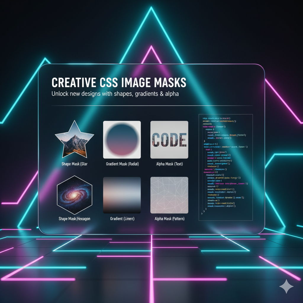
So, What Exactly is CSS Masking? Let's Ditch the Jargon.
Imagine you have a photo and you place a stencil over it. You paint over the stencil, and when you lift it, the paint is only visible where the stencil had holes. The stencil masked the photo, revealing only specific parts.
CSS Masking works on the exact same principle.
You have an element (your image, div, video, etc.), and you apply a "mask" to it. This mask acts like the stencil, determining which parts of your element are visible and which are transparent.
The mask itself can be one of two things:
A Gradient: Think linear or radial gradients. This is perfect for soft, fading transitions.
An Image: Usually a PNG or, even more powerfully, an SVG. The transparent parts of the image become the "holes" in your stencil.
The Two Key Players: mask-image and mask-mode
The core of this magic is the mask-image property. This is where you define your "stencil."
But mask-image has a best friend: mask-mode. This property tells the browser how to interpret your mask. Is it a luminance-based mask or an alpha-based mask? Sounds complex, but it's simple:
Alpha Mask: This is the most intuitive. It uses the transparency (alpha channel) of your mask image. Where the mask is transparent, your element is hidden. Where it's opaque, your element is visible. This is the default for PNG masks.
Luminance Mask: This one uses the brightness of the mask. White areas reveal your element, black areas hide it, and gray areas create semi-transparency.
Let's see this in action.
Hands-On Code: Let's Mask Some Stuff!
Example 1: The Classic Gradient Fade
This is probably the most common use case. You have a hero image, and you want it to fade seamlessly into the background or text.
css
.hero-image {
  width: 100%;
  height: 80vh;
  background-image: url('your-cool-image.jpg');
  background-size: cover;

  /* The Magic Sauce */
  mask-image: linear-gradient(to bottom, black, transparent);
}
What's happening? The linear-gradient creates a mask that is solid black (black) at the top and fades to fully transparent at the bottom. Because we're using a luminance mask (default for gradients), the solid black reveals the image, and the transparent part hides it, creating that smooth fade-out effect.
Example 2: Using a PNG as a Mask
Want to shape an image into a star, a cloud, or a splatter? PNGs are your best friend.
css
.splatter-effect {
  width: 300px;
  height: 300px;
  background-image: url('portrait.jpg');
  background-size: cover;

  /* The Magic Sauce */
  mask-image: url('ink-splatter.png');
  mask-size: cover;
  /* mask-mode: alpha; is the default here */
}
Boom! Your portrait is now constrained to the shape of the ink splatter. The mask-size: cover ensures our splatter mask scales to cover the entire element, just like background-size.
Example 3: The Power of SVG Masks
SVG masks are incredibly powerful because they are resolution-independent and can be defined inline or externally.
HTML/SVG:
html
<svg width="0" height="0" viewBox="0 0 400 400">
  <defs>
    <mask id="star-mask">
      <rect width="100%" height="100%" fill="white"/>
      <polygon points="200,50 250,180 400,180 280,250 320,400 200,300 80,400 120,250 0,180 150,180" fill="black"/>
    </mask>
  </defs>
</svg>

<div class="svg-masked-element"></div>
CSS:
css
.svg-masked-element {
  width: 400px;
  height: 400px;
  background: linear-gradient(45deg, #ff6b6b, #5f27cd);
  mask-image: url(#star-mask);
}
Here, we define an SVG <mask> with a white background and a black star. In an SVG mask, white reveals and black conceals. So, the white rectangle reveals our element, and the black star punches a hole in it, showing the star-shaped gradient beneath.
Real-World Use Cases: Where You'll Actually Use This
This isn't just academic. Here’s where CSS Masking shines in real projects:
Engaging Hero Sections: Fade images into colored backgrounds or overlaid text for a professional, integrated look.
Dynamic Text Effects: Use
mask-imageon text to fill it with a video or a moving gradient background. It's an instant attention-grabber.Interactive Galleries: As a user hovers over an image, you can change the mask to create a morphing or revealing effect.
Branding Integration: Shape profile pictures or section backgrounds using your logo's unique shape.
Scroll Animations: Combine masks with CSS animations or libraries like AOS (Animate On Scroll) to create reveals where content "wipes" in based on a custom shape.
Best Practices & Things to Keep in Mind
Browser Support: It's good, but not 100% universal. Always use the
-webkit-prefix for maximum compatibility (-webkit-mask-image). Tools like Autoprefixer can handle this for you.Performance: Large, complex SVG masks can be heavy. Optimize your SVG files and use simple gradients where possible.
Fallbacks are Your Friend: What if masking doesn't work? Use a
@supportsrule to provide a fallback design.css
@supports (mask-image: linear-gradient(to bottom, black, transparent)) {
  .hero-image {
    mask-image: linear-gradient(to bottom, black, transparent);
  }
}
The
maskShorthand: Just likebackground, there's amaskshorthand to combinemask-image,mask-position,mask-size, etc., in one line.
FAQs: Quick-Fire Round
Q: How is this different from clip-path?
A: Great question! clip-path clips an element to a basic shape (circle, polygon, etc.) or an SVG path. The edges are hard. CSS Masking uses gradients or images, allowing for soft, semi-transparent edges and more complex, textured reveals.
Q: Does this work on any HTML element?
A: Absolutely! You can mask divs, images, text, videos... you name it.
Q: Can I animate masks?
A: Yes, and it's awesome! You can animate mask-size, mask-position, or even swap mask-image on hover to create stunning transitions.
Q: Is this bad for SEO?
A: Not at all. This is purely a presentational CSS effect. It doesn't affect your content's accessibility or SEO when implemented correctly.
Conclusion: Stop Thinking Inside the Box
CSS Masking is a powerful tool that moves you from a developer who places boxes to a designer who crafts experiences. It opens up a new dimension of creativity on the web, allowing for fluidity, texture, and brand expression that was once much harder to achieve.
The best way to get comfortable with it is to play. Open up your code editor, grab an image, and try applying a gradient mask. Then, find a cool PNG and see the transformation. It’s this hands-on experimentation that turns a concept into a skill.
Speaking of turning concepts into high-value skills, mastering modern CSS techniques like this is a core part of what it means to be a professional developer today. If you're looking to build a comprehensive, industry-ready skillset that includes not just advanced front-end magic but also robust back-end development with technologies like Python Programming, Full Stack Development, and the MERN Stack, you need a structured path.
To learn professional software development courses such as Python Programming, Full Stack Development, and MERN Stack, visit and enroll today at codercrafter.in. We break down complex topics like this into manageable, project-based lessons that prepare you for a real-world career.


