CSS Links 101: How to Style Your Website's Links Like a Pro |
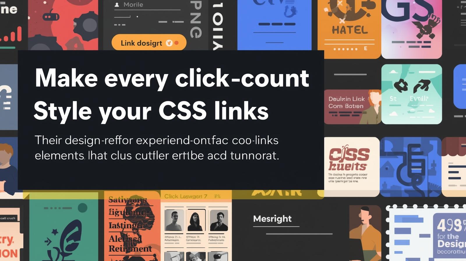
Stop using boring blue links! Master CSS link styling with our in-depth guide. Learn pseudo-classes, hover effects, buttons, best practices, and more
Let's be real for a second. The default blue, underlined link is... kinda basic. It screams "1990s GeoCities" and does nothing for your website's vibe. In today's web, every single element is an opportunity to impress your user, to guide them, and to reinforce your brand.
That's where CSS comes in. With a few lines of code, you can transform those boring links into sleek, interactive, and engaging elements that people actually want to click.
This isn't just about making things look pretty (though that's a big part of it). It's about User Experience (UX). A well-styled link tells a user, "Hey, I'm clickable!" It provides feedback, improves navigation, and makes your entire site feel more polished and professional.
So, grab your code editor, and let's dive deep into the world of CSS links. By the end of this guide, you'll be a link-styling ninja.
The Foundation: Meet the Link Pseudo-Classes
Before we get to the fancy stuff, you need to understand the core concept: pseudo-classes. These are like different "states" your link can be in. Think of them as moods: default, hover, active, and visited.
The proper order to declare them is crucial for them to work correctly. Remember this mnemonic: LoVe HAte (LVHA).
a:link: This styles a link that hasn't been visited yet. (The default state).a:visited: This styles a link that the user has already clicked on. (Use this sparingly for privacy reasons).a:hover: This is the magic! It applies when a user's mouse is hovering over the link. Perfect for feedback.a:active: This styles the link at the very moment it's being clicked. It's usually very brief.
Here’s a basic example in action:
css
/* Unvisited link */
a:link {
  color: #FF6B6B; /* A nice coral color */
  text-decoration: none;
}

/* Visited link */
a:visited {
  color: #9D6DE7; /* A soft purple */
}

/* Mouse over link */
a:hover {
  color: #4ECDC4; /* A teal color */
  text-decoration: underline;
}

/* Selected link */
a:active {
  color: #FFE66D; /* A bright yellow */
  font-weight: bold;
}
Leveling Up: Beyond Color and Underline
Changing color is just the start. Let's explore some modern and creative ways to style links.
1. The "Button-ification" of Links
Sometimes, you need a link to stand out, like a "Sign Up" or "Learn More" call-to-action. Turning it into a button is the way to go.
css
.cta-link {
  display: inline-block; /* Crucial for padding to work on an <a> tag */
  padding: 12px 30px;
  background-color: #4361EE; /* A solid blue */
  color: white;
  text-decoration: none;
  border-radius: 6px;
  font-weight: 600;
  transition: all 0.3s ease; /* Smooth transition for hover effects */
}

.cta-link:hover {
  background-color: #3A56D4; /* A slightly darker blue */
  box-shadow: 0 4px 12px rgba(58, 86, 212, 0.3); /* A cool shadow effect */
  transform: translateY(-2px); /* Makes it look like it's lifting up */
}
Real-World Use Case: This is perfect for any prominent call-to-action on your site. The hover effect provides a tactile, "push-button" feel that users instinctively understand.
2. The Subtle & Modern Underline
The default underline is thick and sits too low. Let's create a custom, sleek one.
css
.sleek-link {
  color: #2B2D42;
  text-decoration: none;
  background-image: linear-gradient(#4361EE, #4361EE); /* The color of the underline */
  background-size: 0% 2px; /* Initially, the underline has no width */
  background-repeat: no-repeat;
  background-position: left bottom; /* Positions it at the bottom */
  transition: background-size 0.3s ease; /* Animate the width */
}

.sleek-link:hover {
  background-size: 100% 2px; /* On hover, the underline expands to full width */
}
Real-World Use Case: This is fantastic for inline text links within articles or navigation menus where you want a clean, animated effect that doesn't disrupt the text flow.
3. Icons for Clarity (Because a Picture is Worth a Thousand Words)
Adding an icon next to a link can instantly communicate its purpose.
css
.external-link::after {
  content: " ↗"; /* Using a simple unicode character */
  font-size: 0.9em;
}

/* Or using an actual icon font like Font Awesome */
.download-link::after {
  font-family: "Font Awesome 5 Free";
  font-weight: 900;
  content: " \f019"; /* Unicode for download icon */
  margin-left: 5px;
}
Real-World Use Case: Use this for links that point to external websites, PDF downloads, or email addresses. It sets clear user expectations before they even click.
Best Practices You Can't Ignore
Making things look cool is fun, but if your links aren't usable, you've failed. Here are the non-negotiable rules:
Accessibility is King: Always ensure sufficient color contrast between your link text and its background. Tools like WebAIM's Contrast Checker are your best friend. Don't rely on color alone; use underlines or icons so color-blind users can identify links.
Affordance is Key: Your link should look clickable. Underlines on hover, color changes, and the cursor changing to a pointer are all vital cues.
Don't Abuse
:visited: For privacy reasons, browsers strictly limit what styles you can apply to visited links (mostly justcolor,background-color,border-color). Also, styling them too dramatically can be confusing for users.Keep it Consistent: Your link styles should be consistent across your entire website. Don't have blue underlined links on one page and red button-links on another for the same purpose. Create a design system.
FAQs: Your Link Styling Questions, Answered
Q: Why is my CSS not working on my links?
A: 99% of the time, it's the specificity of your selectors. Make sure you're targeting the correct class or using the pseudo-classes in the right order (LVHA). Also, check if another CSS rule is overriding yours.
Q: How do I remove the default underline?
A: text-decoration: none; is your go-to property.
Q: Can I style a specific part of a link?
A: Absolutely! You can wrap part of the link text in a <span> tag and apply specific styles to it, like a different color or font weight on hover.
Q: My button link isn't clickable on the padding!
A: You forgot display: inline-block; or display: block;. Inline elements like the default <a> tag don't respect width, height, or padding for clickable area.
Conclusion: Go Forth and Style!
Styling links is one of the most satisfying and impactful skills in a front-end developer's toolkit. It's a direct line to improving your site's usability, aesthetics, and overall professionalism. From simple color changes to complex animated buttons, the power is in your hands.
Remember, the goal is to create a seamless and intuitive experience for your users. Every hover effect, every color choice, is a conversation with them.
This guide just scratches the surface of what's possible with CSS. To learn professional software development courses that dive deep into advanced CSS, modern frameworks, and backend technologies like Python Programming, Full Stack Development, and the MERN Stack, visit and enroll today at codercrafter.in. We'll help you build the skills to craft not just links, but entire, stunning web applications.