CSS Gradients: A No-BS Guide to Creating Stunning Web Designs
Stop using boring, flat colors. Learn how to use CSS Gradients like a pro with linear, radial, and conic gradients. Code examples, best practices, and real-world use cases included.
Let's be real. The days of the plain, "my-first-website" blue or grey background are long gone. Today's web is vibrant, dynamic, and visually arresting. And one of the simplest, most powerful tools in a front-end developer's arsenal to achieve that modern look? CSS Gradients.
If you're still using background-color: #somecolor; and calling it a day, you're missing out on a whole world of design possibilities. Gradients can add depth, create focus, and make your site look like it was designed in 2024, not 2004.
But where do you start? It can seem a bit intimidating at first. Don't worry, we've got you. This guide is your one-stop-shop to going from gradient zero to gradient hero. We'll break down everything, from the absolute basics to some seriously cool advanced tricks.
And hey, if you're looking to truly master the art of web development, this is just the tip of the iceberg. To learn professional software development courses such as Python Programming, Full Stack Development, and MERN Stack, visit and enroll today at codercrafter.in. Let's build something beautiful.
What Exactly Are CSS Gradients?
In the simplest terms, a CSS gradient is a smooth transition between two or more colors. Instead of a hard line where one color stops and the next begins, the browser does the math to create a beautiful blend.
Think of it like a digital sunset—you don't see a sharp line between orange and pink; it's a seamless, gorgeous blend. That's a gradient.
The best part? Gradients are pure CSS. No extra image files to load, which means better performance for your website. They're defined directly within your stylesheets using the background or background-image property.
The Gradient Gang: Meet the Family
There are three main types of gradients you need to know. Let's get acquainted.
1. Linear Gradients: The Go-To
This is the most common type. It creates a gradient that flows in a straight line, in any direction you specify.
The Basic Syntax:
css
background: linear-gradient(direction, color-stop1, color-stop2, ...);Examples You Can Steal:
The Classic Top-to-Bottom (Default):
css
.element {
  background: linear-gradient(#ff9a9e, #fad0c4);
}
This gives you a lovely pinkish-peach blend from the top of the element to the bottom.
Left to Right:
css
.element {
  background: linear-gradient(to right, #a1c4fd, #c2e9fb);
}
A cool, icy blue flowing horizontally. Perfect for fresh, clean designs.
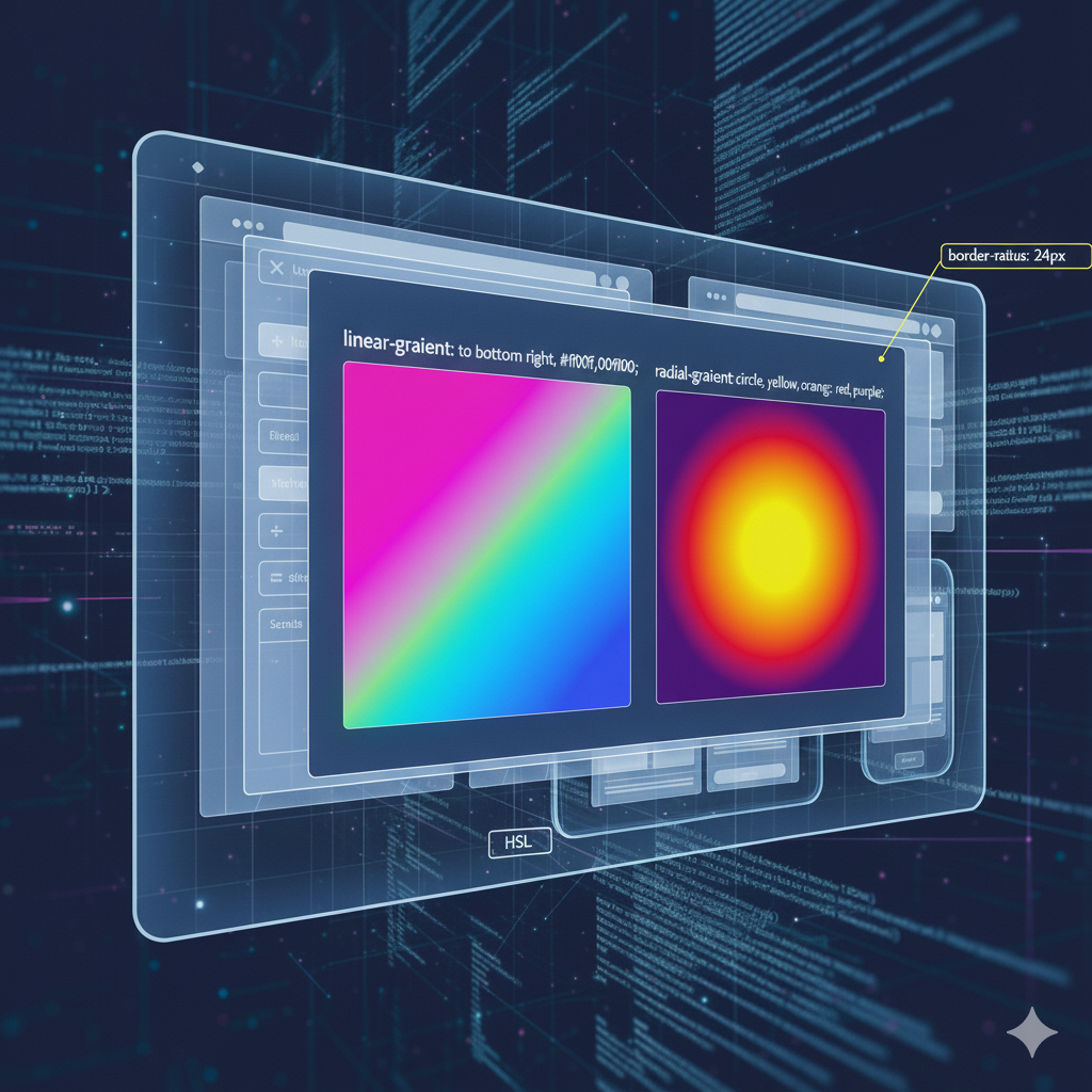
Diagonal is Where It's At:
css
.element {
  background: linear-gradient(to bottom right, #ffecd2, #fcb69f);
}
This creates a gradient from the top-left to the bottom-right. It feels more dynamic and modern.
Using Angles for Precision:
Want total control? Use degrees.css
.element { background: linear-gradient(45deg, #ff9a9e, #fad0c4, #fad0c4); }0degis "to top", and it increases clockwise. So45degis like "to top right".
2. Radial Gradients: The Spotlight Effect
Unlike linear gradients that flow in a line, radial gradients emanate from a central point, like a ripple in a pond or a spotlight.
The Basic Syntax:
css
background: radial-gradient(shape size at position, color-stop1, color-stop2, ...);Examples You Can Steal:
Simple Circular Gradient:
css
.element {
  background: radial-gradient(#a1c4fd, #c2e9fb);
}
By default, it's an ellipse, starting from the center.
A Perfect Circle:
css
.element {
  background: radial-gradient(circle, #ff9a9e, #fad0c4);
}
Forces the gradient to be a perfect circle, regardless of the container's shape.
Positioning the Center:
css
.element {
  background: radial-gradient(circle at top right, #ff9a9e, #fad0c4);
}
This places the starting point of the gradient in the top-right corner. Super cool for creating emphasis.
3. Conic Gradients: The Pie Chart Pro
This is the newer, cooler sibling. A conic gradient rotates around a center point, like the color wheel or a pie chart.
The Basic Syntax:
css
background: conic-gradient(from angle at position, color-stop1, color-stop2, ...);Examples You Can Steal:
Basic Color Wheel:
css
.element {
  background: conic-gradient(red, yellow, lime, aqua, blue, magenta, red);
  border-radius: 50%; /* Makes it a circle */
}
Boom. You just made a color wheel with a few lines of CSS.
Pie Chart:
css
.element {
  background: conic-gradient(
    #ff9a9e 0deg 120deg,
    #fad0c4 120deg 240deg,
    #a1c4fd 240deg 360deg
  );
  border-radius: 50%;
}
This explicitly defines the color stops with angles, creating a perfect three-section pie chart.
Leveling Up: Pro Tips and Best Practices
Okay, you know the basics. Now let's make your gradients look like they were designed by a pro.
1. Use Hard Stops for Bold Sections
You don't always need a smooth transition. Using the same color stop for two colors creates a hard line.
css
.element {
  background: linear-gradient(to right, #ff9a9e 50%, #fad0c4 50%);
}
This splits your element into two distinct colored halves. Great for bold, graphic designs.
2. Stack Gradients for Texture and Depth
This is a superpower. You can add multiple gradients on top of each other by separating them with a comma.
css
.element {
  background:
    linear-gradient(45deg, rgba(255,255,255,0.1) 25%, transparent 25%),
    linear-gradient(to bottom, #667eea, #764ba2);
}
The first gradient here creates a subtle transparent/white diagonal stripe pattern over a beautiful purple base gradient. This adds incredible texture without any images.
3. Taming the "UGLY" with color-mix() and Tools
Let's be honest, sometimes our gradients look... bad. The colors muddy or the transition is just off.
Use Online Tools: Don't try to guess colors. Use sites like uiGradients.com or CSSGradient.io to find beautiful, pre-made gradients and grab the code.
Embrace
color-mix(): This modern CSS function is a game-changer. You can create a gradient that uses a base color and mixes it with another, ensuring harmony.css
.element {
  background: linear-gradient(to right, color-mix(in oklab, blue, white), color-mix(in oklab, blue, black));
}
This creates a gradient from a tint of blue to a shade of blue, which is almost always more pleasing than random colors.
Real-World Use Cases (Beyond a Fancy Background)
So, where do you actually use this stuff? Everywhere.
Hero Sections: A vibrant, subtle linear gradient behind your main headline can make it pop off the page.
Buttons: A gradient button looks more clickable and modern than a flat one. Add a hover effect that darkens the gradient for interaction.
Text Gradients: Yes, you can put a gradient on text!
css
.gradient-text {
  background: linear-gradient(to right, #ff9a9e, #fad0c4);
  -webkit-background-clip: text;
  -webkit-text-fill-color: transparent;
}
Skeuomorphic Design: Use radial gradients to create subtle shadows and highlights, making an element look slightly 3D, like an inset button or a pill.
Data Visualization: As we saw, conic gradients are perfect for simple pie charts without any JavaScript.
Mastering these techniques is what separates hobbyists from professionals. If you're serious about building a career in this, a structured learning path is key. Our Full Stack Development course at codercrafter.in dives deep into CSS, modern design patterns, and the entire MERN Stack, turning you into a job-ready developer.
CSS Gradients FAQ (You Asked, We Answer)
Q: Can I animate gradients?
A: Not directly by animating the background-image property, but you can fake it cleverly with background-position, opacity, or by using CSS custom properties (variables) with Houdini (an advanced API). For most cases, a simple hover state change is the way to go.
Q: Are there performance concerns?
A: Generally, CSS gradients are very performant because they're handled by the browser's graphics engine. They are almost always better than using a large background image.
Q: Why does my gradient look banded and not smooth?
A: This is called "color banding." It happens when the color range is too wide for the display to handle. To fix it, try adding more intermediate color stops or use a subtle noise texture on top.
Q: What's the browser support like?
A: Excellent for linear and radial gradients (over 98% globally). Conic gradients have good support in modern browsers (around 95%), but always have a fallback background color.
Conclusion: Your Flat Color Era is Over
CSS gradients are not just a trend; they're a fundamental tool for creating a modern, engaging web experience. They're lightweight, incredibly versatile, and when used tastefully, can elevate your design from "meh" to "wow."
Start by experimenting with linear gradients on your buttons and hero sections. Play around with radial gradients for cool hover effects. And when you're feeling brave, dive into conic gradients to create unique data visualizations.
The key is to practice. Copy the code from this post, tweak the colors, break it, and fix it. That's how you learn.
And remember, if you're ready to transform your passion for coding into a solid, high-demand career, we're here to guide you every step of the way. To learn professional software development courses such as Python Programming, Full Stack Development, and MERN Stack, visit and enroll today at codercrafter.in. Let's build the future, one gradient at a time.


