CSS Fonts Mastery: A No-BS Guide to Typography That Slays
Stop using boring fonts. Our in-depth guide to CSS Fonts covers everything from @font-face to variable fonts, with real-world examples and best practices to make your website's typography pop.
Let's be real. You didn't get into web development to build websites that look like they're straight out of 1998. You're here to create stuff that's slick, professional, and actually enjoyable to use. And guess what? One of the biggest things separating an amateur-looking site from a pro one is typography.
Yeah, we're talking about fonts.
But it's not just about picking a pretty font from Google Fonts. It's about knowing how to wield CSS to make that font sing on every device, load like a dream, and give your users that "ooh, this feels nice" experience.
So, grab your coffee, and let's deep-dive into the world of CSS Fonts. This isn't your grandma's textbook guide; this is the stuff you actually need to know.
The Absolute Basics: More Than Just font-family
Before we get fancy, let's get our fundamentals right. You know the font-family property, but are you using it effectively?
css
p {
font-family: 'Helvetica Neue', Helvetica, Arial, sans-serif;
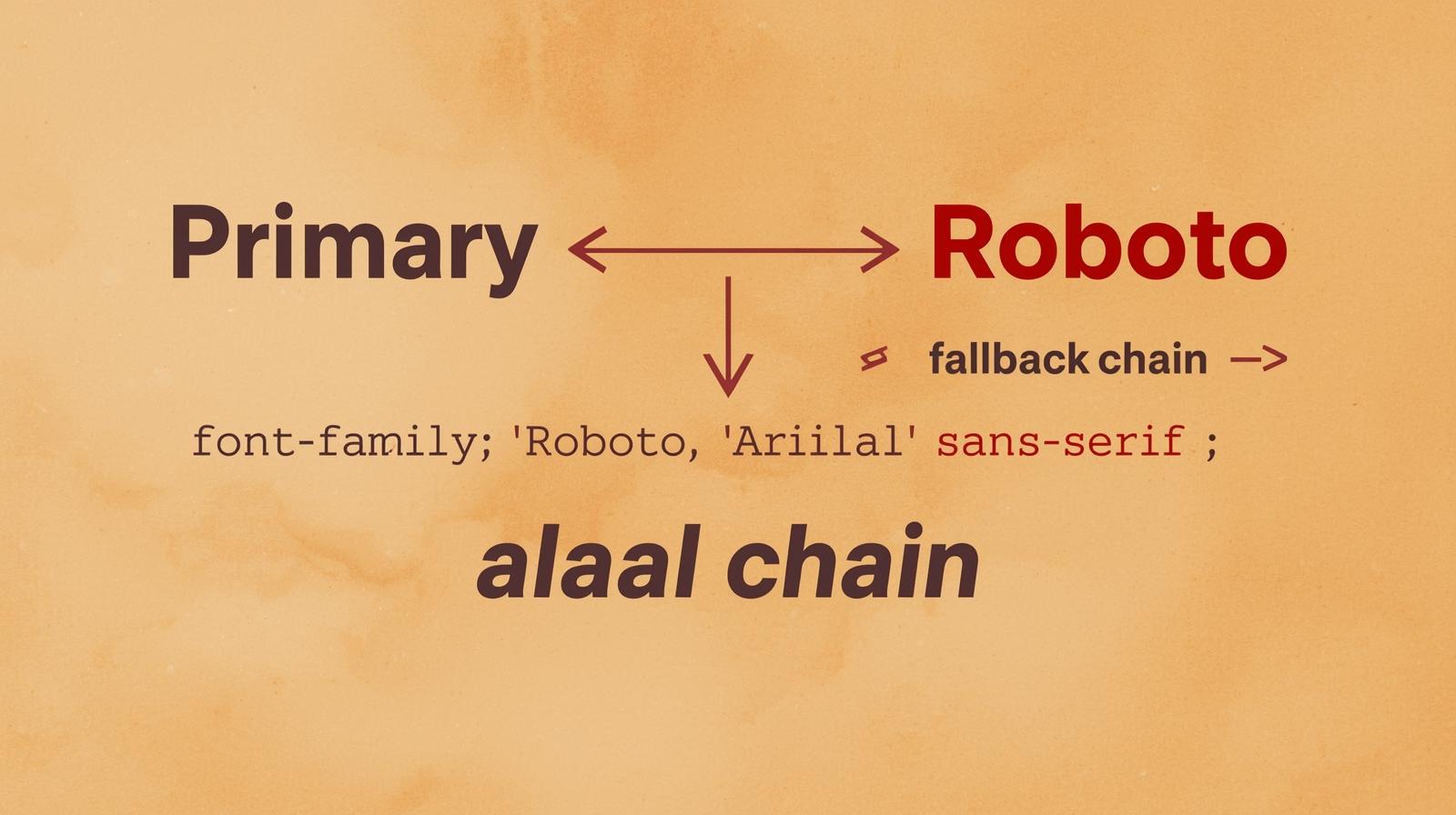
}See what we did there? That's called a font stack. The browser tries to use 'Helvetica Neue' first. If the user doesn't have it, it falls back to Helvetica, then Arial, and finally, whatever the system's default sans-serif font is. This is your first line of defense for cross-platform consistency.
Pro Tip: Always end your font stack with a generic family like serif, sans-serif, or monospace. It's a safety net.
Leveling Up: Bringing in Your Own Fonts with @font-face
System fonts are safe, but they're boring. To truly express your brand, you need custom fonts. Enter @font-face, the CSS rule that lets you define a custom font for the browser to download.
This is where most people mess up. They just copy-paste from Google Fonts and call it a day. But let's break down what's actually happening.
css
@font-face {
  font-family: 'My Awesome Font';
  src: url('my-awesome-font.woff2') format('woff2'),
       url('my-awesome-font.woff') format('woff');
  font-weight: 400; /* Normal */
  font-style: normal;
  font-display: swap; /* This is crucial for performance! */
}

body {
  font-family: 'My Awesome Font', sans-serif;
}
Let's decode the magic:
font-family: This is the nickname you give your font. Call it whatever you want.src: This is where you list the font files. Notice we have two: WOFF2 and WOFF. WOFF2 is a modern, super-compressed format that every modern browser supports. Always provide WOFF2 first, with WOFF as a fallback for older browsers. Forget TTF/OTF files for the web—they're too big.font-weight&font-style: This is a game-changer. By specifying the weight and style here, you tell the browser, "Hey, this specific file is for the Regular (400) weight, normal style." This means you can load a separate file for bold or italics, preventing the browser from faking it (which looks terrible).font-display: swap: This is a performance superstar. It tells the browser to use the fallback font immediately if the custom font isn't ready, and then "swap" it in once it loads. This prevents the dreaded FOIT (Flash of Invisible Text) and gives you a FOUT (Flash of Unstyled Text), which is a much better user experience. The text is readable right away.
Real-World Use Case: Building a Performant Typography System
Let's say you're building a portfolio site for a designer. You want a unique heading font and a clean body font.
Step 1: Choose your fonts wisely. Maybe a bold Poppins for headings and Inter for body text (both are fantastic, free Google Fonts).
Step 2: Use @import in your CSS (or link in HTML) but be smart about it. Google Fonts gives you a link that looks like this:
<link href="https://fonts.googleapis.com/css2?family=Inter:wght@400;600&family=Poppins:wght@700&display=swap" rel="stylesheet">
Notice the &display=swap at the end? That's Google Fonts implementing font-display: swap for you. Also, we're only loading the weights we need: 400 and 600 for Inter, and 700 for Poppins. Don't load the entire font family if you're only using one weight!
Step 3: Apply with a system.
css
/* This is imported from Google, so we don't write @font-face ourselves */

body {
  font-family: 'Inter', sans-serif;
  font-weight: 400; /* Explicitly set the weight */
  line-height: 1.6; /* Readability queen! */
}

h1, h2, h3 {
  font-family: 'Poppins', sans-serif;
  font-weight: 700;
  line-height: 1.2;
}

strong, b {
  font-weight: 600; /* Now the browser uses the real Inter 600 font, not a fake bold */
}
Boom. You now have a robust, performant typography system.
Going Next-Level: Variable Fonts Are The Future
If you really want to flex your typography skills, you need to know about Variable Fonts. Think of a variable font as a single font file that contains a whole spectrum of weights, widths, and sometimes even italics. It's like a font Swiss Army knife.
Instead of having Poppins-Regular.woff2, Poppins-Bold.woff2, Poppins-Light.woff2, you just have one file: Poppins-Variable.woff2.
Here's how you use it:
css
@font-face {
  font-family: 'Poppins Variable';
  src: url('Poppins-Variable.woff2') format('woff2-variations');
  font-weight: 100 900; /* This range is now available from one file! */
  font-display: swap;
}

h1 {
  font-family: 'Poppins Variable', sans-serif;
  font-weight: 350; /* Wait, 350? Yes! You can use any value in the range! */
}
The benefits are huge:
Performance: One file to rule them all, often smaller than loading 2-3 separate font files.
Creative Freedom: Fine-tune the exact weight, width, or optical size you want. It's a designer's dream.
Best Practices You Can't Ignore
Don't Go Font-Crazy: Limit yourself to 2-3 typefaces max. More than that looks chaotic and unprofessional.
Prioritize Readability: For body text,
font-sizeshould be at least16px.line-heightshould be between 1.4 and 1.6. Don't make your lines too long—aim for 50-75 characters per line.Use a Typography Scale: Don't just pick random sizes for your headings. Use a predefined scale (like 1.25, 1.5, 2, 3) for harmony and rhythm. CSS
clamp()is great for this:font-size: clamp(1.5rem, 2.5vw, 3rem);Optimize, Optimize, Optimize: Use WOFF2. Use
font-display: swap. Subset your fonts (remove unused characters) if you're hosting them yourself. Preload critical fonts (like your logo font) using<link rel="preload">.
FAQs (Frequently Asked Questions)
Q: Why does my custom font look blurry on Windows?
A: This is often due to font rendering engines. Macs and Windows render fonts differently. Windows can struggle with thin font weights. The fix? Avoid very thin (font-weight: 100-200) fonts for body text, especially on Windows. Test thoroughly!
Q: Google Fonts or Self-Hosting?
A: Google Fonts is easier and their CDN is fast. It's a great starting point. Self-hosting gives you more control over loading, caching, and privacy (no requests to Google). For high-traffic, performance-focused sites, self-hosting with proper optimization can be better.
Q: What's the deal with px, rem, and em for font-size?
A: Use rem for almost everything. It's relative to the root (<html>) element, which makes it predictable and great for accessibility (if a user zooms, everything scales uniformly). em is relative to its parent, which can get messy. px is absolute and doesn't scale as well.
Q: My font isn't loading at all. What did I do wrong?
A: Triple-check the file path in your src URL. This is the #1 mistake. Also, ensure the @font-face rule is defined before you try to use the font in your CSS.
Conclusion: Typography is a Superpower
Look, mastering CSS fonts isn't just about making things look pretty. It's about performance, accessibility, and creating a seamless user experience. It's the difference between a site that feels janky and one that feels polished and professional.
You've now got the blueprint:
Use
@font-facelike a pro withwoff2andfont-display: swap.Build resilient font stacks.
Understand the power of variable fonts.
Follow the best practices for readability and performance.
This is the kind of detailed, industry-relevant knowledge that separates hobbyists from professional developers. If you're hungry to master not just CSS, but the entire stack—from building robust backend APIs with Python to creating stunning, dynamic UIs with the MERN Stack—you need a structured path.
To learn professional software development courses such as Python Programming, Full Stack Development, and MERN Stack, visit and enroll today at codercrafter.in. We break down these complex topics into digestible, project-based lessons that will get you job-ready.