CSS Errors Explained: Complete Guide to Debugging & Fixing CSS Issues 2025
Master CSS errors with our comprehensive guide. Learn to fix syntax errors, specificity issues, browser compatibility problems & debugging techniques. Perfect for web developers!
Hey there, fellow web developers! Let's be real for a second—we've all been there. You're working on a website, everything looks perfect in your mind, and then bam! The layout breaks, colors don't show up, or your carefully crafted design just... doesn't work. Welcome to the world of CSS errors, my friend. But don't worry—by the end of this guide, you'll be spotting and fixing these pesky bugs like a pro.
CSS (Cascading Style Sheets) is the backbone of modern web design, but it's also notorious for being tricky to debug. Unlike JavaScript, which throws errors in your face, CSS fails silently. It just ignores whatever it doesn't understand and moves on. This silent treatment can drive you absolutely nuts when you're trying to figure out why your button isn't centered or why that color isn't applying.
What Exactly Are CSS Errors?
Before we dive deep, let's get on the same page about what CSS errors actually are. CSS errors happen when your stylesheet contains invalid syntax, incorrect property values, or conflicting rules that prevent your styles from being applied correctly. The frustrating part? Browsers won't throw up a big red error message like they do with JavaScript. Instead, they'll just skip over the problematic code and keep rendering what they can.
This "fail silently" behavior is both a blessing and a curse. It means your website won't crash completely, but it also means you might not even realize there's an error until you spot something looking weird on the page.
The Most Common CSS Errors (And How to Avoid Them)
Let me walk you through the CSS errors that literally every developer encounters at some point. Trust me, even senior devs with years of experience still make these mistakes sometimes.
1. Missing Semicolons—The Silent Killer
This one's a classic. You're cruising along, writing beautiful CSS, and you forget a single semicolon. What happens? The entire style rule breaks.
Wrong way:
css.button { color: red background-color: yellow; }
Right way:
css.button { color: red; background-color: yellow; }
Here's the thing—CSS needs that semicolon to know where one declaration ends and the next begins. Without it, the browser gets confused and treats red background-color: yellow; as one big invalid value. Modern code editors with syntax highlighting can catch these for you, but it's still super easy to miss, especially when you're tired or rushing.
2. Typos in Property Names
We're all human, and typos happen. The problem with CSS is that if you misspell a property name, the browser doesn't tell you—it just ignores that entire line.
Common typo example:
css.header { colr: blue; /* Should be "color" */ backgroun-color: #fff; /* Should be "background-color" */ font-size: 16px; }
The browser will apply the font-size just fine but completely ignore the misspelled properties. Your code editor can help here—most decent editors will underline unknown properties or won't autocomplete them.
3. Invalid Property Values
This error is sneakier. The property name is correct, but the value you're trying to use doesn't work with that property.
Examples of invalid values:
css.box { width: -100px; /* Negative widths aren't valid */ font-weight: italic; /* font-weight only accepts numbers or keywords like "bold" */ color: purple-ish; /* Not a valid color value */ }
Each CSS property has specific value types it accepts. The width property needs positive length values, font-weight wants numbers or specific keywords, and color needs actual color values like hex codes, RGB, or predefined color names.
4. Unclosed Curly Braces
Forget to close a curly brace, and you're in for a world of pain. Everything after the missing brace might get completely ignored.
Broken code:
css.navigation { padding: 20px; margin: 10px; /* Missing closing brace here! */ .footer { background: black; }
The browser sees the .navigation rule starting but never sees it end, so it might interpret everything that follows as part of that rule. This can cascade (pun intended) into multiple styling issues across your entire page.
5. The !important Overuse Problem
Look, I get it. Sometimes you're desperate to make a style apply, and slapping !important on it seems like the quick fix. But here's the truth—overusing !important is like using duct tape to fix a broken engine. It might work temporarily, but you're creating a maintenance nightmare.
Bad practice:
css.text { color: blue !important; font-size: 14px !important; padding: 10px !important; }
The problem with !important is that it breaks the natural cascade of CSS. Once you start using it, you'll need even more !important declarations to override those styles later. Instead of reaching for !important, take a step back and understand CSS specificity—which brings us to our next section.
Understanding CSS Specificity—The Root of Many Errors
Alright, this is where things get interesting. CSS specificity is like a hierarchy that determines which styles actually get applied when multiple rules target the same element. Understanding this concept will literally save you hours of debugging frustration.
The Specificity Hierarchy
Think of specificity as a point system. Different types of selectors have different weights:
Inline styles (inside the HTML element): 1000 points
ID selectors (#header): 100 points
Class selectors, pseudo-classes, attributes (.navbar, :hover, [type="text"]): 10 points
Element selectors (div, p, h1): 1 point
Universal selector (*): 0 points
Real-world example:
css/* Specificity: 1 point */ p { color: black; } /* Specificity: 10 points */ .intro { color: blue; } /* Specificity: 100 points */ #main-text { color: red; }
If you have a paragraph with class="intro" and id="main-text", which color wins? The red from the ID selector, because it has the highest specificity (100 points).
Over-Qualifying Selectors
New developers often make their selectors way more complicated than they need to be. Check this out:
Unnecessarily complex:
cssul#navigation li a { color: white; }
Cleaner and simpler:
css#navigation a { color: white; }
Why is the second version better? Because IDs are already unique—you don't need to specify the element type. Plus, simpler selectors are easier to override later if needed and they perform better too.
Browser Compatibility Issues
Here's something that'll blow your mind—different browsers can interpret CSS differently, leading to inconsistent layouts and broken designs across devices. In 2024-2025, browser compatibility remains one of the biggest challenges for web developers.
CSS Grid and Flexbox Quirks
CSS Grid and Flexbox are amazing for layouts, but they're not universally supported in the same way across all browsers. Older browsers might not support certain features, or they might implement them slightly differently.
Common Grid mistakes:
css/* Mistake: Forgetting to set display: grid */ .grid-container { grid-template-columns: repeat(3, 1fr); /* Won't work without display: grid! */ } /* Correct: */ .grid-container { display: grid; grid-template-columns: repeat(3, 1fr); }
Without display: grid, none of your grid properties will do anything. The browser will just treat your elements as regular block-level elements.
Missing CSS Resets
Different browsers apply different default styles to HTML elements. One browser might give paragraphs 16px margins, while another gives them 12px. This inconsistency can wreck your carefully planned layout.
Solution: Use a CSS reset
css* { margin: 0; padding: 0; box-sizing: border-box; }
This resets all elements to a predictable baseline, so you're starting with a clean slate. Many developers use CSS reset libraries like Normalize.css for this purpose.
CSS Units—Using the Right Tool for the Job
Choosing between pixels (px), rem, em, percentages, and viewport units can feel overwhelming. But here's the thing—each unit has its sweet spot.
When to Use What
Pixels (px): Great for borders, shadows, and elements that need exact dimensions. They're absolute units, meaning they don't scale.
Rem units: Perfect for creating scalable, accessible designs. One rem equals the root font size (usually 16px). Use rem for typography and spacing that should scale consistently.
Em units: Similar to rem, but relative to the parent element's font size. Use sparingly for specific component scaling.
Percentages (%): Ideal for responsive widths and flexible layouts.
Viewport units (vw, vh): Great for full-screen sections and responsive typography.
Example of proper unit usage:
csshtml { font-size: 16px; /* Base size */ } .container { width: 90%; /* Responsive width */ max-width: 1200px; /* Fixed maximum */ padding: 2rem; /* Scalable padding */ border: 1px solid #ccc; /* Fixed border */ font-size: 1rem; /* Scalable text */ }
Color Values—Hex, RGB, or RGBA?
You've got options when it comes to defining colors in CSS, and each format has its use case.
Hex Colors
css.element { background-color: #FF5733; /* Clean and compact */ }
Hex codes are the most popular format. They're concise, easy to copy-paste, and universally supported. The format is #RRGGBB where RR (red), GG (green), and BB (blue) are hexadecimal values from 00 to FF.
RGB and RGBA
css.element { background-color: rgb(255, 87, 51); /* Same color as above */ border-color: rgba(255, 87, 51, 0.5); /* With 50% transparency */ }
The beauty of RGBA is that alpha channel—it lets you add transparency without needing additional properties. This is super handy for overlays, shadows, and layered designs.
HSL and HSLA
css.element { color: hsl(120, 100%, 50%); /* Hue, Saturation, Lightness */ background: hsla(120, 100%, 50%, 0.3); /* With transparency */ }
HSL is more intuitive for humans—you think in terms of actual color properties rather than mixing red, green, and blue. Great for creating color schemes and variations.
Pro tip: Don't use generic color names like "red" or "blue" in production code. Different browsers can interpret these names slightly differently. Always use hex, RGB, or HSL values for precise control.
The CSS Box Model—Understanding Element Dimensions
The CSS box model is fundamental to understanding layout and spacing. Every element on your page is essentially a rectangular box with four parts:
Content: The actual content (text, images, etc.)
Padding: Space between content and border
Border: Surrounds the padding
Margin: Space outside the border
Visual representation:
textMargin → Border → Padding → Content
Box-Sizing Property
By default, when you set width: 300px on an element, that's just the content width. Add padding and borders, and the total width becomes larger. This can cause unexpected layout shifts.
Default behavior (content-box):
css.box { width: 300px; padding: 20px; border: 2px solid black; /* Actual width = 300 + 40 + 4 = 344px */ }
Better approach (border-box):
css.box { box-sizing: border-box; width: 300px; padding: 20px; border: 2px solid black; /* Actual width = 300px (padding and border included) */ }
Using border-box makes your life so much easier. The width you set is the width you get, regardless of padding and borders.
Responsive Design and Media Queries
In 2025, responsive design isn't optional—it's essential. Media queries let you apply different styles based on device characteristics like screen width, height, and orientation.
Best Practices for Media Queries
Start mobile-first:
css/* Base styles for mobile */ .container { width: 100%; padding: 1rem; } /* Tablet and up */ @media (min-width: 768px) { .container { width: 750px; padding: 2rem; } } /* Desktop and up */ @media (min-width: 1024px) { .container { width: 960px; padding: 3rem; } }
Mobile-first design means you start with styles for small screens and add complexity as screen size increases. This approach typically results in cleaner, more maintainable code.
Common Breakpoints
While breakpoints should ideally be based on your content, these are commonly used:
Mobile: Up to 600px
Tablet: 600px to 900px
Desktop: 900px to 1200px
Large Desktop: 1200px and up
Combining conditions:
css@media (min-width: 600px) and (max-width: 900px) and (orientation: landscape) { /* Styles for tablets in landscape mode */ .sidebar { display: block; } }
Debugging CSS Like a Professional
When things go wrong (and they will), knowing how to debug efficiently is a game-changer.
Use Browser DevTools
Every modern browser has built-in developer tools that are absolute lifesavers:
Right-click on any element and select "Inspect"
View all applied styles in the Styles panel
See computed values (the final calculated styles)
Edit styles in real-time to test changes
Check for overridden styles (shown with strikethrough)
Browser DevTools will show you exactly which styles are being applied, which are being overridden, and why. They'll even highlight invalid properties and values.
CSS Validators
Use validation tools to catch syntax errors automatically:
W3C CSS Validator: The official validator from the World Wide Web Consortium
Stylelint: A modern CSS linter that can be integrated into your code editor
Browser extensions: Many code editors have CSS validation plugins
Important note: The W3C validator might flag newer CSS features like custom properties (CSS variables) as errors, even though they're widely supported. Don't panic—these are usually false positives.
Debug Systematically
When something isn't working, follow this debugging process:
Check for typos in property names and values
Verify selectors are targeting the right elements
Check specificity to see if styles are being overridden
Look for syntax errors like missing semicolons or braces
Test in different browsers to rule out compatibility issues
Simplify and isolate the problem by commenting out code sections
Real-World CSS Error Prevention
Prevention is always better than cure. Here are battle-tested strategies to avoid CSS errors in the first place:
1. Use a Modern Code Editor
Editors like VS Code, Sublime Text, or WebStorm provide:
Syntax highlighting to spot errors visually
Auto-completion to prevent typos
Real-time linting to catch errors as you type
IntelliSense for property names and values
2. Follow Naming Conventions
Pick a naming convention and stick to it:
BEM (Block Element Modifier):
css.card { } .card__title { } .card__title--highlighted { }
Consistent naming makes your code:
Easier to read and maintain
Less prone to selector conflicts
More predictable to work with
3. Write Modular CSS
Break your styles into logical, reusable components:
css/* Base styles */ .button { padding: 0.5rem 1rem; border: none; border-radius: 4px; cursor: pointer; } /* Variants */ .button--primary { background: #007bff; color: white; } .button--secondary { background: #6c757d; color: white; }
4. Use CSS Shorthand (But Not Excessively)
Shorthand properties reduce code bloat:
Longhand:
css.element { margin-top: 10px; margin-right: 20px; margin-bottom: 10px; margin-left: 20px; }
Shorthand:
css.element { margin: 10px 20px; /* top/bottom left/right */ }
Just make sure you understand what each shorthand property does—using them incorrectly can override values you didn't intend to change.
5. Comment Your Complex CSS
Future you (or your teammates) will thank you:
css/* * Mobile navigation overlay * Displays as fixed overlay on mobile devices * Transforms to horizontal menu on tablet/desktop */ .mobile-nav { position: fixed; top: 0; left: -100%; /* Hidden off-screen by default */ width: 80%; height: 100vh; background: white; transition: left 0.3s ease; } .mobile-nav.active { left: 0; /* Slide in when active */ }
Advanced Error Handling Techniques
Once you've mastered the basics, these advanced techniques will level up your CSS game.
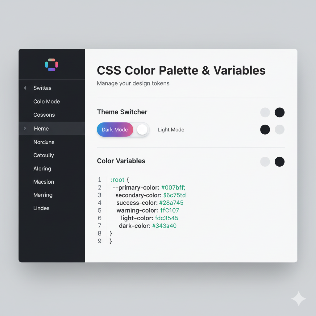
CSS Custom Properties (Variables) Validation
CSS variables are powerful, but they can cause unique errors:
css:root { --primary-color: 45deg; /* Wrong: this is an angle, not a color */ } body { background-color: var(--primary-color); /* This will fail silently */ }
When a CSS variable contains an invalid value for the property it's used in, the property falls back to its initial or inherited value. To prevent this:
css@property --primary-color { syntax: "<color>"; inherits: false; initial-value: rebeccapurple; }
The @property rule explicitly defines the type of value your variable should contain.
Feature Queries (@supports)
Use feature queries to provide fallbacks for unsupported features:
css/* Fallback for browsers without Grid */ .gallery { display: flex; flex-wrap: wrap; } /* Enhanced layout for Grid-supporting browsers */ @supports (display: grid) { .gallery { display: grid; grid-template-columns: repeat(auto-fit, minmax(250px, 1fr)); gap: 1rem; } }
This ensures your site works everywhere while taking advantage of modern features when available.
Level Up Your CSS Skills
Understanding CSS errors is just the beginning of your web development journey. At codercrafter.in, we offer comprehensive courses that take you from CSS basics to advanced front-end development techniques. Whether you're interested in mastering the MERN Stack, diving deep into Full Stack Development, or becoming proficient in Python Programming, our industry-expert instructors will guide you every step of the way.
Our courses are designed for real-world application, not just theory. You'll build actual projects, debug real errors, and learn the problem-solving skills that employers are looking for. Visit codercrafter.in today to explore our course offerings and start your journey toward becoming a professional web developer.
Frequently Asked Questions
Q: Why doesn't my CSS show up even though the file is linked correctly?
A: Check for syntax errors in your CSS file. A single missing semicolon or unclosed brace early in your file can cause the browser to ignore styles that come after it. Use browser DevTools to see if any styles are being applied at all.
Q: How do I know which browser versions I need to support?
A: Check your website analytics to see which browsers your users actually use. Generally, focus on the last two versions of major browsers (Chrome, Firefox, Safari, Edge). For enterprise applications, you might need to support specific older browsers.
Q: Should I use rem or px for font sizes?
A: Use rem for better accessibility and responsive design. Rem units scale with the user's browser settings, making your site more accessible for users who need larger text. Reserve px for borders, shadows, and other elements that should remain fixed.
Q: What's the difference between margin and padding?
A: Padding is the space between an element's content and its border. Margin is the space outside the border, separating the element from other elements. Think of padding as internal spacing and margin as external spacing.
Q: How can I test my CSS across different browsers without installing them all?
A: Use browser testing tools like BrowserStack, LambdaTest, or CrossBrowserTesting. These cloud-based platforms let you test on real devices and browsers without needing physical access to them.
Q: Is it okay to use !important in CSS?
A: Use it sparingly and only as a last resort. Overusing !important makes your code harder to maintain and debug. Instead, solve specificity issues by understanding selector weights and restructuring your CSS properly.
Q: Why do my colors look different on different devices?
A: Different screens have different color profiles and calibrations. Additionally, using color names instead of hex/RGB values can cause inconsistencies across browsers. Always use specific color values (hex, RGB, or HSL) for consistency.
Q: What's the best way to organize CSS files for large projects?
A: Use a methodology like BEM or SMACSS for naming, organize styles into logical modules or components, and consider using a CSS preprocessor like Sass or LESS for variables and nesting. Keep related styles together and separate layout from theme styles.
Conclusion: Becoming a CSS Error-Free Developer
CSS errors are an inevitable part of web development, but they don't have to be a constant source of frustration. By understanding the most common errors, learning how specificity works, mastering the box model, and using modern debugging tools, you can write cleaner, more maintainable CSS that works consistently across all browsers and devices.
Remember these key takeaways:
Validate your code regularly using browser DevTools and CSS validators
Understand specificity to avoid selector conflicts
Use appropriate units (rem for scalable design, px for fixed elements)
Test across browsers to catch compatibility issues early
Write semantic, well-organized CSS with consistent naming conventions
Leverage modern tools like CSS Grid and Flexbox properly
Think mobile-first when implementing responsive designs
CSS is both an art and a science. The more you practice, the more intuitive it becomes. Don't get discouraged by errors—they're learning opportunities. Every bug you fix makes you a better developer.
Ready to take your web development skills to the next level? Whether you're just starting out or looking to master advanced techniques, codercrafter.in has the perfect course for you. From Python Programming to Full Stack Development and MERN Stack specialization, our comprehensive curriculum and hands-on projects will transform you into a confident, job-ready developer. Visit codercrafter.in today and start building the future you want!
