CSS Box Sizing: Tame Your Layouts and End CSS Frustration
Struggling with unpredictable element sizes? Master the CSS box-sizing property. Learn how border-box fixes layout headaches, see practical examples, and build professional, responsive designs with ease.
Alright, let's set the scene. You're deep in the zone, crafting what you believe is the most beautiful, pixel-perfect div. You set a width: 300px, add a little padding: 20px for breathing room, and throw on a border: 2px solid #f00 for that pop of color. You check the browser... and wait. Why is this thing suddenly 344 pixels wide?!
You frantically open the developer tools, and there it is: the browser is adding your padding and border outside your specified width. Your beautiful layout is now a janky, broken mess. Sound familiar?
If you've ever wanted to yeet your laptop out the window because of CSS, chances are the default box model was the culprit. But fear not, because today we're talking about box-sizing, the single most important CSS property for maintaining your mental health as a developer. This isn't just a "tip"—it's a fundamental shift in how you control your layouts.
What Is The CSS Box Model, Anyway?
Before we get to the solution, let's quickly break down the problem. Every single element in your HTML is a rectangular box. CSS uses a "box model" to determine how the size of that box is calculated. It's made up of four parts, from the inside out:
Content: The actual stuff inside the box—your text, image, etc.
Padding: The transparent space between the content and the border.
Border: The line that wraps around the padding and content.
Margin: The transparent space outside the border, pushing other elements away.
The million-dollar question is: When you set a width and height in CSS, what exactly are you defining?
This is where box-sizing comes in.
Meet the box-sizing Property: Your New Best Friend
The box-sizing property tells the browser which part of the box model the width and height should apply to. It has two main values that you need to know:
content-box(The Default Villain)border-box(The Hero We Deserve)
box-sizing: content-box; - The "Old School" Headache
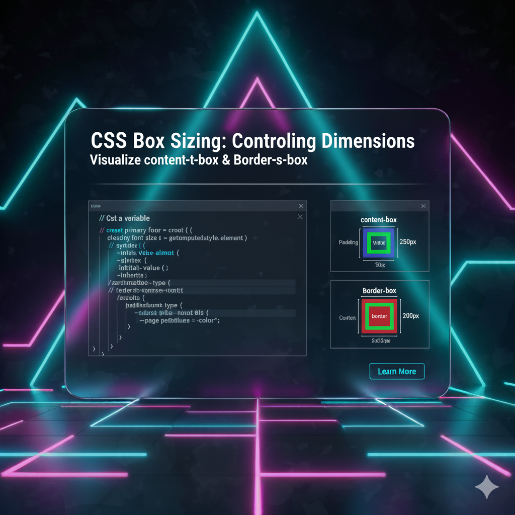
This is the default value. If you don't set box-sizing at all, this is what you're stuck with. With content-box, the width and height you set only apply to the content area.
The padding and border get added on top of that width.
Let's visualize it with some code. Imagine this CSS:
css
.box {
  width: 300px;
  padding: 20px;
  border: 2px solid red;
  /* box-sizing is not set, so it's 'content-box' by default */
}
How wide is the .box element actually?
Content Width:
300pxLeft Padding:
20pxRight Padding:
20pxLeft Border:
2pxRight Border:
2pxTotal Rendered Width = 344px
See? That's where our initial frustration came from. Your layout calculations become a constant game of mental math. No thank you.
box-sizing: border-box; - The Modern Game-Changer
Now, let's talk about the star of the show. With border-box, the width and height you set include the content, padding, and border.
The box's total size is exactly what you tell it to be. It's intuitive. It's predictable. It's a breath of fresh air.
Let's take the same example but add our hero property:
css
.box {
  box-sizing: border-box; /* The magic line! */
  width: 300px;
  padding: 20px;
  border: 2px solid red;
}
Now, how wide is it?
Total Width:
300px(This now INCLUDES padding and border)Inside that
300px:Left Border:
2pxLeft Padding:
20pxContent Width:
256px(300 - 2 - 20 - 20 - 2)Right Padding:
20pxRight Border:
2px
The element will render as a clean, predictable 300px wide. The content area shrinks to accommodate the padding and border. This makes creating layouts, especially responsive ones, infinitely easier.
Real-World Use Case: Why This Actually Matters
"This seems theoretical," you might say. Let's make it concrete.
Use Case 1: Creating a Simple Sidebar Layout
You want a sidebar that takes up 30% of the page and a main content area that takes up 70%. Simple, right?
With the default content-box:
css
.sidebar {
  width: 30%;
  padding: 20px; /* Oops! This adds extra width */
  float: left;
}

.main-content {
  width: 70%;
  padding: 20px; /* Oops! This also adds extra width */
  float: left;
}
Your total width is now 30% + 70% + 40px + 40px, which is more than 100%. The result? The second element drops down below the first one, breaking your layout. Cue the frustration.
With the glorious border-box:
css
* {
  box-sizing: border-box; /* Apply to everything! */
}

.sidebar {
  width: 30%;
  padding: 20px; /* This is now INSIDE the 30% */
  float: left;
}

.main-content {
  width: 70%;
  padding: 20px; /* This is now INSIDE the 70% */
  float: left;
}
They now sit perfectly side-by-side, exactly as you intended. The padding is contained within the percentages you declared. Life is good.
Use Case 2: Building a Responsive Card Grid
You're building a grid of product cards. You want three cards per row on a desktop. With border-box, you can confidently set the width of each card to calc(33.333% - 20px), add some padding and a border, and know they will fit perfectly within their container. No surprise overflows, no horizontal scrollbars. It just works.
The Professional's Move: The Universal border-box Reset
So, what's the best practice? The modern consensus, followed by nearly every professional developer and CSS framework (like Bootstrap, Tailwind, etc.), is to set every element to use border-box.
This is done with a simple CSS reset at the very top of your stylesheet:
css
*,
*::before,
*::after {
  box-sizing: border-box;
}
Let's break this down:
*: Targets all elements.*::before: Targets all::beforepseudo-elements.*::after: Targets all::afterpseudo-elements.
This ensures there are no surprises. Every single box on your page will behave predictably. It’s the single most impactful line of CSS you can write for a new project.
Pro Tip: While this is the modern standard, if you're working on a legacy project that doesn't use this reset, be cautious about just dropping it in, as it can break existing layouts. It's best implemented at the start of a new project.
FAQs: Your Box-Sizing Questions, Answered
Q: Does box-sizing: border-box; include margin?
A: No! Margin is still added outside the box. It affects the space between the element and its neighbors, not its own defined size.
Q: Can I use box-sizing on just one element?
A: Absolutely. You can apply it to any individual element, like a specific .card or .sidebar. But the power move is to use the universal selector (*) as shown above.
Q: What about the height?
A: The exact same logic applies. height: 200px with border-box will include the content, vertical padding, and vertical borders in that 200px.
Q: Is this a new property?
A: Not really! It's been well-supported in all browsers for over a decade, so you can use it without fear.
Level Up Your CSS and Build Real-World Projects
Understanding concepts like box-sizing is what separates hobbyists from professional developers. It's about writing clean, maintainable, and predictable code. This is just the tip of the iceberg.
If you're ready to move from wrestling with CSS to mastering it, along with powerful backend technologies, you need a structured learning path.
To learn professional software development courses such as Python Programming, Full Stack Development, and MERN Stack, visit and enroll today at codercrafter.in. Our project-based curriculum is designed to take you from fundamentals to job-ready, teaching you how to build complex, scalable applications the right way.
Conclusion: Stop Fighting, Start Building
The default content-box model is a relic from a different web. It creates unnecessary friction and complicates layout design. By adopting the border-box reset as a standard practice, you eliminate a major source of layout bugs and make your CSS intuition match the reality in the browser.
It’s a simple change, but its impact is profound. So, do yourself a favor: open your next stylesheet, type in that universal border-box reset, and experience the peace of mind that comes with finally taming the CSS box model. Your future self will thank you.


