CSS Borders Complete Guide: Styles, Properties, Examples & Best Practices 2025
Master CSS borders with this comprehensive guide covering border properties, styles, rounded corners, gradients, animations, real-world examples, and best practices for modern web design.
CSS borders are like the picture frames of web design—they define, separate, and accentuate the elements that make up your web pages. Whether you're building a sleek portfolio, an e-commerce store, or a corporate website, understanding how to master CSS borders can transform your designs from bland to brilliant. This comprehensive guide will walk you through everything you need to know about CSS borders, from the fundamental properties to advanced techniques that'll have you creating professional-grade designs in no time.
Think of borders as the unsung heroes of web design. They're subtle yet powerful, simple yet versatile. In this deep dive, we'll explore how these seemingly basic CSS properties can create visual hierarchy, improve user experience, and add that extra polish your projects deserve. And if you're serious about leveling up your web development skills, you'll want to stick around—there's a lot to unpack here. To learn professional software development courses such as Python Programming, Full Stack Development, and MERN Stack, visit and enroll today at codercrafter.in.
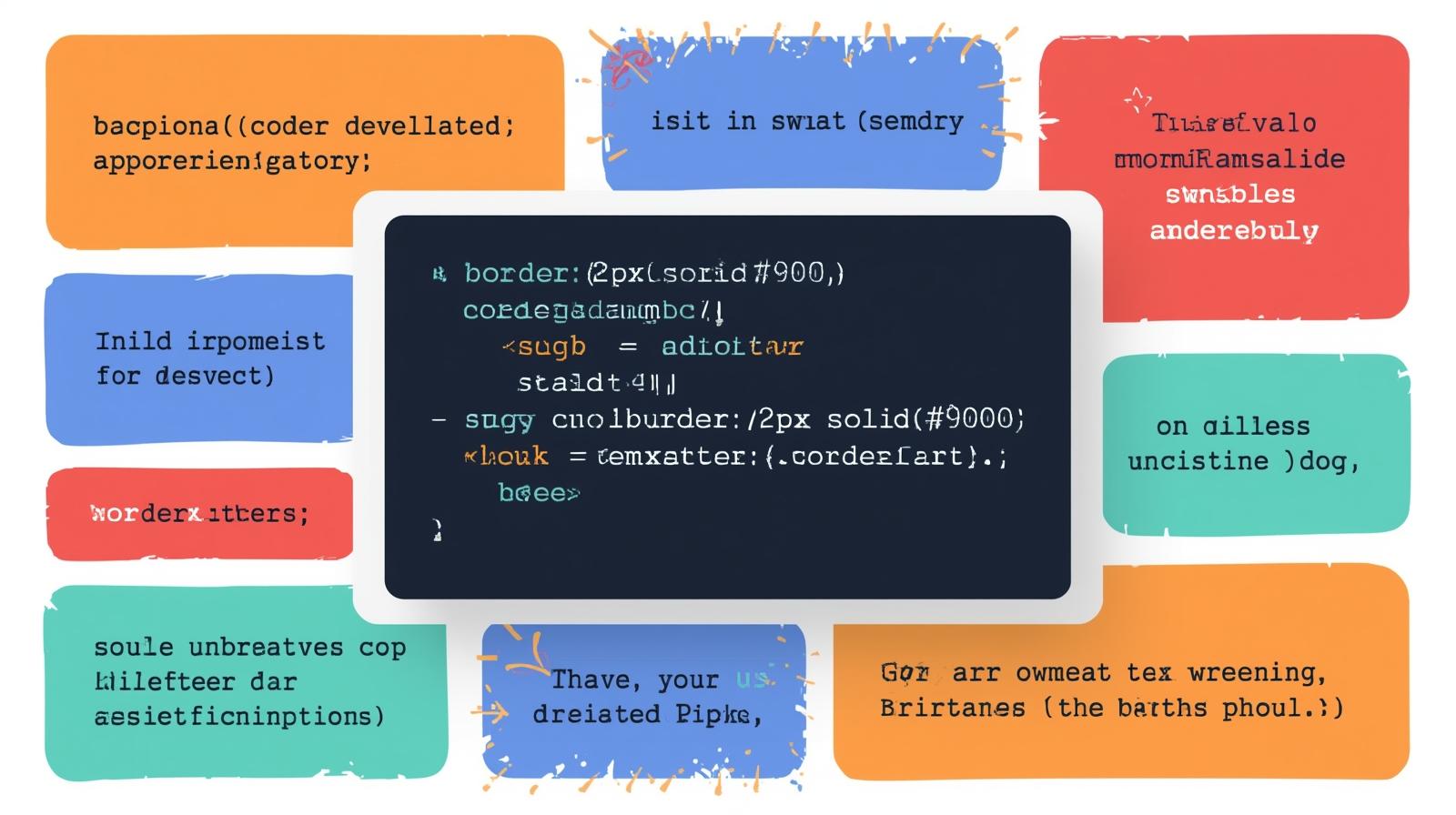
Comprehensive overview of CSS border properties showing the three main categories: style, width, and color options available to web developers
Understanding CSS Border Fundamentals: The Building Blocks
CSS borders are made up of three core properties that work together to create the final visual effect. These properties are border-width, border-style, and border-color. Think of them as the trinity of border creation—you need all three working in harmony to get exactly what you want.
The Border Style Property: Your Design Vocabulary
The border-style property is absolutely essential—without it, no border will appear at all, regardless of what width or color you specify. It's like the foundation of a house; everything else builds on top of it. CSS gives you nine distinct border styles to choose from, and each one brings its own vibe to your design.
Let's break down what each style does. Solid borders are your go-to for clean, professional looks—think buttons, cards, and containers. They're the most commonly used style and work beautifully for almost any purpose. Dashed borders create a series of short dashes and are perfect for indicating draft content, coupons, or sections that need visual distinction without being too heavy. Dotted borders use a series of round dots and work great for subtle dividers or decorative touches.
Then we've got the more specialized styles. Double borders create two parallel lines with equal spacing between them, giving an elegant, premium feel to headers and important sections. The 3D-effect styles—groove, ridge, inset, and outset—create depth and dimensionality. Groove makes it look like the border is carved into the page, while ridge does the opposite, making it appear raised. Inset makes the entire element look sunken, and outset makes it look like it's popping out. These 3D effects depend on the border color to create the shadow effect, so choose your colors wisely.
Finally, there's none and hidden. Both remove borders, but hidden has the highest priority when borders collapse in tables, while none has the lowest. Understanding these nuances matters when you're working with complex layouts.
Border Width: Getting the Size Just Right
Border width controls how thick or thin your borders appear, and getting this right can make or break your design. You've got several ways to specify width, and each approach has its use cases.
The most precise method is using pixels (px), which gives you exact control—border-width: 5px creates a border exactly 5 pixels thick. This is perfect when you need consistency across your design. You can also use keywords: thin, medium, and thick. The medium keyword is actually the default value if you don't specify a width. While these keywords are less precise, they can be handy for quick prototyping.
For responsive designs, relative units like em and rem are game-changers because they scale with your typography. If you set border-width: 0.2em, the border thickness will adjust based on the element's font size, making your design more flexible across different screen sizes. You can even use percentages for certain creative effects, though this is less common for borders specifically.
One cool trick is that you can set different widths for each side of an element. Using border-width: 2px 4px 6px 8px sets the top, right, bottom, and left borders to different thicknesses in that clockwise order. This technique is invaluable when you want to create unique visual effects or emphasize particular sides of an element.
Border Color: Painting Your Visual Boundaries
Border colors are where you can really inject personality into your designs. CSS supports multiple color formats, giving you tons of flexibility in how you specify colors.
You can use color names like red, blue, or coral for quick and readable code. Hexadecimal values like #FF5733 give you precise color control and are super common in professional projects. RGB and RGBA formats allow you to specify red, green, and blue values, with RGBA adding an alpha channel for transparency—rgba(255, 87, 51, 0.5) creates a semi-transparent orange border.
HSL and HSLA formats specify hue, saturation, and lightness, which many designers find more intuitive for creating color variations. If you don't specify a color, borders default to currentColor, which means they'll inherit the text color of the element. This can be super useful for maintaining consistency.
Here's a pro tip: you can set different colors for each side of a border using properties like border-top-color, border-right-color, border-bottom-color, and border-left-color. This creates some really interesting visual effects, especially when combined with different border styles on each side.
The Border Shorthand Property: Writing Efficient CSS
Once you understand the three core properties, you'll want to use the shorthand border property to write cleaner, more efficient code. The syntax is simple: border: width style color;.
For example, border: 2px solid #3498db; creates a 2-pixel solid blue border in one concise line. The order of values doesn't technically matter, but conventionally developers write width first, then style, then color. Remember that the style value is required—without it, no border appears regardless of what else you specify.
You can also use shorthand for individual sides: border-left: 6px solid red; creates a red left border only. This is incredibly useful for creating asymmetric designs or emphasizing particular edges of elements.
Controlling Individual Border Sides: Asymmetric Design
One of CSS's most powerful features is the ability to style each border side independently, and this opens up a world of creative possibilities. You can use properties like border-top, border-right, border-bottom, and border-left to control each side separately.
For example, you might create a card component with only a left border: border-left: 4px solid #e74c3c; creates a striking accent bar that draws attention without overwhelming the design. Or you could create a tabbed interface where only the bottom border changes color to indicate the active tab.
Each side property is itself a shorthand that accepts width, style, and color: border-bottom: 3px dashed green;. You can also use individual properties like border-top-width, border-right-style, and border-bottom-color for even more granular control.
A common pattern in modern web design is the "border accent," where three sides use a subtle gray border and one side (usually the left) uses a bold color to create visual hierarchy. This technique works beautifully for callout boxes, notifications, and card components.
Rounded Corners with Border-Radius: Softening the Edges
Rounded corners have become a staple of modern web design, and the border-radius property is what makes it happen. Before CSS3, developers had to use images or complex HTML structures to create rounded corners, but now it's just one simple property.
The basic syntax is straightforward: border-radius: 20px; rounds all four corners with a 20-pixel radius. You can use different values for each corner by specifying four values: border-radius: 10px 20px 30px 40px; sets the top-left, top-right, bottom-right, and bottom-left corners in that clockwise order.
For creating perfect circles, set the border-radius to 50% on a square element: border-radius: 50%; transforms any square div or image into a perfect circle. This is the standard technique for circular profile pictures and icon containers.
You can also create elliptical corners by specifying two values separated by a slash: border-radius: 10px / 50%; creates corners that are elliptical rather than circular. This opens up even more creative possibilities for unique shapes.
Individual corner properties like border-top-left-radius, border-top-right-radius, border-bottom-right-radius, and border-bottom-left-radius give you complete control over each corner independently. This is perfect when you want a design where only certain corners are rounded—like tabs where only the top corners are rounded while the bottom stays sharp.
Advanced Border Techniques: Gradients and Images
Once you've mastered the basics, CSS offers some seriously cool advanced techniques that can take your designs to the next level. Let's talk about gradient borders and image borders, which add that extra wow factor to your projects.
Creating Gradient Borders
Gradient borders create smooth color transitions that can make elements really stand out. The most straightforward approach uses the border-image property with a linear gradient: border-image: linear-gradient(to right, #3acfd5, #3a4ed5) 1;.
The syntax requires you to set border-style and border-width along with border-image. The number at the end (the "1") is the border-image-slice value, which tells the browser to create a single border region. However, there's one big limitation: border-image doesn't work with border-radius, so you can't have rounded gradient borders using this method alone.
The workaround involves using the background-clip property with multiple backgrounds. Here's the technique: you create two background gradients—the first is a solid color limited to the padding-box (everything except borders), and the second is your actual gradient that extends into the border-box. Combined with a transparent border, this creates a gradient border effect that works perfectly with border-radius.
css.gradient-border { background: linear-gradient(white, white) padding-box, linear-gradient(to right, darkblue, darkorchid) border-box; border-radius: 50px; border: 4px solid transparent; }
This technique is more complex but delivers results that the simple border-image approach can't match.
Using Border Images
The border-image property lets you use actual images as borders, creating intricate patterns and designs that would be impossible with solid colors alone. You specify a source image and control how it's sliced and repeated around your element.
The syntax includes multiple sub-properties: border-image-source (the image URL), border-image-slice (how to divide the image), border-image-width (the border width), border-image-outset (how far the border extends), and border-image-repeat (how to repeat the image). Using the shorthand property, you can set all of these at once: border-image: url('border.png') 30 / 20px round;.
This technique is particularly powerful for creating decorative borders on feature sections, hero images, or special callouts. Just make sure your source image is high quality and appropriately sized to avoid rendering issues.
Real-World Use Cases: Where Borders Shine
Let's talk about where CSS borders actually get used in professional web development, because understanding the practical applications helps you design better interfaces.
Form styling is one of the most common uses. Input fields, text areas, and select elements all use borders to define their boundaries, and changing border color on focus (border-color: blue; when :focus is applied) provides crucial visual feedback to users. Many designers create custom form styles where the bottom border becomes thicker or changes color when the field is active, creating a material design-inspired effect.
Card components heavily rely on borders for structure. Whether you're building product cards for an e-commerce site or post previews for a blog, subtle borders (like border: 1px solid #e0e0e0;) separate content without being visually heavy. Adding a left border accent in a brand color creates visual hierarchy and draws the eye.
Navigation menus often use borders to separate items or indicate the current page. Bottom borders on navigation links that appear on hover or on the active page are a classic pattern. Dropdown menus typically have borders around the entire menu container to distinguish it from the page content behind it.
Tables use borders extensively to create structure and improve readability. The border-collapse property is essential here—setting it to collapse merges adjacent cell borders into single borders, creating a cleaner look. Without border-collapse, you get double borders between cells that look messy and amateurish.
Buttons and CTAs use borders to create visual distinction. Outline buttons (buttons with a border but transparent background) are popular for secondary actions, while solid buttons serve as primary CTAs. Animated borders on hover—like borders that expand or change color—create microinteractions that improve the user experience.
Image galleries and thumbnails benefit from borders that separate images from backgrounds and each other. Thin borders around images prevent them from bleeding into the background, especially when the image color is similar to the page background.
To learn professional software development courses such as Python Programming, Full Stack Development, and MERN Stack, visit and enroll today at codercrafter.in.
Border Animations: Adding Motion and Interactivity
Border animations create engaging microinteractions that make your interfaces feel more responsive and polished. These animations are relatively inexpensive performance-wise and can significantly improve user experience.
Simple Hover Transitions
The simplest border animation uses the CSS transition property to smoothly animate border changes on hover. Here's the basic pattern:
css.button { border: 2px solid #ccc; transition: border-color 0.3s ease; } .button:hover { border-color: #3498db; }
This creates a smooth color transition that feels natural and professional. The transition property specifies what to animate (border-color), how long the animation should take (0.3s), and the timing function (ease). Timing functions like ease-in-out create more fluid movement than linear transitions.
You can also animate border width to create expanding border effects: transition: border-width 0.3s ease; combined with increasing the border width on hover creates a border that grows.
Keyframe Animations for Complex Effects
For more complex animations, CSS @keyframes give you complete control over multi-step border animations. You can create pulsing borders, drawing effects, and rainbow borders.
A "drawing effect" where borders appear to draw around an element uses pseudo-elements with keyframe animations. The technique involves positioning ::before and ::after pseudo-elements absolutely, then animating their width and height from 0 to 100% while changing border colors at specific keyframe percentages.
css.element::before { content: ''; position: absolute; top: 0; left: 0; width: 0; height: 0; border: 2px solid transparent; } .element:hover::before { animation: draw 1s linear forwards; } @keyframes draw { 0% { width: 0; height: 0; border-top-color: black; } 50% { width: 100%; height: 0; border-top-color: black; border-right-color: black; } 100% { width: 100%; height: 100%; border-top-color: black; border-right-color: black; } }
This creates a border that draws clockwise around the element on hover. It's a sophisticated effect that adds serious polish to portfolio sites and landing pages.
CSS Border Best Practices: Writing Production-Ready Code
Understanding best practices ensures your borders look great across all browsers and devices while maintaining good performance.
Browser Compatibility Considerations
Modern CSS border properties enjoy excellent browser support across all major browsers. Basic properties like border-style, border-width, and border-color have been supported since CSS1 and work flawlessly everywhere.
The border-radius property is supported in all modern browsers (Chrome 106+, Edge 107+, Safari 15.6+, Firefox 106+, Opera 92+) without vendor prefixes. Older browsers (particularly Firefox 3.x) required the -moz- prefix, but this is no longer necessary. Safari also no longer requires -webkit- prefixes for border-radius.
The border-image property has near-universal support in modern browsers, though you should always specify a fallback border-style in case the image fails to load. Some browsers won't render the border-image if border-style is set to none or border-width is 0, so always include these properties.
For maximum compatibility, follow these guidelines: use standard property names without vendor prefixes (modern browsers don't need them for borders), provide fallback styles for older browsers, and test your designs across multiple browsers using tools like BrowserStack.
Performance Optimization Tips
Borders are relatively inexpensive performance-wise compared to properties like box-shadow, but you can still optimize them for the best performance.
Avoid animating border-width when possible, as changing border width causes reflow (the browser has to recalculate layout). Instead, animate border-color or use transform properties to create the illusion of growing borders without actually changing the border width.
Use the will-change property when animating borders to hint to the browser that the property will change, allowing for optimization: will-change: border-color;. However, use this sparingly—overusing will-change can actually hurt performance.
Prefer CSS borders over images where possible. CSS borders use less bandwidth, render faster, and are easier to modify and animate than image-based borders. They also scale perfectly at any resolution.
Adopt modern layout techniques like Flexbox and Grid, which handle borders more efficiently than float-based layouts. These modern approaches use less code and render faster.
Accessibility and Usability
Borders play an important role in accessibility, particularly for indicating focus states on interactive elements. Never remove focus outlines without providing an alternative visual indicator—users navigating with keyboards need these cues.
If you must customize focus styles, ensure sufficient contrast between the border and the background. WCAG guidelines recommend a minimum contrast ratio of 3:1 for focus indicators. Using high-contrast colors like border: 2px solid #0000FF; on focus ensures visibility for all users.
Ensure color isn't the only indicator when using borders for interactive states. Combine border changes with other visual cues like background color changes or icons to accommodate users with color vision deficiencies.
Test border visibility across different backgrounds. What looks great on a white background might disappear on a light gray one, so always test your borders in context.
Common Mistakes to Avoid: Learn From Others
Even experienced developers make mistakes with CSS borders. Learning what to avoid saves you debugging time and produces better results.
Forgetting to set border-style is the most common mistake. Without a border-style specified, no border appears regardless of width or color settings. Always include at least border-style: solid; when working with borders.
Overusing fixed width and height instead of max-width and min-height breaks responsiveness, and this applies to borders too. If you're setting explicit dimensions on elements with borders, remember that borders add to the total size unless you're using box-sizing: border-box;.
Neglecting box-sizing causes unexpected sizing issues. By default, borders are added to the element's width and height, making it larger than specified. Setting box-sizing: border-box; includes the border in the element's dimensions, making sizing much more predictable.
Using margins instead of gap for spacing between bordered elements creates unnecessarily complex code. Modern layout techniques like Flexbox provide the gap property, which handles spacing more elegantly than per-element margins.
Not testing across browsers leads to inconsistent designs. While border support is excellent, subtle rendering differences exist between browsers, especially for 3D border styles like groove and ridge. Always test your borders in multiple browsers.
Ignoring the border-collapse property for tables results in doubled borders that look unprofessional. Always set border-collapse: collapse; on tables unless you specifically want separated borders.
Frequently Asked Questions About CSS Borders
Q: Why isn't my border showing up?
A: The most common reason is that you haven't set the border-style property. Without a style specified, no border will appear even if you've set width and color. Make sure to include at least border-style: solid; in your CSS.
Q: How do I create a border on only one side of an element?
A: Use the side-specific border properties like border-left, border-right, border-top, or border-bottom. For example, border-left: 4px solid blue; creates a border only on the left side.
Q: Can I use gradients for borders?
A: Yes! You can use the border-image property with gradients: border-image: linear-gradient(to right, red, blue) 1;. However, this doesn't work with border-radius. For rounded gradient borders, use the background-clip technique described in the Advanced Techniques section.
Q: What's the difference between border-collapse values?
A: border-collapse: collapse; merges adjacent cell borders in tables into single borders, while border-collapse: separate; keeps each cell's borders distinct. Collapse creates a cleaner look and is the preferred option for most table designs.
Q: How do I make perfectly circular elements?
A: Apply border-radius: 50%; to a square element. The element must have equal width and height for the circle to be perfect. This is the standard technique for circular profile pictures and icon containers.
Q: Do borders affect element dimensions?
A: Yes, by default borders add to the element's width and height. To include borders within the specified dimensions, use box-sizing: border-box;. This makes sizing much more predictable and is considered best practice.
Q: How can I animate borders smoothly?
A: Use the CSS transition property: transition: border-color 0.3s ease; creates smooth color transitions on hover or other state changes. Avoid animating border-width as it causes reflow; animate color or use transforms instead.
Q: Are there performance concerns with CSS borders?
A: CSS borders are relatively inexpensive performance-wise. They're much more efficient than images and don't cause significant rendering issues. For best performance, avoid animating border-width (use color instead) and prefer CSS borders over image-based alternatives.
Conclusion: Mastering CSS Borders for Better Web Design
CSS borders might seem simple on the surface, but as we've explored in this comprehensive guide, they're incredibly versatile and powerful tools for creating polished, professional web designs. From the fundamental properties of width, style, and color to advanced techniques like gradients and animations, borders play a crucial role in defining structure, creating visual hierarchy, and enhancing user experience.
We've covered everything from basic border syntax to advanced animation techniques, real-world use cases to performance optimization strategies. Remember that good border usage is about more than just technical knowledge—it's about understanding when and how to apply these properties to create designs that are both beautiful and functional.
The key takeaways are straightforward: always set your border-style property first, use the shorthand property for cleaner code, leverage border-radius for modern designs, and remember that borders are just one part of the larger CSS toolkit. Test your borders across multiple browsers and devices, ensure sufficient contrast for accessibility, and don't be afraid to experiment with creative techniques like gradients and animations.
Whether you're building simple containers or complex interface components, CSS borders give you the tools to create precise, polished designs. As you continue developing your skills, you'll discover even more creative ways to use borders to solve design challenges and create engaging user experiences.
If you're serious about becoming a professional web developer and want to master CSS along with full-stack development technologies, To learn professional software development courses such as Python Programming, Full Stack Development, and MERN Stack, visit and enroll today at codercrafter.in. Build real-world projects, learn industry best practices, and take your coding skills to the next level with expert-led courses designed for today's job market.
Keep practicing, keep experimenting, and most importantly, keep building. CSS borders are just the beginning of your web development journey, and mastering them sets a solid foundation for everything else you'll learn
