CSS Accessibility: Why It's a Game-Changer for Web Dev

Level up your web development skills! Learn how CSS accessibility boosts usability for everyone
CSS Accessibility: It's Not Just a "Nice-to-Have," It's a Core Skill
Let's be real. When we talk about web accessibility, our minds often jump straight to semantic HTML (<nav>, <main>, <article>, you know the drill) and ARIA attributes. We treat CSS like the pretty face of the operation—the one that just makes things look good.
But what if I told you that your CSS can either build a bridge for millions of users or slam a door in their faces?
Yeah, it's that serious.
CSS accessibility is the art of using your stylesheets not just to style, but to communicate, guide, and include. It’s about ensuring that the visual experience you craft is perceivable, operable, and understandable for everyone, regardless of how they interact with the web.
Think about someone navigating with just a keyboard. Or someone with low vision who relies on high contrast modes. Or someone with a cognitive disability who gets overwhelmed by flashing animations. Your CSS choices directly impact these users.
So, let's break down how you can stop thinking of CSS as just a styling tool and start using it as a powerhouse for inclusivity.
The Lowdown: How CSS and Accessibility are BFFs
At its core, web accessibility (often abbreviated as a11y) is about removing barriers. And CSS is your primary tool for controlling presentation. When used wisely, it enhances the underlying HTML structure without breaking it.
The golden rule? CSS is for presentation, HTML is for structure and meaning. You can't use CSS to fix bad HTML, but you can definitely use bad CSS to break good HTML.
Real-World Scenarios: Where Your CSS Makes or Breaks the Experience
1. Focus Indicators: Don't You Dare outline: none;
You've probably seen it, or even done it. That little blue glow or dotted line around a link or button when you tab through a site. The default can look a bit... basic. So the temptation is to just nuke it:
css
button:focus {
  outline: none;
}
STOP. RIGHT. THERE.
For keyboard users, that focus ring is their GPS. Removing it is like driving blindfolded. They have no idea where they are on the page.
The Accessible Way: Style it! Make it even better.
css
button:focus {
  outline: 3px solid #005fcc;
  outline-offset: 2px;
  border-radius: 2px;
}
This creates a high-contrast, clearly visible indicator that is actually more stylish than the default.
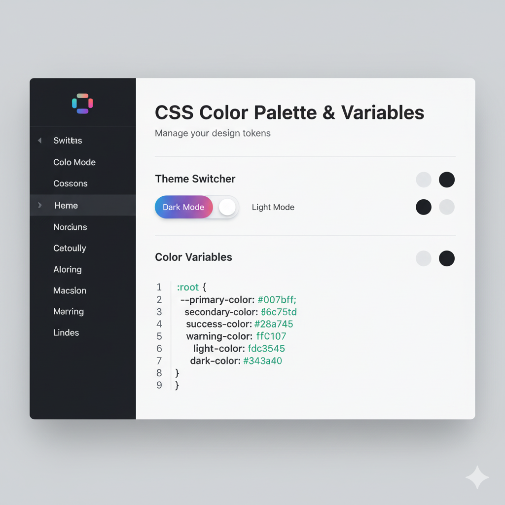
2. Color and Contrast: It's Not Just About Aesthetics
That light grey text on a white background might look minimalist and chic, but for roughly 1 in 12 men with color vision deficiency, it's completely unreadable.
The Rule: Ensure a minimum color contrast ratio. The Web Content Accessibility Guidelines (WCAG) require a contrast ratio of at least 4.5:1 for normal text.
The Accessible Way: Use tools! Don't just guess.
Browser DevTools: Most browsers now have a built-in contrast checker in their elements inspector.
WebAIM Contrast Checker: A fantastic online tool to test your color combinations.
Never use color alone to convey meaning. For example, a form error shouldn't just be a red outline; it should also have an icon and clear text like "This field is required."
3. Hover States & Touch Targets: Bigger is Better
Tiny buttons and links are a pain for everyone, but they're a nightmare for users with motor impairments.
The Rule: Make sure interactive elements are large enough to click or tap easily. WCAG recommends a minimum size of 44x44 pixels.
Also, rely on more than just :hover. What about touchscreen users? Someone using a voice command tool? Always provide a fallback.
css
/* Good for mouse users */
button:hover {
  background-color: #e0e0e0;
}

/* Essential for all users, especially when paired with focus */
button:focus,
button:active {
  background-color: #d0d0d0;
  transform: scale(1.05); /* A subtle feedback */
}
4. Hiding Content (The Right Way)
Sometimes you need to hide content visually but keep it available for screen readers. A classic example is a "skip to main content" link.
The Wrong Way: display: none; or visibility: hidden; completely removes the element from the accessibility tree.
The Accessible Way: Use a CSS pattern that visually hides content but keeps it accessible.
css
.sr-only {
  position: absolute;
  width: 1px;
  height: 1px;
  padding: 0;
  margin: -1px;
  overflow: hidden;
  clip: rect(0, 0, 0, 0);
  white-space: nowrap;
  border: 0;
}
This "screen-reader only" class shifts the element off-screen, making it invisible to sighted users but perfectly readable by assistive tech.
5. Respecting User Motion Preferences
Some people are sensitive to animations that flash, spin, or zoom. It can cause vertigo or migraines. Luckily, CSS has a fantastic feature for this: prefers-reduced-motion.
The Accessible Way: Wrap your animations in a media query.
css
.my-fancy-spin {
  animation: spin 2s infinite linear;
}

@media (prefers-reduced-motion: reduce) {
  .my-fancy-spin {
    animation-duration: 0.01s; /* Effectively remove it */
    /* Or use animation: none; */
  }
}
This shows respect for the user's system-level preferences and is a mark of a truly professional developer.
Your CSS Accessibility Checklist (Copy-Paste This)
Focus Indicators: Styled and visible, never removed.
Color Contrast: Checked with a tool, minimum 4.5:1 for text.
Color Independence: Meaning is not conveyed by color alone.
Touch Targets: Buttons and links are at least 44x44px.
Text Readability: Use relative units (
rem,em) for font sizes so users can zoom.Reduced Motion: Used
prefers-reduced-motionto tone down or remove animations.Logical Flow: The visual order (controlled by CSS Grid/Flexbox) matches the DOM order for tabbing.
Print Styles: Consider adding a print stylesheet so content is legible when printed.
FAQs: Quick Fire Round
Q: My design has low-contrast text. The client insists. What do I do?
A: Push back. Explain the legal and ethical implications. Show them the statistics on how many users they're excluding. Frame it as a business risk and a loss of potential customers.
Q: Does using em or rem really matter that much?
A: Absolutely. If a user increases their default browser font size, sites using px might not scale properly. Using rem respects the user's settings, which is a core accessibility principle.
Q: Are CSS frameworks like Bootstrap or Tailwind accessible?
A: They can be, but they aren't magic. Bootstrap has good accessibility built-in for components, but it's up to you to use them correctly. Tailwind gives you the tools, but the responsibility to combine them accessibly is on you. Don't blame the framework!
Q: Where can I learn more about this stuff?
A: The Web Accessibility Initiative (WAI) by W3C is the ultimate resource. Also, follow accessibility experts on Twitter and LinkedIn. The field is always evolving.
Conclusion: Be the Developer Who Cares
Writing accessible CSS isn't about memorizing a bunch of boring rules. It's about developing empathy. It's about shifting your mindset from "Does this look cool?" to "Can everyone use this?"
It’s what separates a good developer from a great one. In today's competitive landscape, companies are actively seeking developers who build with inclusivity in mind. It's no longer a niche skill—it's a professional requirement.
Mastering these concepts is a core part of becoming a well-rounded, industry-ready software developer.
Ready to build beautiful, functional, and inclusive websites from the ground up? To learn professional software development courses such as Python Programming, Full Stack Development, and the MERN Stack, all taught with best practices like accessibility in mind, visit and enroll today at codercrafter.in. Let's build a more accessible web, together.
