CSS 2D Transforms: A No-BS Guide to Move, Scale, and Rotate Your Web Elements
Stop building static, boring websites. Master CSS 2D Transforms with this in-depth guide. Learn translate, rotate, scale, skew, and matrix with real-world examples and code. Level up your front-end skills today!
Let's be real for a second. The web can feel a bit... samey. Boxes within boxes, grids, and cards. It's clean, it's functional, but sometimes you look at a site and think, "Okay, but where's the personality? Where's the pop?"
Enter CSS 2D Transforms.
This isn't some fancy, out-of-reach, NASA-level tech. This is a core part of CSS that lets you break your elements out of the static mold. Think of it as giving your HTML elements superpowers. Want a button that lifts up when you hover? A profile picture that tilts slightly? A notification badge that scales in with a little bounce? That's all 2D Transforms, my friend.
In this deep dive, we're going to move beyond the theory and get our hands dirty with the code that makes websites feel alive and interactive. By the end of this, you'll be wielding transform like a pro.
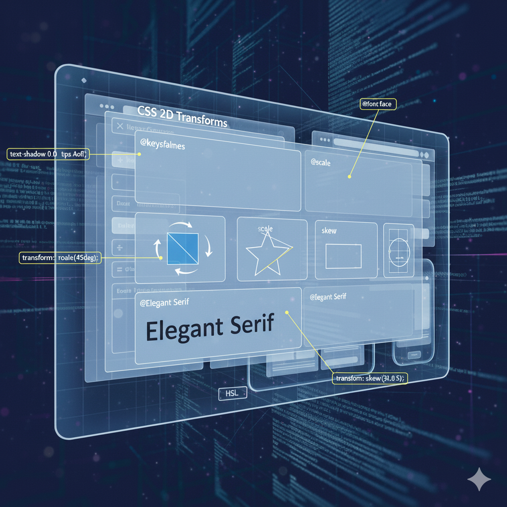
What Are CSS 2D Transforms, Actually?
In the simplest terms, a 2D Transform is a CSS property that lets you visually manipulate an element in a two-dimensional space. The key word here is manipulate. It doesn't affect the layout around it (like changing margin or padding would); it just changes how the element itself is rendered on the screen.
The magic happens with the transform property. This one property is your gateway to several functions:
translate(): Move it.rotate(): Spin it.scale(): Resize it.skew(): Slant it.matrix(): The master control that combines all of the above.
The best part? Because it doesn't mess with the document flow, animations using transform are buttery smooth and highly performant. The browser's rendering engine loves optimizing these changes.
Breaking Down the Transform Functions (With Code You Can Steal)
Let's get into the nitty-gritty of each function. I'll show you the code and what it does.
1. translate() - The Mover
This is your go-to for moving an element from its original position. It's like using position: relative with top and left, but again, much better for performance.
transform: translateX(50px);→ Moves it 50px to the right.transform: translateY(-20px);→ Moves it 20px up.transform: translate(25px, 50px);→ Moves it 25px right and 50px down.
Real-World Use Case: The classic "hover lift" effect on cards.
css
.card {
  transition: transform 0.3s ease;
}

.card:hover {
  transform: translateY(-10px); /* Lifts the card 10px up */
  box-shadow: 0 10px 20px rgba(0,0,0,0.1); /* Adds a shadow for depth */
}
2. rotate() - The Spinner
This one does exactly what it says on the tin. It rotates an element. You can use degrees (deg), radians (rad), or turns (turn).
transform: rotate(45deg);→ Rotates the element 45 degrees clockwise.transform: rotate(-0.125turn);→ Same as-45deg(because 0.125 * 360 = 45).
Real-World Use Case: A "loading" icon or a decorative element that needs a bit of dynamic flair.
css
.loading-spinner {
  width: 40px;
  height: 40px;
  border: 4px solid #f3f3f3;
  border-top: 4px solid #3498db;
  border-radius: 50%;
  animation: spin 1s linear infinite;
}

@keyframes spin {
  0% { transform: rotate(0deg); }
  100% { transform: rotate(360deg); }
}
3. scale() - The Resizer
This changes the size of an element. A value of 1 is the original size. 2 is twice as big, 0.5 is half the size.
transform: scale(1.2);→ Makes the element 20% larger.transform: scaleX(0.8);→ Squishes it horizontally to 80% width.transform: scale(1.1, 0.9);→ Makes it wider but shorter.
Real-World Use Case: Zooming in on a product image thumbnail or making a button feel "pressable."
css
.thumbnail {
  transition: transform 0.2s ease;
}

.thumbnail:hover {
  transform: scale(1.05);
  cursor: zoom-in;
}
4. skew() - The Slanter
This one creates a... well, a skew effect. It slants an element along the X and/or Y-axis. It can create some cool parallax or distorted effects.
transform: skewX(15deg);→ Slants the element sideways, like a parallelogram.transform: skewY(-10deg);→ Slants it vertically.transform: skew(15deg, -10deg);→ Combines both.
Real-World Use Case: Creating interesting section dividers or dynamic background elements.
css
.diagonal-section {
  transform: skewY(-3deg);
  background-color: #f06d06;
}
.diagonal-section > .content {
  transform: skewY(3deg); /* Counter-skew the content so it's readable */
}
5. matrix() - The Boss Level
The matrix(a, b, c, d, tx, ty) function is the big one. It combines all the transformations into one function using a mathematical transformation matrix. tx and ty are for translate, while a, b, c, d control scale, skew, and rotate.
Honestly, you'll rarely write this by hand. Developers often use tools or the browser's dev tools to generate this value. It's powerful but not very human-readable.
The Power of Combining Transforms
Here's where the real magic happens. You can chain multiple transform functions in a single transform property. The order matters! rotate(45deg) translate(50px) is very different from translate(50px) rotate(45deg).
In the first one, the element rotates around its origin and then moves 50px along the now-rotated axis. In the second, it moves 50px to the right and then rotates in place.
Example: A Cool Hover Button
css
.cta-button {
  padding: 15px 30px;
  background: #4CAF50;
  color: white;
  border: none;
  transition: transform 0.4s ease, background-color 0.4s ease;
}

.cta-button:hover {
  transform: scale(1.05) rotate(2deg);
  background-color: #45a049;
  cursor: pointer;
}
This makes the button grow slightly and give a subtle, playful tilt on hover.
Best Practices & Pro-Tips
Always Pair with
transition: A transform that happens instantly can be jarring. Almost always use thetransitionproperty to animate the change, making it feel natural.Mind the Performance:
transformandopacityare the two safest properties to animate for buttery-smooth 60fps performance. They don't trigger expensive layout or paint operations.Use
transform-origin: This property lets you change the point around which a transformation happens. Want to scale an element from its bottom-right?transform-origin: bottom right;. Want to spin a door from its hinge? This is how.Combine with Pseudo-elements: You can create amazing effects by applying transforms to
::beforeand::afterpseudo-elements, like creating layered backgrounds or animated underlines.
Mastering these concepts is what separates hobbyists from professional developers. If you're looking to build a rock-solid foundation in modern web development, our project-based courses are the perfect launchpad. To learn professional software development courses such as Python Programming, Full Stack Development, and MERN Stack, visit and enroll today at codercrafter.in.
FAQs: Your Questions, Answered
Q: Do CSS Transforms work on inline elements?
A: Yes, but applying a transform to an inline element (like a <span>) can change its display behavior to a block-level element for the purpose of the transform.
Q: What's the difference between transform: translate(50px, 50px) and position: relative; top: 50px; left: 50px;?
A: The visual result is similar, but transform is handled by the GPU and doesn't affect the document flow. The position method can cause a re-layout of surrounding content and is generally less performant for animations.
Q: Can I use percentages with translate()?
A: Yes! And it's super useful. The percentage is based on the element's own dimensions. So translateX(50%) would move the element 50% of its own width to the right. This is fantastic for centering an element absolutely: top: 50%; left: 50%; transform: translate(-50%, -50%);.
Q: How do skew() and rotate() differ?
A: rotate() turns the entire element uniformly. skew() stretches the coordinates of the element, creating a distortion effect. It's the difference between turning a rectangle and shearing it.
Conclusion: Go Forth and Transform
CSS 2D Transforms are not just a "nice-to-have." They are an essential tool in the modern front-end developer's toolkit. They empower you to create a more engaging, intuitive, and visually interesting user experience without sacrificing performance.
Start small. Add a translateY on a button hover. Give a card a subtle scale effect. Play with rotate on your icons. Once you get comfortable, you'll start seeing opportunities to use them everywhere.
The goal isn't to make your website look like a circus; it's to use these tools with purpose to guide the user, provide feedback, and add that final layer of polish that makes a site feel premium.
Ready to transform your skills from basic to brilliant? At CoderCrafter, we don't just teach syntax; we teach you how to think and build like a professional developer. Check out our comprehensive Full Stack Development program and start building dynamic, portfolio-ready projects. Enroll now at codercrafter.in!


