CSS 3D Transforms: A Beginner's Guide to Mind-Blowing Web Effects
Ready to make your websites pop? Dive into our beginner-friendly guide on CSS 3D Transforms. Learn with practical examples, real-world use cases, and best practices to level up your front-end skills.
Let's be real for a second. The web can feel a bit... flat. Boxes, grids, more boxes. It's functional, but is it fun? What if you could break your elements out of that 2D prison and make them spin, flip, and explode into the third dimension?
That’s exactly what CSS 3D Transforms are for. This isn't just some fancy-pants trick for senior devs; it's a powerful tool that can make your user interfaces more intuitive, your websites more memorable, and your front-end skills 10x more impressive.
In this deep dive, we're not just going to skim the surface. We're going to get our hands dirty, understand the core concepts, and build some seriously cool stuff. Buckle up!
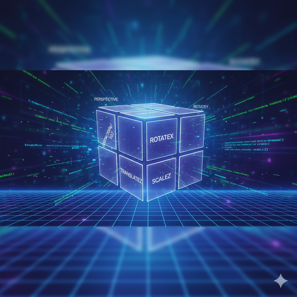
First Things First: What Even Are CSS 3D Transforms?
In the simplest terms, CSS 3D Transforms are a set of properties that allow you to change the shape, position, and orientation of an HTML element in a three-dimensional space.
Think of it like this: your browser viewport is a stage. A normal div is just a piece of paper lying flat on that stage. CSS 3D Transforms let you pick up that paper, rotate it, move it closer or further away, and even skew it. You're manipulating it in a 3D context.
The magic happens thanks to your GPU (Graphics Processing Unit). When you use 3D transforms, the browser often hands off the rendering to the GPU, which is built for this kind of math, making the animations buttery smooth.
The Core Concepts You NEED to Grasp
Before we start coding, let's set the stage (pun intended) with three key ideas:
The 3D Coordinate System: Your browser has three axes:
X-axis: Runs horizontally (left to right).
Y-axis: Runs vertically (top to bottom).
Z-axis: The new one! It runs perpendicular to your screen. Positive Z comes towards you, and negative Z goes away from you.
The Transform Property: This is your main tool. The
transformproperty is where you apply all your 3D functions likerotate3d(),translate3d(), etc.Perspective: This is the most crucial concept. Without perspective, you won't see any 3D effect. Perspective is what creates the illusion of depth. It's like deciding where the user is standing in relation to your 3D scene. You can set it on a parent element using
perspective: 600px;(a lower value creates a more dramatic, "close-up" effect, a higher value is more subtle).
Let's Get Our Hands Dirty: The Key 3D Functions
Alright, theory is boring. Let's look at the code that makes things happen.
1. rotate3d() - Spinning Things Around
This function lets you spin an element around any of the three axes.
transform: rotateX(45deg);- Tilts the element forward/backward.transform: rotateY(45deg);- Spins the element left/right (like a carousel).transform: rotateZ(45deg);- Spins the element clockwise/counter-clockwise (this one is actually a 2D transform, but it works in 3D space).
Pro Tip: You can combine them! transform: rotateX(30deg) rotateY(25deg); gives a cool, tilted look.
2. translate3d() - Moving Things in Space
This function moves an element along the X, Y, and Z axes.
transform: translateX(100px);- Moves it 100px to the right.transform: translateY(-50px);- Moves it 50px up.transform: translateZ(100px);- This is the 3D magic! It moves the element closer to you by 100px. If it has a background, it might now appear larger and cover other elements.transform: translate3d(100px, -50px, 200px);- The shorthand for moving on all three axes at once.
3. scale3d() - Making Things Bigger/Smaller in 3D
Scales an element's dimensions. scaleZ() is rarely used on its own but becomes important when combined with other transforms.
transform: scale3d(1.5, 1, 2);- Makes it 1.5x wider, keeps the height the same, and scales the "depth" by 2.
Building Something Real: A 3D Card Flip
Enough with the isolated examples. Let's build a classic: a card that flips over on hover. This is a perfect demo of how 3D can enhance UI.
HTML Structure:
html
<div class="scene">
  <div class="card">
    <div class="card__face card__face--front">FRONT</div>
    <div class="card__face card__face--back">BACK</div>
  </div>
</div>
CSS Magic:
css
/* 1. Set the stage with Perspective */
.scene {
  width: 200px;
  height: 260px;
  perspective: 600px; /* The user is 600px away from the scene */
}

/* 2. The card itself, with transform-style */
.card {
  width: 100%;
  height: 100%;
  position: relative;
  transition: transform 0.8s; /* Smooth flip animation */
  transform-style: preserve-3d; /* THIS IS KEY! Tells the browser the children are in 3D space */
}

/* 3. Flip the card on hover */
.scene:hover .card {
  transform: rotateY(180deg);
}

/* 4. Position the faces */
.card__face {
  position: absolute;
  width: 100%;
  height: 100%;
  backface-visibility: hidden; /* Hides the back face when it's facing away */
  display: flex;
  align-items: center;
  justify-content: center;
  font-size: 1.5rem;
  color: white;
}

.card__face--front {
  background: #3498db;
}

.card__face--back {
  background: #e74c3c;
  transform: rotateY(180deg); /* The back face starts off already flipped */
}
Boom! You now have a working 3D card flip. The key players here are perspective on the parent, transform-style: preserve-3d on the moving element, and backface-visibility to hide the... well, the back face.
Where You've Seen This IRL (Real-World Use Cases)
This isn't just for fancy portfolios. You see this everywhere:
Product Showcases: E-commerce sites use 3D rotation to let you view a product from all angles.
Interactive Galleries & Carousels: A 3D carousel is far more engaging than a simple slider.
Login/Register Forms: A flip animation to switch between login and sign-up forms is a slick UX pattern.
Dashboard UI: Flipping dashboard cards to reveal more detailed information or settings.
Gaming UIs: 3D is heavily used in web-based games for cards, dice, and interactive elements.
Best Practices: Don't Be That Dev
With great power comes great responsibility. Here’s how to use 3D transforms without making your users motion-sick.
Performance is King: 3D transforms are GPU-accelerated, which is good. But don't go overboard. Animating
top/leftis a performance nightmare; animatingtransformandopacityis buttery smooth.Use
will-changeSparingly: This property hints to the browser that an element is about to be transformed. It can help, but overusing it can hurt performance. Only use it on elements you are sure will be animated.will-change: transform;.Provide a "Reduce Motion" Option: Some users are sensitive to animation. Use the
@media (prefers-reduced-motion: reduce)media query to tone down or disable your animations for them. It's an accessibility win!It's an Enhancement: Your site should still be 100% functional and look good without the 3D effects. Use them to enhance the experience, not as a core requirement.
Test on Mobile: Mobile browsers handle 3D well, but always test. Sometimes you need to add
-webkit-backface-visibility: hidden;for older iOS support.
FAQs: Your Burning Questions, Answered
Q: Do I need to know JavaScript to use 3D Transforms?
A: Not at all! You can create tons of interactive effects using :hover and :focus pseudo-classes. JS comes in when you need more complex, dynamic control (like dragging to rotate).
Q: How is this different from 3D in WebGL/Three.js?
A: CSS 3D is for transforming existing HTML elements (your divs, ps, imgs). It's perfect for UI components. WebGL (often via the Three.js library) is for rendering complex, high-performance 3D graphics, models, and entire scenes from scratch. They serve different purposes.
Q: Why isn't my 3D effect working?
A: 99% of the time, it's one of these:
You forgot to set
perspectiveon a parent element.You forgot
transform-style: preserve-3don the immediate parent of the moving 3D children.Your Z-axis movement is too subtle; try a larger value for
translateZ.
Q: Can I use this with CSS frameworks like Tailwind?
A: Absolutely! Tailwind has utility classes for perspective, rotate-X, translate-Z, etc. The underlying CSS is the same.
Conclusion: Your Next Steps into the Third Dimension
So there you have it. CSS 3D Transforms are not some arcane magic reserved for coding wizards. They are a practical, powerful, and performant way to add depth, context, and a "wow" factor to your projects. Start with a card flip, then try building a 3D cube, and before you know it, you'll be thinking in three dimensions for all your UI challenges.
Mastering these concepts is exactly what separates a good developer from a great one. It's about understanding the medium of the web and pushing its creative boundaries.
Ready to level up your entire skillset and build stunning, professional-grade web applications? This is just the beginning. To learn in-demand, professional software development courses such as Python Programming, Full Stack Development, and the MERN Stack, visit and enroll today at codercrafter.in. We'll help you turn your curiosity into a career.


