CSS Tooltips: The Ultimate Guide to Creating Cool, Code-Free Hover Effects
Stop overcomplicating UI hints! Learn how to create pure CSS tooltips from scratch. We cover custom styles, animations, best practices, and real-world code examples. Level up your front-end skills today!
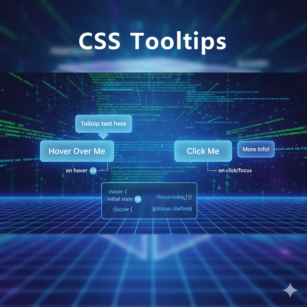
Alright, let's talk about one of the smallest yet most powerful elements in a UI designer's toolkit: the humble tooltip.
You know what I'm talking about. You're hovering over an icon in a new app, and a little text box pops up saying "Settings." Or you're on an e-commerce site, and hovering over a size chart icon reveals, well, the size chart. That little pop of context? That's a tooltip.
For the longest time, we relied on JavaScript for these. But what if I told you that you can create incredibly sleek, customizable, and performant tooltips using nothing but pure CSS? Yep, no extra scripts, no dependencies. Just clean, efficient styling.
In this deep dive, we're not just going to scratch the surface. We're going to build tooltips from the ground up, style them to perfection, add some smooth animations, and talk about the best practices to make them actually useful. Buckle up!
So, What Exactly is a CSS Tooltip?
In simple terms, a CSS tooltip is a small, contextual text box that appears when a user hovers over (or focuses on) an element. The "CSS" part means we're using the ::before or ::after pseudo-elements, combined with the :hover pseudo-class, to create and control this pop-up—all without writing a single line of JavaScript.
It's lightweight, it's fast, and it's a fantastic way to enhance user experience without compromising on performance.
Let's Get Our Hands Dirty: Building a Basic Tooltip
The core concept is genius in its simplicity. We'll use an element's ::after pseudo-element as the tooltip itself. By default, it's hidden. When you hover over the parent element, we make it visible.
The HTML Structure
We don't need much. Just an element to hover on, and we'll add a custom data-* attribute to hold our tooltip text.
html
<button class="tooltip-btn" data-tooltip="This is a cool tooltip!">
  Hover Me!
</button>
See that data-tooltip? That's where we store the text. Using a data-* attribute keeps our HTML semantic and our CSS flexible.
The CSS Magic
This is where the fun begins. Let's break it down step-by-step.
css
/* The parent element that triggers the tooltip */
.tooltip-btn {
  position: relative; /* This is CRUCIAL! It anchors the tooltip to this button. */
  display: inline-block;
  padding: 10px 20px;
  background: #4f46e5;
  color: white;
  border: none;
  border-radius: 6px;
  cursor: pointer;
}

/* The tooltip itself - created using ::after */
.tooltip-btn::after {
  content: attr(data-tooltip); /* This pulls the text from our data-tooltip attribute! */
  position: absolute;
  bottom: 125%; /* Positions the tooltip above the button */
  left: 50%;
  transform: translateX(-50%); /* This centers the tooltip perfectly */

  /* Styling the tooltip */
  background-color: #333;
  color: white;
  padding: 8px 12px;
  border-radius: 4px;
  font-size: 0.85rem;
  white-space: nowrap;

  /* Initially hidden */
  opacity: 0;
  visibility: hidden;
  transition: opacity 0.3s ease, visibility 0.3s ease;
}

/* The magic: Show the tooltip on hover */
.tooltip-btn:hover::after {
  opacity: 1;
  visibility: visible;
}
Boom! You've just created a functional tooltip. The key players here are:
position: relativeon the parent andposition: absoluteon the::after.content: attr(data-tooltip)which dynamically uses our HTML attribute.The transition on
opacityandvisibilityfor a smooth fade-in effect.
Leveling Up: Customization & Variations
A basic black tooltip is cool, but let's make it pop. Here are some common variations.
1. The Directional Tooltip
Why always on top? Let's make tooltips that can appear on the bottom, left, or right.
css
/* Tooltip on the Bottom */
.tooltip-bottom::after {
  top: 125%;
  bottom: auto;
  left: 50%;
  transform: translateX(-50%);
}

/* Tooltip on the Left */
.tooltip-left::after {
  top: 50%;
  right: 125%; /* Positions it to the left */
  bottom: auto;
  left: auto;
  transform: translateY(-50%); /* Centers it vertically */
}

/* Tooltip on the Right */
.tooltip-right::after {
  top: 50%;
  left: 125%; /* Positions it to the right */
  bottom: auto;
  transform: translateY(-50%);
}
2. Adding a Speech Bubble with a Caret
That little pointing triangle makes a tooltip look super professional. We can create it using the ::before pseudo-element.
css
.tooltip-bubble::after {
  /* ... (all the base tooltip styles from before) ... */
  bottom: 100%;
  left: 50%;
  transform: translateX(-50%) translateY(10px); /* Start slightly lower for animation */
}

/* Create the caret (the triangle) */
.tooltip-bubble::before {
  content: '';
  position: absolute;
  bottom: 100%; /* Position it right at the bottom of the tooltip */
  left: 50%;
  transform: translateX(-50%);
  border: 5px solid transparent;
  border-top-color: #333; /* This creates the triangle pointing down */
  opacity: 0;
  visibility: hidden;
  transition: opacity 0.3s ease, visibility 0.3s ease, transform 0.3s ease;
}

.tooltip-bubble:hover::after {
  transform: translateX(-50%) translateY(0); /* Slide into final position */
}
.tooltip-bubble:hover::before {
  opacity: 1;
  visibility: visible;
  transform: translateX(-50%) translateY(0);
}
3. Getting Fancy with Animations
A simple fade is nice, but let's get creative with CSS animations.
css
/* A subtle scale-in effect */
.tooltip-scale::after {
  /* ... base styles ... */
  transform: translateX(-50%) scale(0.8); /* Start scaled down */
  transition: opacity 0.2s ease, visibility 0.2s ease, transform 0.2s ease;
}

.tooltip-scale:hover::after {
  opacity: 1;
  visibility: visible;
  transform: translateX(-50%) scale(1); /* Scale to full size */
}
Real-World Use Cases: Where Do Tooltips Actually Shine?
Tooltips aren't just for fun; they solve real UI/UX problems.
Icon-Only Buttons: In a minimalist toolbar, a "trash" icon needs a "Delete" tooltip for clarity.
Form Field Explanations: Hover over an "i" icon next to "Password" to see the requirements.
Disabling Action Confusion: Greyed-out "Download" button? A tooltip can say "Please complete the form to enable download."
Jargon Busters: A term like "SSL Certificate" in a feature list can have a simple explanation on hover.
Keyboard Shortcuts: Hover over the "Save" button, and the tooltip might say "Save (Ctrl+S)".
Best Practices: Don't Be That Developer
Don't Put Critical Info in Tooltips: If the information is essential for completing a task, it shouldn't be hidden behind a hover. Tooltips are for supplementary content.
Keep it Short and Sweet: A tooltip is not a paragraph. It's a sentence or a few words.
Mind the Delay: On touch devices, there's no "hover." You must have a fallback, often using a click. For truly accessible tooltips, you might eventually need a bit of JavaScript to handle focus and
aria-describedby.Contrast is Key: Make sure your tooltip text is readable against its background color.
Test, Test, Test: Check how your tooltips behave on different screen sizes. A tooltip positioned on the right might disappear off-screen on a mobile device.
FAQs: Your Tooltip Questions, Answered
Q: Can I use HTML inside a CSS tooltip?
A: Unfortunately, no. The content property only renders text. If you need formatted HTML (like a link or bold text) inside your tooltip, you'll have to use a JavaScript solution.
Q: How do I make tooltips work on mobile/touch devices?
A: This is the biggest limitation of pure CSS tooltips. Since there's no persistent hover state, you often need to use a :active pseudo-class (which works on tap) or resort to a small JavaScript library that uses touch events to simulate a hover.
Q: Are pure CSS tooltips accessible?
A: They can be, but you need to be careful. For keyboard users, you should ensure the trigger element is focusable (like a <button>) and the tooltip appears on :focus as well as :hover. Using aria-label or aria-describedby can also help screen readers announce the tooltip content.
Q: Why is my tooltip not showing up?
A: 99% of the time, it's one of these:
Forgot
position: relativeon the parent.Forgot
content: ""in the::afterrule.The
z-indexis too low, and the tooltip is appearing behind another element.
Wrapping Up
CSS tooltips are a perfect example of how powerful modern CSS has become. They allow us to create subtle, performant, and beautiful UI enhancements that make our applications feel more polished and intuitive.
Mastering these small details is what separates a good developer from a great one. It’s about understanding the tools in your belt and knowing when and how to use them to create the best possible experience.
If building these kinds of sleek, user-friendly interfaces from the ground up excites you, you're thinking like a true front-end artisan.
To learn professional software development courses that dive deep into front-end magic, advanced Python Programming, comprehensive Full Stack Development, and the powerful MERN Stack, visit and enroll today at codercrafter.in. We'll help you transform this curiosity into a solid, industry-ready skillset.


