CMYK vs. RGB: The No-BS Guide to Color Models & Conversion
Tired of your prints looking dull? Our detailed guide explains CMYK vs. RGB in plain English, shows you how to convert colors correctly, and shares pro tips to keep your designs vibrant everywhere. Save time and money!
Alright, let's talk about one of the most common "oh crap" moments in digital design: you've just created something absolutely fire on your screen, but when it comes back from the printer, it looks… sad. The colors are dull, that vibrant neon pink is now a dusty rose, and your masterpiece is ruined.
Sound familiar? You've just run headfirst into the CMYK vs. RGB wall. It's a classic rookie mistake, but honestly, even pros get tripped up sometimes. Don't sweat it. Today, we're breaking down everything about these color models and, most importantly, how to convert between them without losing your mind (or your brand's signature color).
Wait, What Even Are RGB and CMYK? (The Simple Explainers)
Let's ditch the textbook jargon.
RGB is your screen's lifeblood.
Think of it as building light. You start with a black screen (darkness) and add Red, Green, and Blue light to create all the colors you see. Mix all three at full power? You get blinding white. This is additive color. It's used for anything that emits light: your phone, your TV, your laptop, digital cameras, you name it. RGB values are usually given as three numbers from 0 to 255. RGB(255, 0, 0) is pure red. RGB(255, 255, 0) makes yellow. RGB(0, 0, 0) is black.
CMYK is how the physical world gets colorful.
This is the paint-by-numbers for printers. You start with a white sheet of paper and add ink to subtract brightness, hence subtractive color. The inks are: Cyan, Magenta, Yellow, and Key (which is black—"K" for "key" because it's the key plate in printing). Mixing cyan, magenta, and yellow should make black, but in reality, it makes a muddy brown. That's why we add pure black ink (K) for depth, crisp text, and to save money on using three inks for every dark area. CMYK values are percentages from 0% to 100%.
The Real-World Beef: Why Can't They Just Get Along?
Here's the core issue: RGB has a much wider range of colors (gamut) than CMYK. Especially those super bright, electric blues, greens, and neon pinks you can make with light? Yeah, you can't print those with ink on paper. There's just no physical ink that matches that luminosity.
When you convert from RGB to CMYK, the printer (or your software) has to take those out-of-bounds colors and find the closest, duller match it can actually produce. This is why your design can look "washed out" in print.
So, When Do I Use Which? (Spoiler: It's Context)
Use RGB for anything digital. Period. Websites, social media graphics, app interfaces, video content, online ads, PowerPoint presentations, anything that will live on a screen.
Use CMYK for anything physical and printed. Business cards, brochures, magazine ads, product packaging, stickers, banners, t-shirts (depending on the printing process), and that fancy letterhead.
Pro-Tip: Always start your design in the final color mode. If it's for web, start in RGB. If it's for print, start in CMYK. It's easier than trying to fix colors later.
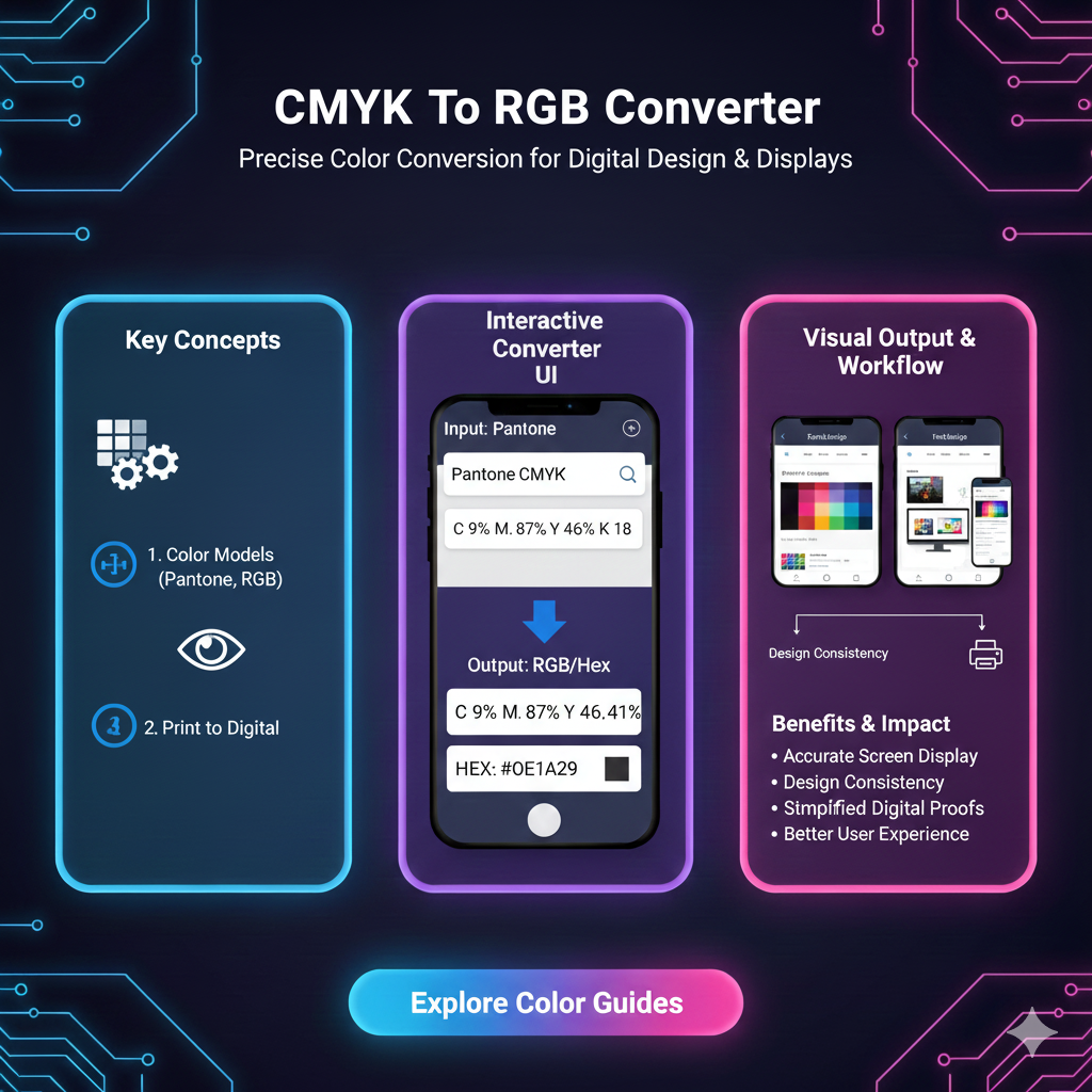
How to Convert CMYK to RGB (And Vice Versa) Like a Boss
You don't need a PhD in color theory. Here are your tools.
1. The Go-To: Professional Design Software
Adobe Photoshop: Go to
Image > Modeand choose your target. Crucially, before you convert, work in a non-destructive way. Use adjustment layers or duplicate your layer. Photoshop will do the math, but preview it first (View > Proof Colorscan simulate CMYK on an RGB file).Adobe Illustrator: This one's smarter. You can define your document's color mode (File > Document Color Mode), and it handles color relativity better. You can have RGB and CMYK objects in the same doc, and it will preview how they'll convert.
Figma/Sketch: These are born-digital, so they're RGB-native. For print, you'd typically finalize designs here, then import into something like Illustrator or InDesign for a proper CMYK conversion and print prep.
2. The Quick Fix: Online Converters
Perfect for quick checks or if you don't have design software.
How it works: You punch in your CMYK percentages (e.g., C: 100%, M: 50%, Y: 0%, K: 0%) and it spits out the RGB values. Or you upload a file, and it converts the whole thing.
Watch Out: Quality varies. These are algorithmic and don't consider color profiles (more on that below). Great for a ballpark figure, not great for final, critical brand work. Always check the output visually.
3. The Behind-the-Scenes Hero: Color Profiles
This is the advanced move. When you convert, how the software maps the colors is guided by an ICC profile. It's like a rulebook. Common ones are "sRGB" for web and "U.S. Web Coated (SWOP) v2" for standard North American printing. Your printer will often specify which profile to use. In Photoshop's conversion dialog, you can choose the profile and the rendering intent (like "Perceptual" to preserve relationships between colors or "Relative Colorimetric" to keep in-gamut colors accurate).
Real-World Use Case: A Branding Nightmare (And Fix)
Imagine you're launching a new energy drink called "Volt" with a signature electric blue. Your logo looks insane on the website (RGB). You send the same file to the can printer (CMYK), and it comes back a standard, less-vibrant blue. Disaster.
The Solution: You needed a spot color (like a Pantone color). This is a pre-mixed, specific ink that guarantees an exact color match, regardless of the screen or CMYK process. You design with the Pantone library, specify that spot color for print, and use its RGB/CMYK equivalents for digital as close as possible matches. This is how big brands keep consistency everywhere.
Best Practices & FAQs (The TL;DR)
Q: I'm a YouTuber/blogger. Do I need to care?
A: If you're only ever making content for screens (videos, web graphics), live your best life in RGB and ignore CMYK. The moment you order merch or printed promo materials, you have to care.
Q: Can I convert back and forth without losing quality?
A: Absolutely not. Every conversion is lossy, especially going from CMYK back to RGB. You won't magically get those bright colors back. Save original versions.
Q: My printer asked for a PDF with "CMYK and bleeds." What does that mean?
A: It means they want your file in the CMYK color mode, and any design that goes to the edge of the page needs to extend ("bleed") about 1/8 inch past the cut line so there's no white edges after trimming.
Q: What about HEX codes?
A: HEX codes (like #FF0033) are just RGB values in hexadecimal notation for the web. They are firmly in the RGB world.
Best Practices Checklist:
Know your final output before you even open a design tool.
Calibrate your monitor. If your screen colors are off, you're guessing.
For critical print work, ask your printer for their preferred CMYK profile and specs.
Use swatch books (like Pantone) for physical color matching. Don't trust your screen.
When in doubt, do a test print. Order one poster or business card before committing to 5000.
Wrapping It Up
Think of CMYK and RGB as two different languages. RGB speaks the language of light (screens), and CMYK speaks the language of ink (print). A perfect, lossless translation between the two is impossible because some "words" (colors) simply don't exist in the other language.
The key isn't just knowing how to hit the "convert" button—it's about understanding the context of your project from the very beginning. By choosing the right color model at the start and converting mindfully when you must, you save yourself a ton of time, money, and frustration. Your screen-to-print game is about to level up.
Now go make something awesome—in the right color space.