The CSS Box Model Explained: Stop Fighting Your Layouts

Struggling with CSS layouts? Master the CSS Box Model—the core of web design. Learn margin, padding, border, box-sizing, and best practices with real-world examples
The CSS Box Model Explained: Stop Fighting Your Layouts
The CSS Box Model Explained: Finally Stop Fighting Your Layouts
Alright, let's talk about one of those "aha!" moments in web development. You know the one. You’re trying to line up a few divs, you set a width: 300px, and suddenly... everything is broken. Your layout is spilling over, things aren't aligning, and you're left wondering if CSS has a personal vendetta against you.
Sound familiar? 99% of the time, the culprit is a fundamental concept that many beginners gloss over: The CSS Box Model.
Think of it as the law of gravity for web layout. You can try to ignore it, but it will always, always pull you back. Once you truly get it, the chaos starts to make sense. Your layouts will finally behave, and you'll gain a superpower: the ability to predict exactly how your HTML elements will look on the page.
So, grab your coffee, and let's demystify this thing once and for all.
What Is The CSS Box Model, Actually?
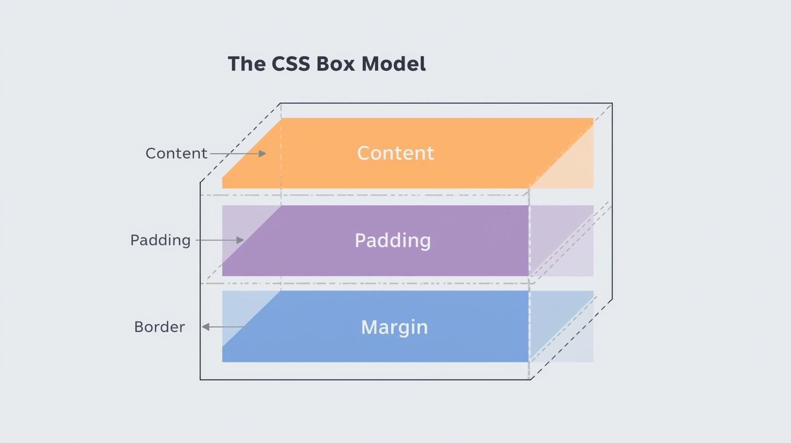
In the simplest terms, every single element in your HTML document is treated by CSS as a rectangular box.
I mean every. From a massive <div> to a tiny <span>, from a heading <h1> to an image <img>—they are all boxes. The CSS Box Model is essentially a set of rules that defines how these boxes' sizes, spacing, and borders are calculated.
This model wraps around every element in four layers, working from the inside out:
The Content
The Padding
The Border
The Margin
Let's break down each layer like we're unpacking a Russian doll.
1. The Content: The Star of the Show
This is the core of the box. It's the actual "stuff"—the text, the image, the video player. You control its size with the width and height properties.
css
.my-box {
  width: 300px;
  height: 200px;
}
This does not mean your entire box will be 300px wide. This is the biggest misconception! This only sets the size of the content area.
2. The Padding: Your Element's Personal Space
Imagine the content is a priceless painting. The padding is the matte and frame inside the display case—it creates breathing room inside the element, between the content and the border.
It's transparent and controlled by the padding property.
css
.my-box {
  width: 300px;
  height: 200px;
  padding: 20px; /* Adds 20px of space inside, on all sides */
}
Now, your box is getting wider. The content is still 300px, but we've added 20px of space on the left and right.
3. The Border: The Frame
This is the literal frame around your element and its padding. You can make it thick, thin, dotted, dashed, or a solid color. It's controlled by the border property.
css
.my-box {
  width: 300px;
  height: 200px;
  padding: 20px;
  border: 5px solid #ff6b6b; /* A 5px thick, solid, coral-colored border */
}
Boom. Another 5px added to the left and right. Our box is visibly growing.
4. The Margin: The "Get Out of My Face" Zone
The margin is the space outside the border. It's an invisible force field that pushes other elements away. It doesn't have a background color or style; it's just empty space used to separate the element from its neighbors.
css
.my-box {
  width: 300px;
  height: 200px;
  padding: 20px;
  border: 5px solid #ff6b6b;
  margin: 30px; /* Pushes other elements 30px away on all sides */
}
The Million-Dollar Question: How Wide Is My Box Actually?
This is where the plot thickens. By default, CSS uses the content-box model. This means when you set a width: 300px, you are only setting the width of the content.
The total width of the element is calculated as:
Total Width = width + padding-left + padding-right + border-left + border-right
So, for our example:
Content
width: 300pxPadding: 20px left + 20px right = 40px
Border: 5px left + 5px right = 10px
Total Actual Width = 300 + 40 + 10 = 350px
Your element, which you thought was 300px wide, is actually taking up 350 pixels on the screen! This is why layouts break. You have two 50% width columns, but with padding and border, they now add up to more than 100%.
The Hero We Needed: box-sizing: border-box
Thankfully, the web development community realized this default behavior was, frankly, a pain. So, a new CSS property came to the rescue: box-sizing.
The border-box model is a game-changer. When you use it, the width and height properties include the content, padding, and border.
The formula becomes:
Total Width = width (which now includes padding and border)
Let's apply it. The magic incantation is:
css
.my-box {
  box-sizing: border-box;
  width: 300px;
  height: 200px;
  padding: 20px;
  border: 5px solid #ff6b6b;
  margin: 30px;
}
Now, let's do the math:
You declared
width: 300px.This 300px now encompasses the content, the 40px of padding, and the 10px of border.
The content area will automatically shrink to
300 - 40 - 10 = 250pxto make everything fit.Total Actual Width = 300px. Exactly what you set!
This is so much more intuitive. This is why it's considered a must-do best practice to set this on every element on your page from the start.
The Ultimate CSS Reset
Put this at the very top of your CSS file. Trust me, it will save you countless headaches.
css
*,
*::before,
*::after {
  box-sizing: border-box;
}
This selector applies border-box to every element and every pseudo-element.
Real-World Use Case: Building a Simple Card Component
Let's get practical. You're building a product card for an e-commerce site.
The Goal: A card that is 250px wide, with a nice thumbnail, some text, a bit of inner space, a subtle border, and spaced away from other cards.
With the default content-box model (the wrong way):
You'd have to do mental gymnastics. "I want 250px total, but with 15px padding and a 1px border, so my width must be 250 - 30 - 2 = 218px... ugh."
With border-box (the right way):
css
.product-card {
  box-sizing: border-box; /* Game-changer! */
  width: 250px; /* The total width I want */
  padding: 15px; /* Nice inner spacing */
  border: 1px solid #eee; /* A subtle border */
  border-radius: 8px; /* Rounded corners */
  margin: 10px; /* Space between cards */
  background: white;
  box-shadow: 0 2px 5px rgba(0,0,0,0.1); /* A little shadow for depth */
}

.product-card img {
  width: 100%; /* Image will fit perfectly inside the 250px box */
}
See how clean that is? You set the width you actually want, and the padding and border live happily inside it. No surprises. This is how modern, professional websites are built.
Best Practices & Pro Tips
Always Use
border-box: We've covered this. It's non-negotiable for sane layouts.Use Shorthand Properties Wisely:
margin: 10px 20px;(top/bottom: 10px, left/right: 20px)padding: 10px 15px 5px 0;(top: 10px, right: 15px, bottom: 5px, left: 0) - Remember the order: Top, Right, Bottom, Left (like a clock).
Watch Out for Margin Collapse: This is a classic head-scratcher. When two vertical margins meet (e.g., the bottom margin of one paragraph and the top margin of the next), they collapse into a single margin equal to the larger of the two. It's a feature, not a bug, but it can be confusing.
Use DevTools Relentlessly: Your browser's developer tools are your best friend. They visually show you the box model for any element you inspect, breaking down its content, padding, border, and margin. Use it to debug constantly!
FAQs
Q: Does outline affect the box model?
A: Nope! outline is drawn outside the border but does not take up space—it doesn't affect the element's size or position. It's like a highlighter over the page.
Q: What about box-sizing: padding-box?
A: It was a thing that included padding in the width but not the border. It's now deprecated and not recommended for use.
Q: My margins aren't working on inline elements like <span>. Why?
A: Good catch! Top and bottom margins don't affect inline elements. If you need margin on all sides, change the display property to inline-block.
Q: Is the Box Model the same for Flexbox and Grid items?
A: Yes! The Box Model rules still apply. Flexbox and Grid are just methods for arranging the boxes. The boxes themselves still have content, padding, border, and margin.
Conclusion: You've Unlocked a Core Superpower
Understanding the CSS Box Model isn't just learning a few properties; it's about internalizing the fundamental logic of how browsers paint the screen. It's the bedrock upon which all your layouts will be built. No more guessing, no more frantic tweaking of values. You are now in control.
Mastering fundamentals like the Box Model is what separates hobbyists from professional developers. It's the first step towards building complex, responsive, and pixel-perfect websites without tearing your hair out.
Ready to level up your web development skills from foundational concepts to building full-fledged applications? This deep dive into the CSS Box Model is just the beginning. To learn professional software development courses such as Python Programming, Full Stack Development, and the MERN Stack, visit and enroll today at codercrafter.in.