Pantone to RGB Converter: The No-Stress Guide for Designers
Stressed about color matching? Our in-depth guide explains how to convert Pantone to RGB accurately, why it's tricky, and best practices for seamless digital branding. No jargon, just solutions.
Alright, let's get real for a second. You’ve spent hours crafting the perfect design on your screen. The colors are vibing, the layout is fire, and you’re ready to launch. You send it off, and then… the client emails back. "The blue on the website looks totally different from our logo on the business card!" Cue the internal scream. Sound familiar?
This, my friends, is the classic color space showdown. And at the heart of it often lies the journey from Pantone to RGB. If you're a designer, marketer, or anyone who’s ever had to translate a brand from the physical world to the digital one, this is your survival guide. No jargon-filled nonsense—just a straight-talking, deep dive into making colors behave across every platform.
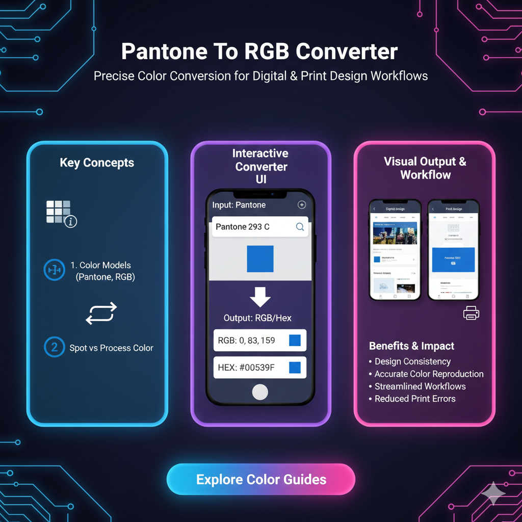
So, What Actually Are Pantone and RGB?
Let's break it down before we get into the conversion magic.
Pantone (PMS - Pantone Matching System): Think of Pantone as the ultimate color dictionary for the physical world. It’s a proprietary, standardized color system used primarily in printing and manufacturing. Each color has a unique number (like "PMS 19-4052 Classic Blue" or the iconic "PMS 485 C" for that Coca-Cola red). The key thing? Pantone colors are created using specific ink mixtures, so they are consistent. A Pantone swatch in New York will look identical to one printed in Tokyo. It’s the gold standard for brand consistency on anything tangible—logos on pens, packaging, apparel, you name it.
RGB (Red, Green, Blue): This is the language of light. Every screen you look at—your phone, monitor, TV—creates colors by mixing red, green, and blue light in varying intensities. Each channel has a value from 0 to 255. Pure white is RGB(255, 255, 255), and pure black is RGB(0, 0, 0). RGB is additive color; you start with black (no light) and add colors to get to white. It’s the essential color mode for anything that lives on a digital screen: websites, apps, social media graphics, video content.
Why Can’t They Just Be the Same? The Core Challenge
Here’s the frustrating truth: There is no perfect 1:1 conversion from Pantone to RGB. Why? They’re fundamentally different beasts.
Medium: Pantone is ink on paper (reflective light). RGB is emitted light from a screen.
Gamut: This is the range of colors each system can produce. Some vibrant Pantone inks (especially neon oranges, deep blues, and certain metallics) simply cannot be replicated by the tiny LEDs in your screen. Conversely, some super-bright screen colors can't be printed with standard inks. You’re essentially translating between two different languages, and some words just don’t have a direct translation.
The conversion, therefore, is an approximation—a "best possible match" under digital constraints.
Real-World Use Cases: When You Need to Convert
Building a Brand's Digital Identity: You have a brand style guide that lists the official Pantone colors. To build the website, design social media templates, or create digital ads, you need the RGB (and HEX) equivalents.
From Print Design to Web Design: You designed a beautiful brochure in InDesign using Pantone colors. Now the client wants a landing page that matches. Time to convert those swatches.
Mockups and Presentations: Showing a client how their logo will look on a website or app interface requires the RGB version to be accurate.
When Working with Developers: They live in a world of HEX codes (which are derived from RGB). Giving them
#0F4C81is infinitely more helpful than saying "PMS 654 C."
How to Convert: Tools & The Right Mindset
You can’t just guess. Use reliable tools, but always trust your calibrated eyes.
Method 1: The Official Source (Most Reliable)
The Pantone Color Finder tool on the Pantone website is the best starting point. Search for your Pantone number, and it will provide you with the recommended RGB, HEX, and CMYK values. These are their official approximations.
Method 2: Design Software (Handy & Integrated)
Adobe Illustrator/Photoshop: Open the Color Picker, click "Color Libraries," and choose your Pantone book. Select your color, then switch the color mode to RGB in the picker. It will show you the converted values. Pro Tip: Always note the "out-of-gamut" warning (a little triangle symbol) which tells you the RGB match isn't perfect.
Figma/Sketch: While they don't have native Pantone libraries, you can use plugins or input the official RGB values you got from the Pantone site.
Method 3: Online Converters (Quick & Dirty)
A quick Google search for "Pantone to RGB converter" will bring up dozens of tools. Use these with caution. They are convenient but can vary in accuracy. Cross-reference results with the official Pantone guide if possible.
Best Practices for a Seamless Workflow
Start Digital, Then Go Print: It’s often easier to match a print color to a digital one than vice-versa. When possible, begin your brand colors in RGB/HEX for the digital world, then find the closest Pantone match for print.
Calibrate Your Monitor: If your screen colors are off, all your conversions are meaningless. A basic hardware calibrator is a worthwhile investment for any serious designer.
Create a Master Brand Palette Document: Don't just convert once and forget. Make a single source of truth document that lists:
Pantone Name & Number
RGB Values
HEX Code
CMYK Values (for standard printing)
Optional: HSL/HSB values for certain design needs.
Communicate with Stakeholders: Explain to clients or your team that colors will look different on screen vs. on a t-shirt. Setting this expectation early prevents "why don't they match?!" panic later.
Embrace the Difference for Metallics & Neons: For impossible-to-match Pantones (like metallics or fluorescents), get creative digitally. Use gradients, textures, or subtle animation to suggest that luminous or metallic quality, rather than trying to find a flat color that will always fall short.
FAQs – Your Burning Questions, Answered
Q: Is there a perfect Pantone to RGB converter?
A: No. Because of the fundamental differences in medium and gamut, every conversion is an approximation. The Pantone-provided values are your most authoritative guide.
Q: Why does my converted RGB color look dull compared to the Pantone swatch?
A: You’re likely trying to convert a vibrant Pantone color that exists outside the RGB gamut. The software is giving you the closest possible match within the limits of screen technology, which can sometimes mean a less saturated, duller version.
Q: Should I use RGB or HEX for web?
A: They are two sides of the same coin! HEX codes (like #FF5733) are just a hexadecimal representation of the same RGB values. Developers prefer HEX, but design software often shows both. They are 100% interchangeable for web use.
Q: What about CMYK? Where does that fit in?
A: CMYK (Cyan, Magenta, Yellow, Key/Black) is the standard four-color printing process used for things like magazines, posters, and brochures. The path often is: Pantone (for spot color/logo) -> RGB (for digital) -> CMYK (for full-color print projects). Each step requires careful conversion.
Wrapping It Up: Think of It as Translation, Not Copy-Paste
Converting Pantone to RGB isn’t a science of perfection; it’s an art of faithful translation. The goal isn’t to achieve an impossible identical match, but to maintain the feeling, integrity, and recognizability of your brand color as it moves from the world of objects into the world of light.
By using the right tools, setting clear expectations, and documenting everything, you can ditch the color anxiety and ensure your brand looks consistently awesome—whether someone is holding it in their hand or scrolling past it on their feed.
Now go forth and convert with confidence! Your designs (and your clients) will thank you