CSS Selectors: Complete Guide with Examples & Best Practices 2025

Master CSS selectors with our comprehensive guide. Learn 30+ selector types, real-world examples, best practices, and common mistakes to avoid. Perfect for web developers at all levels
CSS selectors are the foundation of modern web design, serving as the bridge between your HTML structure and the visual presentation you want to achieve. Whether you're building a simple landing page or a complex web application, understanding CSS selectors is absolutely essential for efficient, maintainable, and professional web development. This comprehensive guide will walk you through everything you need to know about CSS selectors, from basic concepts to advanced techniques that will elevate your web development skills.
CSS selectors are patterns used to select and target HTML elements that you want to style on your web page. Think of them as a powerful targeting system that allows you to apply colors, fonts, layouts, and animations to specific elements without cluttering your HTML with inline styles. The CSS selectors module provides developers with over 60 different selectors and five combinators, giving you unprecedented control over how your web pages look and behave. By mastering CSS selectors, you can write cleaner code, reduce redundancy, and create more maintainable stylesheets that scale beautifully as your projects grow.
Understanding the Five Categories of CSS Selectors
CSS selectors are organized into five main categories, each serving distinct purposes in web development. These categories include basic selectors that target elements by name, ID, or class; attribute selectors that target elements based on their HTML attributes; combinator selectors that define relationships between elements; pseudo-class selectors that target elements in specific states; and pseudo-element selectors that style specific parts of elements. Understanding these categories is crucial for choosing the right selector for any styling challenge you encounter.
Basic Selectors: The Building Blocks of CSS
Basic selectors form the foundation of CSS styling and are the first selectors every web developer learns. The universal selector uses an asterisk (*) to select every single element on the page, making it useful for CSS resets where you want to remove default browser styling. For example, * { margin: 0; padding: 0; } removes all default margins and padding from every element. However, use this selector sparingly as it can impact performance when overused.
The element selector (also called a tag selector) targets all instances of a specific HTML element by its tag name. When you write p { font-size: 16px; }, you're selecting every paragraph element on your page and setting its font size to 16 pixels. This selector is perfect for establishing baseline styles for common elements like headings, paragraphs, and links throughout your entire website.
Class selectors are denoted by a period (.) followed by the class name and are among the most versatile and commonly used selectors in CSS. They allow you to create reusable styles that can be applied to multiple elements across your website. For instance, .button { background-color: blue; color: white; padding: 10px 20px; } creates a button style that can be applied to any element with the class "button". Multiple classes can even be applied to a single element, allowing you to combine different style rules efficiently.
The ID selector uses a hash symbol (#) followed by the ID name to target a unique element on the page. While IDs are unique and should only appear once per page, CSS developers generally recommend avoiding ID selectors in stylesheets because they have extremely high specificity, making them difficult to override and leading to what's known as "specificity wars". Instead, class selectors are preferred for their flexibility and lower specificity.
Group selectors allow you to apply the same styles to multiple different selectors by separating them with commas. For example, h1, h2, h3 { font-family: Arial, sans-serif; color: #333; } applies the same font and color to all three heading levels, reducing code duplication and making your stylesheets more maintainable.
Attribute Selectors: Targeting Elements by Their Properties
Attribute selectors provide powerful capabilities for targeting elements based on the presence or value of their HTML attributes. The presence selector [attribute] selects any element that has the specified attribute, regardless of its value. For example, input[type] { border: 2px solid black; } targets all input elements that have a type attribute, whether it's text, email, password, or any other value.
The exact value selector [attribute="value"] is more specific, selecting only elements where the attribute exactly matches the specified value. Using input[type="text"] { background-color: yellow; } targets only text input fields, leaving checkboxes, radio buttons, and other input types unaffected. This precision makes attribute selectors invaluable for form styling where different input types require different visual treatments.
Advanced attribute selectors include the starts with selector [attribute^="value"] which matches elements where the attribute value begins with the specified string. This is particularly useful for styling external links: a[href^="https"] { color: green; } can style all secure links differently. Similarly, the ends with selector [attribute$="value"] matches elements where the attribute ends with a specified string, perfect for targeting file types: a[href$=".pdf"] { color: red; font-weight: bold; } can visually distinguish PDF links from regular links.
The contains substring selector [attribute*="value"] matches elements where the attribute contains the specified substring anywhere within its value. For example, [class*="icon-"] would match any element with a class containing "icon-", such as "icon-home", "social-icon-facebook", or "menu-icon-hamburger". While powerful, substring matching can be slower than other selectors, so use it judiciously in performance-critical applications.
Combinator Selectors: Defining Element Relationships
Combinator selectors define the relationship between two or more selectors, allowing you to target elements based on their position in the DOM tree. The descendant combinator uses a space between selectors to target all elements that are descendants (children, grandchildren, etc.) of a specified parent element. For instance, div p { color: red; } selects all paragraph elements inside div elements, regardless of how deeply nested they are.
The child combinator uses the greater-than symbol (>) to select only direct children of an element, not grandchildren or deeper descendants. This provides more precise control: div > p { background-color: yellow; } only affects paragraphs that are immediate children of div elements. The difference between descendant and child selectors is crucial for maintaining specificity and preventing unintended style application to deeply nested elements.
The adjacent sibling combinator uses the plus symbol (+) to select an element that immediately follows another specific element, where both share the same parent. This is particularly useful for styling elements that appear after specific content: h1 + p { margin-top: 0; } removes the top margin from paragraphs that immediately follow h1 headings, creating tighter visual grouping. Both elements must be siblings and the selected element must come directly after the first element.
The general sibling combinator uses the tilde symbol (~) to select all elements that are siblings of a specified element and come after it in the document. Unlike the adjacent sibling combinator, this selects all following siblings, not just the immediate next one: h1 ~ p { color: gray; } would style all paragraph siblings that come after an h1, even if other elements appear between them.
Pseudo-class Selectors: Styling Element States
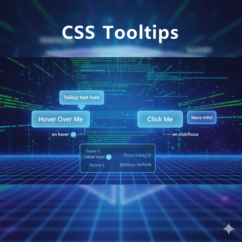
Pseudo-class selectors are keywords added to selectors that specify a special state of the selected elements. The :hover pseudo-class is one of the most widely used, applying styles when a user moves their cursor over an element without clicking. For example, button:hover { background-color: #0056b3; transform: scale(1.05); } creates an interactive effect where buttons change color and slightly enlarge when hovered over, providing immediate visual feedback to users.
The :focus pseudo-class targets elements that currently have focus, typically applied to form inputs and interactive elements. Using input:focus { border: 2px solid blue; outline: none; } provides clear visual indication when users click into or tab to an input field, improving form usability and accessibility. This is especially important for keyboard navigation users who rely on focus indicators to understand their current position in a form.
The :first-child pseudo-class selects elements that are the first child of their parent element. This is invaluable for removing unwanted spacing: li:first-child { margin-top: 0; } ensures the first item in a list doesn't have excess top margin, creating cleaner layouts. Similarly, :nth-child(n) allows you to select elements based on their position using formulas like even, odd, or custom expressions like 3n+1. A common use case is alternating table row colors: tr:nth-child(even) { background-color: #f2f2f2; } creates the classic striped table effect that improves readability.
Link-related pseudo-classes include :link for unvisited links, :visited for visited links, and :active for links being clicked. These must be used in the specific order known as LVHA (Link-Visited-Hover-Active) to work correctly: a:link { color: blue; } a:visited { color: purple; } a:hover { color: red; } a:active { color: orange; }. This ordering ensures that each pseudo-class properly overrides the previous one based on user interaction.
Pseudo-element Selectors: Styling Element Parts
Pseudo-elements allow you to style specific parts of an element or insert content without adding extra HTML. The ::before pseudo-element inserts content before the actual content of an element. It's commonly used for adding decorative elements: h1::before { content: "→ "; color: blue; } adds a blue arrow before every h1 heading. The content property is required for ::before to render, even if it's just an empty string.
The ::after pseudo-element works identically to ::before but inserts content after the element's content. This is perfect for adding icons, decorative elements, or additional text: a[href^="http"]::after { content: " ↗"; } adds an external link icon after links to external websites. Both ::before and ::after create inline boxes by default, but their display property can be changed to create more complex layouts.
The ::marker pseudo-element targets the marker box of list items, allowing you to customize bullet points and numbers. Using ::marker { color: red; font-size: 20px; } changes the color and size of all list markers on your page. This provides much more flexibility than older techniques that required removing default markers and adding custom ones manually.
The ::selection pseudo-element styles the portion of text that users select with their cursor. Creating a custom selection style like ::selection { background: yellow; color: black; } can reinforce brand colors and create a more polished user experience. This small detail shows attention to design consistency throughout the entire user interaction.
Real-World Use Cases and Practical Applications
CSS selectors shine in real-world scenarios where you need to solve specific design challenges efficiently. Form styling is a prime example where attribute selectors excel. When building a registration form, you can use input[type="email"] { background-image: url('email-icon.png'); } to add visual indicators for different input types, while input:required { border-left: 3px solid red; } highlights required fields, and input:valid { border-left: 3px solid green; } provides validation feedback. These targeted selectors create intuitive user experiences without requiring extra classes or JavaScript.
Navigation menus benefit greatly from combinator and pseudo-class selectors. A common pattern is .nav-menu li:first-child { margin-left: 0; } to remove left margin from the first menu item, combined with .nav-menu a:hover { background-color: #f0f0f0; } for hover effects. For dropdown menus, .nav-menu li:hover > ul { display: block; } shows sub-menus when hovering over parent items. This approach keeps your HTML clean while achieving sophisticated interactive behaviors.
Table styling showcases the power of :nth-child selectors. The classic alternating row colors pattern table tr:nth-child(odd) { background-color: #f9f9f9; } and table tr:nth-child(even) { background-color: #ffffff; } creates the zebra-striping effect that improves readability in data-heavy tables. You can also use table tr:hover { background-color: #e0e0e0; } to highlight rows as users scan across them, making it easier to follow data across columns.
E-commerce product grids often use combinations of selectors for responsive layouts. Using .product-grid > .product-item:nth-child(3n+1) { clear: left; } ensures proper wrapping in three-column layouts, while .product-item:hover .quick-view { opacity: 1; } reveals action buttons on hover. The adjacent sibling combinator helps with spacing: .product-item + .product-item { margin-left: 20px; } adds consistent gaps between items without affecting the first item.
Blog layouts leverage pseudo-elements for decorative enhancements. Adding blockquote::before { content: '"'; font-size: 60px; color: #ccc; } creates attractive quote marks, while article h2::after { content: ''; display: block; width: 50px; height: 3px; background: blue; margin-top: 10px; } adds decorative underlines to headings without additional markup. These purely CSS solutions reduce HTML clutter and make designs easier to maintain.
Best Practices for Writing Efficient CSS Selectors
Keeping selector specificity low is the most important principle for maintainable CSS. Overly specific selectors like body #header .nav ul li a.active create specificity wars where you need increasingly complex selectors to override styles. Instead, use a simple class selector like .nav-link-active which is easier to understand, override, and maintain. The simpler your selectors, the more flexible and reusable your CSS becomes.
Avoid ID selectors in your stylesheets because they have extremely high specificity (100 points compared to 10 for classes). Once you use an ID selector, you're forced to use IDs again every time you want to override those styles, creating a cascade of specificity issues. Class selectors provide all the targeting power you need with much lower specificity, making your CSS more maintainable and easier to extend. Reserve IDs for JavaScript hooks or anchor links, not styling.
Minimize the use of long descendant chains that tightly couple your CSS to your HTML structure. A selector like .container .sidebar .widget .title a breaks whenever you change your HTML structure, requiring updates in multiple places. Instead, use a direct class like .widget-title-link which works regardless of DOM structure changes. This separation of concerns makes both your HTML and CSS more maintainable and easier to refactor.
Use child selectors (>) instead of descendant selectors (space) when you only want to target immediate children. This limits the DOM traversal the browser needs to perform and prevents accidentally styling nested elements you didn't intend to target. For example, .menu > li only selects direct children of the menu, not nested sublists, providing more precise control and better performance.
Group selectors with commas to reduce code duplication and improve maintainability. Instead of writing separate rules for h1 { font-family: Arial; }, h2 { font-family: Arial; }, and h3 { font-family: Arial; }, write h1, h2, h3 { font-family: Arial; } to apply the same style in one rule. This DRY (Don't Repeat Yourself) principle makes updates easier since you only need to change the style in one place.
Avoid the universal selector (*) for general styling as it affects every single element on the page and can slow down rendering. While it's acceptable for CSS resets at the beginning of your stylesheet, using it frequently or combining it with other selectors like .container * forces the browser to evaluate every descendant element, which is computationally expensive. Target specific elements or use class selectors instead for better performance.
Limit the use of attribute substring selectors like [class*="icon-"] as they require more processing than simple attribute or class selectors. The browser must check each element's attribute value and perform substring matching, which is slower than exact matches. While these selectors are powerful and sometimes necessary, use them judiciously and consider whether a class selector would work instead.
Never use !important unless absolutely necessary, as it breaks the natural CSS cascade and makes debugging extremely difficult. When you use !important, the only way to override that style is with another !important declaration with higher specificity, creating an escalating arms race of increasingly complex selectors. Instead, restructure your selectors to achieve the desired specificity naturally through proper CSS organization.
Write meaningful, semantic class names that describe what the element is or does, not how it looks. Use .primary-button instead of .blue-button because if you later decide primary buttons should be green, the class name .blue-button becomes confusing and misleading. Semantic naming makes your code self-documenting and easier for other developers (including future you) to understand and maintain.
Common Mistakes to Avoid When Using CSS Selectors
One of the most common mistakes developers make is not realizing you can apply multiple classes to a single element. Writing <div class="center highlight bold"></div> combines all three class styles on one element, eliminating the need for duplicate code or overly specific selectors. This powerful feature allows you to create modular, reusable style components that can be mixed and matched throughout your project.
Forgetting the required content property in ::before and ::after pseudo-elements is another frequent error that prevents these pseudo-elements from rendering. Even if you don't want visible content, you must include content: ""; for the pseudo-element to appear and receive other styling properties like background, dimensions, or positioning. Without this property, your carefully crafted pseudo-element styles simply won't display.
Using the wrong comment syntax is a surprisingly common mistake, especially for developers who work with multiple languages. CSS only supports /* comment */ syntax, not // comment which works in JavaScript and many other languages. Using double slashes in CSS doesn't create an error but also doesn't comment out the code, potentially causing unexpected styling issues that are difficult to debug.
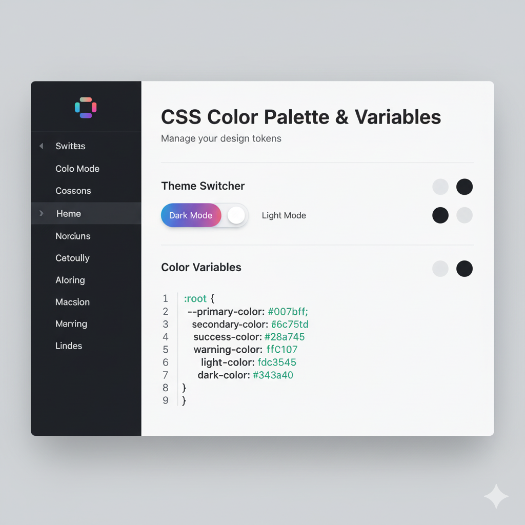
Forgetting to use the var() function around CSS custom properties (variables) is an easy mistake that silently fails. Writing color: --primary-color; doesn't work; you must write color: var(--primary-color); to reference the variable value. Similarly, misnaming your variables (like using --primary-color when you defined --color-primary) creates frustrating bugs that can be time-consuming to track down.
Confusing display and position properties is another common error that stumps beginners. Writing display: absolute; when you mean position: absolute; is a frequent typo that prevents your positioning code from working. These properties serve completely different purposes: display controls how an element participates in layout flow (block, inline, flex, etc.), while position controls positioning behavior (static, relative, absolute, fixed, sticky).
Applying :nth-child to the wrong element in your selector is a mistake even experienced developers make. Writing .parent:nth-child(2) when you mean .parent .child:nth-child(2) targets the wrong element entirely. The :nth-child pseudo-class applies to the element it's attached to, not its children, so understanding selector specificity and application is crucial for achieving intended results.
Not maintaining the correct order for link pseudo-classes (LVHA: :link, :visited, :hover, :active) causes some states to never activate. If you place :hover before :link and :visited, the hover effect won't work because the more specific link states override it. This ordering requirement, based on CSS specificity rules, is essential for proper link interaction styling.
Using inline styles instead of external stylesheets negates many benefits of CSS. Inline styles like <div style="color: red; font-size: 18px;"> make your HTML bloated, harder to maintain, and impossible to cache effectively. They also have the highest specificity (1000 points), making them extremely difficult to override with stylesheet rules. Always prefer external or internal stylesheets over inline styles except in rare, specific circumstances.
Over-nesting selectors in preprocessors like SASS creates complex, highly specific selectors that are difficult to maintain. While SASS makes nesting convenient, you should generally limit nesting to 2-3 levels maximum. Deep nesting like .header .nav .menu .item .link { } tightly couples your CSS to your HTML structure and creates the exact specificity problems that preprocessors were meant to help solve.
Not using a CSS reset or normalize stylesheet leads to inconsistent rendering across different browsers. Each browser applies its own default styles to HTML elements, creating cross-browser inconsistencies. Including a CSS reset like Normalize.css at the beginning of your stylesheet ensures consistent baseline styling across all browsers, saving hours of debugging browser-specific display issues.
Performance Optimization for CSS Selectors
While CSS selector performance has improved significantly in modern browsers, understanding performance implications helps you write more efficient code, especially for complex applications. Simple selectors are always faster than complex ones, so button:hover { background-color: blue; } performs better than body #navlist ul li a.button:hover { background-color: blue; }. The second selector requires the browser to traverse multiple DOM levels and check multiple conditions, while the first provides immediate matching.
Browsers match selectors from right to left, which has important performance implications. For a selector like .wrapper .section .title .link, the browser first finds all .link elements, then filters those that are inside .title elements, then further filters for those inside .section elements, and finally those inside .wrapper elements. Understanding this right-to-left matching explains why the rightmost selector (the "key selector") has the biggest performance impact.
The universal selector combined with other selectors can create performance bottlenecks. Writing .container * { } forces the browser to check every descendant element of .container, which could be hundreds of elements. If a page has 900 divs, a selector like .module div with 3 levels of nesting results in factorial calculations that can significantly slow down style recalculation. Use more specific selectors to reduce the number of elements that need evaluation.
Attribute substring selectors require more processing time than exact matches because the browser must perform string comparison operations on attribute values. While [type="text"] quickly checks for exact equality, [class*="icon-"] must examine the entire class attribute and search for the substring, which is computationally more expensive. Use these selectors when necessary but consider whether a simpler class selector would achieve the same result.
Modern browser DevTools provide CSS selector performance analysis features that help identify problematic selectors. Chrome DevTools' Performance panel includes a "Selector Stats" feature that shows which selectors took the longest to calculate during style recalculation events. This data-driven approach helps you identify and optimize actual performance bottlenecks rather than guessing which selectors might be slow.
That said, selector performance rarely causes significant problems in modern applications. Studies show that even in worst-case scenarios, the difference between the fastest and slowest selectors is typically only 50 milliseconds. Focus on selector performance when you have thousands of DOM elements or notice slow style recalculations in your performance profiles, but don't prematurely optimize at the expense of code readability and maintainability.
Child selectors offer better performance than descendant selectors because they limit DOM traversal. Using .module > h3 tells the browser to only check immediate children, while .module h3 requires checking all descendants at all levels. On a page with complex nesting, this difference becomes more pronounced, though modern browsers optimize descendant selector matching quite well.
Frequently Asked Questions About CSS Selectors
What is the difference between a class selector and an ID selector?
Class selectors (.) can be applied to multiple elements and have lower specificity (10 points), making them ideal for reusable styles. ID selectors (#) should be unique per page and have much higher specificity (100 points), making them difficult to override and generally not recommended for styling. Most modern CSS best practices favor class selectors for their flexibility and maintainability.
When should I use attribute selectors instead of class selectors?
Attribute selectors are ideal when you need to target elements based on HTML attributes that already exist for functional purposes, like form input types or link targets. For example, input[type="email"] targets email inputs without requiring additional classes. However, if you're adding attributes solely for styling purposes, class selectors are generally clearer and more maintainable.
Why is the order important for link pseudo-classes?
Link pseudo-classes must follow the LVHA order (:link, :visited, :hover, :active) due to CSS specificity rules. If :hover comes before :link and :visited, those more specific states will override the hover effect. Similarly, :active must come last to override all previous states when a link is being clicked. Following this order ensures all states work correctly.
Can I use multiple pseudo-classes on the same element?
Yes, you can chain multiple pseudo-classes together on a single selector. For example, input:required:focus { border: 2px solid blue; } targets required input fields only when they have focus. This powerful technique allows very precise targeting without needing additional classes or complex selectors.
What's the difference between ::before and :before notation?
The double-colon (::) notation is the CSS3 standard for pseudo-elements, while the single-colon (:) notation is from CSS2. All modern browsers support both notations for backward compatibility, but using :: for pseudo-elements (::before, ::after) and : for pseudo-classes (:hover, :focus) helps distinguish between the two types of selectors.
How do I choose between descendant and child selectors?
Use child selectors (>) when you only want to target direct children, preventing styles from cascading to nested descendants. Use descendant selectors (space) when you want to target all elements at any nesting level. Child selectors provide more precision and better performance, while descendant selectors offer broader coverage.
Do CSS selectors affect page load performance significantly?
In most cases, CSS selector performance has minimal impact on overall page load time. Modern browsers are highly optimized for CSS parsing and selector matching. Focus on selector performance only when you have extremely complex pages with thousands of elements or when performance profiling reveals actual bottlenecks. Readability and maintainability should usually take precedence over micro-optimizations.
What are the best selectors for responsive design?
Responsive design typically relies on class selectors combined with media queries rather than specific selector types. Use semantic class names like .container, .grid, and .col that describe layout roles, then modify their behavior with media queries. Attribute selectors can also be useful for progressive enhancement, like [class*="col-"] to target all column classes.
Mastering CSS for Professional Web Development
Understanding CSS selectors is fundamental to becoming a proficient web developer, but it's just the beginning of your journey into professional software development. The principles you've learned here—specificity management, selector efficiency, code maintainability, and performance optimization—apply to every aspect of modern web development. As you continue building your skills, you'll find that CSS selectors integrate with advanced concepts like CSS Grid, Flexbox, animations, and responsive design patterns to create sophisticated user interfaces that delight users and scale gracefully.
To take your web development skills to the next level and learn comprehensive software development techniques, consider enrolling in professional courses that provide structured learning paths, hands-on projects, and expert mentorship. To learn professional software development courses such as Python Programming, Full Stack Development, and MERN Stack, visit and enroll today at codercrafter.in. These industry-focused programs cover everything from foundational concepts to advanced frameworks, preparing you for successful careers in modern software development. Whether you're interested in front-end technologies like React and Vue.js, back-end development with Node.js and Python, or full-stack applications with the MERN stack, professional training provides the skills employers are actively seeking.
Conclusion
CSS selectors are the powerful targeting mechanism that makes modern web styling possible, offering developers precise control over how HTML elements are presented to users. Throughout this comprehensive guide, we've explored the five main categories of selectors—basic, attribute, combinator, pseudo-class, and pseudo-element—each providing unique capabilities for different styling challenges. We've examined real-world use cases from form validation to responsive layouts, demonstrating how thoughtfully chosen selectors create maintainable, performant, and elegant solutions.
The best practices we've covered emphasize simplicity, low specificity, and separation of concerns, principles that lead to CSS that's easy to understand, modify, and scale. By avoiding common mistakes like excessive ID selectors, deep nesting, and specificity wars, you'll write cleaner code that works harmoniously with your HTML rather than fighting against it. Understanding performance implications helps you make informed decisions, though remember that selector performance rarely causes real-world problems in modern browsers.
As you apply these CSS selector techniques in your projects, you'll develop an intuitive sense for which selectors best solve particular challenges. The journey from beginner to expert is built through practice, experimentation, and learning from both successes and mistakes. Keep this guide as a reference, continue exploring advanced CSS features, and never stop building. For comprehensive training in Full Stack Development, MERN Stack, Python Programming, and other cutting-edge technologies, visit codercrafter.in today and transform your passion for coding into professional expertise. The future of web development is bright, and with solid fundamentals in CSS selectors and modern development practices, you're well-equipped to create the next generation of exceptional web experiences
